Yesterday, in a spot check, we observed that Torok and Nicholls had acknowledged a substantial inhomogeneity in the Low Head lighthouse series, used in Jones et al 1990. Given this problem in one of the 49 series, this begs the question of what the other 48 series look like. Here are quite a few plots of individual stations plus some spaghetti graphs.
I’ve identified 37 of the 49 Jones series in the Torok and Nicholls 1996 archive. Through some patient cross-checking I’ve made a codex linking the Australian BOM ids to GHCN ids. I was able to match location and name for 36 of the 37 series (I couldn’t locate a GHCN number for Maryborough, Queensland although there is one for Maryborough, Victoria). I have 4 series available for each series:
the annual average from monthly data in the Torok and Nicholls archive (“BOM monthly average”)
the adjusted Torok and Nicholls value (annual)
the annual average from monthly data in the GHCN v2 archive
The Jones et al 1990 version ties almost exactly to the annual average of BOM monthly data for the period of overlap – the Jones period of 1930-1988 being shorter than available (raising the question of why Jones selected exactly this period – this is the Team, after all). In turn, both generally match GHCN data. When you look at the graphs, notice that the data all ends in the early 1990s – why has GHCN been unable to organize itself to update “rural” Australian data – another interesting question.
When you start looking through the various station versions, it’s hard not to ponder where one finds firm ground amidst the various adjustments – there’s a reason for all the adjustments, but the adjustments are so large relative to the size of the presumed “signal” that Step 1 in all of these studies surely needs to be a systematic description in an organized form of the adjustments. You’ll see what I mean better by looking at some examples.
Here’s a plot of the 4 versions for Omeo – wherever that is. You can see that the GHCN data (red) closely matches the average taken from BOM monthly data (blue), which matches the Jones version (black) during the 1930-1988 overlap. Torok has made a substantial downward adjustment of 19th century data, which is not reflected in the GHCN raw version supposedly used NOAA gridded (I’ve not checked against the GHCN adjusted version yet.) Torok and Nicholls 1996 describe a variety of plausible reasons for adjusting 19th century data, pointing out, in addition to the usual problems of changing instrumentation, problems distinctive to rural Australia: thermometers being seized by dingoes, taken by crows and being smashed by angry wives.

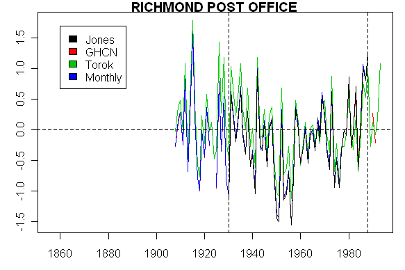
Here’s another one from Richmond Post Office where the Torok adjustment has a little different effect. In this case, the Torok adjustment increases values in the 1930s somewhat. Looking at the graphic as a whole, one does not leave with a sense of a strong trend. Nonetheless, this site has a strong positive trend in the Jones et al study, accentuated somewhat by the fact that it starts with an exceptionally low value in 1930 and ends with a high value in 1988. Again one of those providential coincidences so characteristic of Team climate science.
Here’s another series with a similar pattern – again no particular overall trend. However, in the Jones version, there is a positive trend, to which the downspike at the opening of the series contributes substantially. Note that the Torok adjustment here eliminates the opening downspike in the Jones version.

Now for something even punchier. Here’s a series with a very strong upward trend. Torok and Nicholls adjusted this series a bit, but, even after the adjustment, there was still a strong upward trend. Since other series don’t have this trend, how can one assume that this particular trend is not due to some unannotated inhomogeneity? I don’t know what the inhomogeneity is here, but it sure looks to me like there’s something wrong with this “High Quality” series.
Here’s another series with no particular trend, in which GHCN, Jones, Torok and BOM average versions are all virtually identicl in the overlap period, while the Torok adjustment lowers the 19th century values.

While many have no trends, here’s another series with a strong trend – is the trend real? Right now, I don’t see how you can assume that it’s real.

What do things look like an overall basis? Here I’ve made a spaghetti graph of the above 36 stations from the Torok archive (the GHCN plot looks very similar). Tree rings start to look pretty good. The Jones et al network period is shown by dashed lines and pretty much coincides with this graphic.

After adjustment, the “High Quality” Torok and Nicholls network looks like this – the main difference being the elimination of higher late 19th century values due to adjustments for measurement changes.

Here’s a plot of the average of the data in the 4 networks, showing clearly the effect of the Torok and Nicholls adjustments on 19th century values and what seems to be a somewhat opportunistic choice of period in Jones et al 1990.


31 Comments
As I recall there have been as many as 9500 stations whose data have been part of the official surface record at some point in time. The stations have been located in scores of countries, some of which no longer exist. The local stations do not “belong” to the UN or any central authority. How does even Phil Jones know what he is getting?
One of the things that intrigues me about these records is how relatively few of them seem to be updated continuously in GHCN and presumably Jones and that most of the ones being updated seem to be in cities. It’s just a surmise right now but for GHCN to have no updates for this “rural” network since the early 1990s or the CHinese data is really weird.
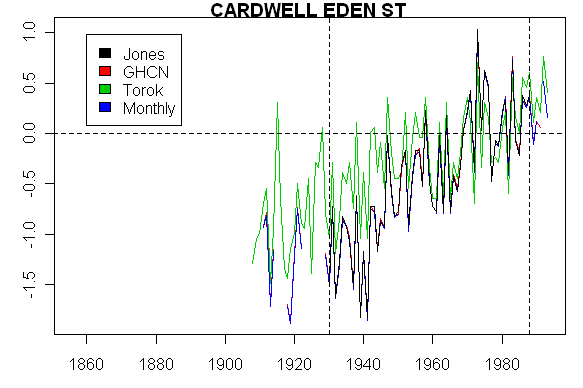
Steve, Cardwell is a sleepy little town in North Queensland towards the southern end of a bay, and sandwiched between a mountain range and the Coral Sea.
There has been some development in the area, but it is limited as there is simply nowhere to expand to, however traffic along the Bruce Highway that runs more or less along the beachfront at the centre of the town has increased significantly, and the highway has been upgraded several times with consequent loss of trees along the roadsides – and no doubt the occasional cyclone has also removed some trees.
When I first went through there in 1969 the highway was a single sealed lane with a wide dirt strip each side running mainly under a canopy of large trees, and township itself was just a couple of shops, a school, and some scattered houses, also mainly surrounded by large trees making them difficult to notice unless you were actually looking for them.
The last time I went through in the late 1980s it was wide sealed highway and wide open to the sky and was a bit more built out with far fewer trees – no doubt the road has been upgraded further since then, and every bit of available land will have been built on at the expense of local trees.
You will find a town map here:
Click to access Cardwell-Street.pdf
– which shows that Eden St is very short, and is a little north of the town centre between the highway (Victoria St) and the beach, so the highway will most likely be having a significant impact on temperatures, as will the ongoing removal of large trees over the years.
This website has a photo of Cardwell from the air at top LHS along with a brief history of the town:
http://www.cardwelltourism.com/history.html
Here is another brief history on the Cardwell Shire Council website:
http://www.csc.qld.gov.au/?page_id=106
Tibooburra is a tiny town in the far north-west of New South Wales, surrounded by arid fringe-grazing land. It often features in the weather report for having the highest day-time temperature in the State.
It’s difficult to imagine much UHI effect there, either from development or land-use changes.
(Surprisingly for such a small town, Tibooburra has two pubs: one is the “Family Hotel” and the other is known as the “Other Hotel”!)
Omeo is about 400km NE of Melbourne, just south of the alpine regions, amongst low rolling hills of grazing land. In early years it was a gold town though. Until around 1939 (when the surrounding area was devastated by fires) it was surrounded by forest.
While I’m on it, the other Victorian sites you listed:
– Swan Hill and Echuca are on the Murray river, 300/500km north of Melbourne, surrounded by flat grassland. They are 160km apart, but still close enough that even their hourly temperatures are very similar.
– Cape Otway, Wilsons Prom and Gabo Island (200km W, 200km and 500km E of Melbourne respectively) are obviously coastal, surrounded by national parks.
– Maryborough is an old gold town in the central region, now a dairy region. 150km NW of Melbourne and 70km north of Ballarat.
The Maryborough that is “rural” in Plummer’s list and urban in the Torok and Nicholls list is in Queensland and had a population of 10,159 in 1901 and 21,192 in 2001.
The Maryborough that is rural in the Torok and Nicholls list is in Victoria, and had a population of 5622 in 1901 and 7476 in 2001.
The following charts show absolute TMAX and TMIN, rather than anomalies.
These three look like there is something wrong, or, at least, that there should be some explanation:
Cardwell (as per Steve’s comment above)
Innisfail
Bowen Post Office
These two just give a big picture. The TMAX average increases by about 0.2C, and TMIN by about 0.6C.
All TMAX
All TMIN
I have this little OpenGL program that can plot simple graphics to lat/long on a spinning globe. The skin of the globe can be any bitmap, I was going to use “Earth at Night” and plot the temps over decades, with the idea that this would show where the warming is coming from. You would press a key and the the temp data would be plotted with the average decade by decade, so that you could also see how stations are added and subtracted geographically. A basic assumption was that I could give my credit card and get a download of all of the temp data from NOAA or somebody. It looks like my plan is hopelessly naive.
My program already has tens of thousands of plot points in terms of geographic location downloaded from CIA websites and others, so managing the number of plot points should not be a problem. Does anybody here have any comments on such a plan? I would like to contribute to the debate, but not to obfuscate it with something graphically nice but misleading, like a lot of the output of Global Warming Art, for example.
So a continued theme here is that Jones is less than forthcoming on data
sources and methods. I’m wondering, though, didn’t he have graduate
students working on these papers for him? Is it possible that one or
two grad students with a bit of knowledge and integrity might be found?
#8. There’s a lot of data. It takes quite a bit of work to sort out the idiosyncratic climate formats – all designed for Fortran punch cars – into usable files, but I’ve done this. Email me particulars and I’ll try to make suggestions.
Carl:
I was in Queensland – Port Douglas – last year – a day after the hurrican essentially wiped out Innisfall. I was struck by the dramatic shift in climate both on a NS axis along the coast and even moreso EW axis with the dry tablelands in what amounts to a rainshadow of the coastal range. I had the impression that population growth in this area can vary dramatically with the rapid development of retirment communites. But then that triggered an even more likely explanation for the strong upward trend in Cardwell – air conditioning. Like many parts of Florida – there are parts of Queensland that would be very marginally habitable without a/c – especially for older folks. I tried looking for demographic data on Cardwell but I have yet to track down a good source that gives multi-decade census data. When I did this for small towns in Artic Canada I found some very dramatic increases in structures which in turn can be a proxy for a distinct UHI effect. Any suggestions?
P.S. We had a great time and I certainly recommend it for any snowbirds.
Steve M,
“When you look at the graphs, notice that the data all ends in the early
1990s – why has GHCN been unable to organize itself to update “rural”
Australian data – another interesting question.”
That question seems to have been answered in advance in the GHCN overview
section on updates.
None of those four stations is an MCDW station. If a station is not a
USA station covered in 1, or 2, below, and if it’s not an MCDW station,
it will not be updated in GHCN V2. That should be quite clear from a
reading of the GHCN overview section on updates, which you have seen
before, but it seems that the last sentence caught your attention and
distracted you from the important parts of that section, i.e. the parts
that preceded the last sentence.
I had posted the section on GHCN updates in a comment on another thread,
but I repeat it here for your convenience.
“8 – Updates
Thirty-one different sources contributed temperature data to GHCN. Many
of these were acquired through second-hand contacts and some were
digitized by special projects that have now ended. Therefore, not all
GHCN stations will be able to be updated on a regular basis. Of the 31
sources, we are able to perform regular monthly updates with only three
of them ( Figure 5 ). These are (1) the USHCN, 1221 high-quality,
long-term, mostly rural stations in the United States; (2) a 371 station
subset of the U.S. First Order station network (mostly airport stations
in the U.S. and U.S. territories such as the Marshall and Caroline
Islands in the western Pacific); and (3) 1,502 Monthly Climatic Data for
the World (MCDW) stations (subset of those stations around the world that
report CLIMAT monthly code over the Global Telecommunications System
(GTS) and/or mail reports to NCDC). Other stations will be updated or
added to GHCN when additional data become available, but this will be on
a highly irregular basis.”
Steve, here is a link to the BoM page of Australia’s Reference Climate Station Network – there is a clickable map that opens a page for each site, including site photos:
http://www.bom.gov.au/climate/change/reference.shtml
Jerry , I noticed your excerpt before. I realize that they said that the updates would be irregular:
but this is getting on to 10-15 years since the last update. Maybe they’re waiting for Lonnie Thompson to archive first.
Steve,
I posted my previous comment in the wrong thread; I wrote it
for the Queensland thread, and then misposted it. In any case
let me suggest that your interest in the last sentence of
the update section seems to be preventing you from perceiving,
or understanding, what the GHCN V2 process is about. It is
not an ongoing scavenger hunt (my term, not theirs). They
did their scavenger hunt back in the mid 1990s. The ongoing
updates are those specified in that updates section prior to
the last sentence. Let me suggest that you do not allow your
perception of the process to be distorted by that last sentence.
They are no longer in a scavenger hunt mode; they are receiving
data from three sources, and if those sources do not include
data for some station, then that station does not get updated
in the GHCN process, period, case closed, fini, etc.
#15. Jerry, thanks for the clarification. (I think that) I see what you mean now.
#15. Jerry, I think that my original reading is still appropriate. Let’s review the bidding:
I understand that their regular monthly update consists of the US data plus the 1502 MCDW stations.
They do not say that the other stations will NEVER be updated, they say that they will be updated “irregularly”, which in this case has gone on for 15 years without any update.
If Jones is simply doing calculations on the 1502 stations coming in on MCDW, then his ongoing work is trivial – that’s probably why he’s being so obstinate in discussing exactly what’s in it.
So if I get your drift, the MCDW stations are bound to be mostly urban stations as they are better funded etc, then the bias towards urban environments in the last 10 years of day is bound to bias towards higher recent temperatures. There is a potential explanation for recent apparent warmth right there.
What is MCDW? And could it be added to the Acronym page?
Re:#19
From #12:
It would appear that GHCN are saying that they will themselves “perform regular monthly updates with only three of [the series]”. The final sentence “Other stations will be updated or added to GHCN when additional data become available, but this will be on a highly irregular basis” indicates a passive role for GHCN. They will not themselves take any steps to update any of these stations, but if someone else happens to throw the data over the transom, so to speak, they will include it in their calculations.
If this supposition is correct, as David Stockwell says, we are left with the UHI contaminated stations in the MCDW network as the sole representatives for most of the globe. Then we would not only have a “bring the proxies up to date” problem but also a “bring the rural non-UHI contaminated station records up to date” problem.
I have another question. How much of the “divergence problem” would disappear if the temperature measures related to the temperatures actually experienced by the trees rather than the temperatures measured in far-off cities affected by growing heat islands? If local rather than global temperatures are used for those tree ring series that have been updated, how much of a divergence problem remains? I can imagine that some is still there as a result of CO2 fertilization and other non-temperature related effects, but it would be useful to know.
Steve,
Again, that last sentence is not indicative of the ongoing GHCN process.
It would be wonderful to have recent data for many more stations, but
that says nothing about how GHCN was put together, and how it functions.
A statement such as:
“When you look at the graphs, notice that the data all ends in the early
1990s – why has GHCN been unable to organize itself to update “rural”
Australian data – another interesting question.”
is rather analogous to a statement such as:
“Why has WDCP been unable to organize itself to archive Lonnie Thompson’s
ice core data – another interesting question.”
Both exhibit misperceptions of who does what.
BTW, the numbers of stations for which temperature updates were expected
were optimistic even at the time the overview was published: 1997.
“These are (1) the USHCN, 1221 high-quality, long-term, mostly rural
stations in the United States; (2) a 371 station subset of the U.S.
First Order station network (mostly airport stations in the U.S. and U.S.
territories such as the Marshall and Caroline Islands in the western
Pacific); and (3) 1,502 Monthly Climatic Data for the World (MCDW)
stations …”
1221+371+1502=3094
If we look at the numbers of stations from which GHCN V2 contains mean
monthly temperature data, we see:
for 1996: 2736 Total 1468 USA 1268 Other
for 2002: 2596 Total 1426 USA 1170 Other
#22. OK, I get your comparison to WDCP. I wonder if GHCN took any steps to request updated information.
But pursuing the Thompson comparison – it’s not right that THompson’s data isn’t archived – and the system as a whole has continued to drop the ball. If rural climate stations aren’t being updated in the public archives, then someone’s dropped the ball. Billions of dollars has been spent and there’s enough splash in the system to get better quality. If a GCM run had to be sacrificed to get better data – or even an entire GCM lab – than the decision-makers should have done that in a heartbeat.
We’ve got what – 20 competing GCMs – and we don’t have temperature data for rural stations since 1990 or 1993 or updated proxies. C’mon.
Jerry, here’s what puzzles me. We’re told that AGW is a threat to the world as we know it. That being the case, it seems like all these agencies should be working hard to provide up-to-the-second data to each other. If the GHCN is intended to be a keeper of high-quality temperature data suitable for climatology purposes, and if other entities like the Australian BOM support that view, then periodically (monthly?) the BOM should transmit the data. It’s hard for me to understand why that doesn’t happen.
#24
In today’s local newspaper, it had an article about Al Gore taking Canada to task. It seems that, according to Gore, Canada (others last time I checked) is not meeting its Kyoto agreements. He has quite a tirade about the ethics and responsibility.
As someone who will be engaged in compliance if this becomes national or state law, I agree with that there is a fundamental problem. Steve is concerned over the model accuracy and I agree. However, it is more than just a bit worrisome that there are those who are proposing massive changes, and yet have not provided cost analysis in a rational manner. In this case “rational” would include the data, and methodology for estimating a cost/benefit ratio.
#23
It seeems “irrational” that professionals such as I will be asked to help with something where the science, the methodology, the data, and assumptions are not up for reveiw. Believe me, if I propose something that is to meet a regulation (CA has some excellent threads about difficulties obtaining information)I had better be able to provide it and once built, prove it performs as expected.
I wonder how the IPCC can expect that there won’t be a huge outcry and spotlight when industry starts demanding answers. Industry does have friends in Congress; and a few self-ignored caveats are not going to be acceptable if lawmakers expect industry to comply. I have looked for some of the basis for cost, but have not found much that an enigeer such as myself can use to predict compliance costs. Having been in a couple of environmental regulations’ hearings before, believe me these questions will be ansered, or the pressure will mount to scrap the regulation.
Re #23 and #24,
Steve and Dave,
Let me start by suggesting that different decision makers make different
decisions for all kinds of conceivable, and inconceivable, reasons.
WMO resolution 40 seems to have been an attempt to encourage free
exchange of weather data, but seems not to be binding.
http://www.nws.noaa.gov/im/wmocovr.htm
The occurrence of such a resolution may be taken as indicative of
reluctance on the parts of some meteorological organizations to give away
their data.
Regarding data for Queensland stations of recent discussions, the Australian BOM
seems to have the data. See http://www.bom.gov.au/climate/averages/tables/ca_qld_names.shtml
You can get small amounts of recent data, but I have not found links to
their longer term monthly temperature data.
On the other hand, the Met Service of Cananda will let you download a pair
of CD images containing daily data for the complete periods of record
for over 11,200 stations,
http://www.climate.weatheroffice.ec.gc.ca/prods_servs/cdcd_iso_e.html
almost as many sites as in the entire WMO list of observing stations.
(BTW, I have not been able to get my CD ‘burn’ software to record those
images correctly on CDs.)
Did ‘GHCN’ take any steps to request updated information?
The recently published GHCN daily collection seems, to put it mildly,
huge: temperature data from over 16,000 sites, including my favorite
‘outlier’: a TMAX of 53.3 C at McConnelsville Lock, Ohio, USA, in a
January. 🙂 It does not include the data for the Australian sites of
particular interest to you at this time, but it clearly includes very
large amounts of both old, and recent, data, and may be taken as an
indicator that people associated with GHCN have been requesting updated
information. I notice that it includes data for many more Canada, and
USA, sites than GHCN V2 does, and many fewer Australia sites than GHCN V2
does.
The Australian BOM sells long term temperature data on a CD rom.
http://www.bom.gov.au/climate/how/newproducts/IDCtemps.shtml
Re #26 Thanks, Jerry. There are some things, like current meteorological data and air traffic control, where the world seems to cooperate well. I thought that basic climatological data, like temperature and precipitation, would be part of a cooperative, organized global effort. I guess it’s not that simple.
Steve,
When you refer to Torok and Nicholls 1996 I assume you refer to their paper “A historical annual temperature datset for Australia”, Aust.Met.Mag. 45, (1996) 251-260. Plus associated data on the BoM ftp site.
Further down your post you say “Torok and Nicholls 1996 describe a variety of plausible reasons for adjusting 19th century data,..”. Can I just point out that your link there takes one to a geocities site by Simon Torok and the paper (INHOMOGENEITIES IN THE AUSTRALIAN INSTRUMENTAL TEMPERATURE RECORD.
Simon Torok (1) and Neville Nicholls (2).), which as far as I can see is undated, and unpublished ?, does not refer to “Torok and Nicholls 1996” above, so I assume predates it. Do you agree with that, or is there an explanation I have missed.
On the subject of your graphic “Here’s a plot of the average of the data in the 4 networks, showing clearly the effect of the Torok and Nicholls adjustments on 19th century values..”
Can I point out that in Torok and Nicholls 1996, their Australian anomaly maps Fig 5, and time series graphic Fig 6, are only for the period post 1910, thus avoiding their huge adjustments circa 1900. It would be possible to make a point that the pre-1910 huge adjustments for screen change were not strictly peer reviewed.
In 1994 I published a Comment in the International Journal of Climatology on this very subject of late 19C screen changes in Australia.
http://www.warwickhughes.com/papers/ozstev.htm
Although peering back in time over 100 years is a very imperfect process it was clear that antipodean Colonial Met authorities from ~1880 were well aware of the Stevenson Screen and there is much evidence of its use.
In a nutshell, I think the magnitude (circa -1 degree C)) of the pre-1900 adjustment by Torok and Nicholls 1996 is based on a dubious premise.
#27 & 27 JerryB Data is valuable , and I can understand why Governmental Agencies are incilned to sell it. However the scientific need for data out-weighs this, and I can see no good reason why data shouldn’t be freely available for scientific purposes, or at the very least, data over 1 year old.
I worked for the Post Office in Australia for several years in the late fifties to the mid sixties and have first hand experience of weather observations done by Post Office staff in country areas. Most of them appeared to be more interested in the allowance for reading the weather rather than the accuracy of the observations, even if some of them could focus to take late night readings accurately. It was not unknown for the Postmaster at a small station to leave town for the weekend, after close of business on a Saturday, and leave the the ‘observations’ for the weekend with the telephone exchange operator to phone through to the MET Department at the appropriate time. More than one was caught out when a less than bright operator would ask the Met officer if he would like all the weekend reports as he/she had them there. I have been suspicious of small station weather observations ever since then.