I’ve plotted up a version of the series in the Wilson spaghetti graph, together with URLs and a script from which original data for most of the series in the Wilson spaghetti graph can be downloaded together with read scripts. Wilson used a couple of grey versions (Hegerl, Juckes) although there are online versions of both, which may or may not equate to what I’ve used. In a few cases, I’ve had to re-post ASCII versions online at CA to deal with zip files that are hard to directly access. The script http://data.climateaudit.org/scripts/spaghetti/spaghetti.wilson07.txt will collect these files and make a coherent time series object called “spaghetti”. The data can also be read directly from an ASCII tab-separated file at http://data.climateaudit.org/data/spaghetti/wilson.newscientist.dat.
Most of the series already come using a 1961-90 reference period. Some are scaled against NH temperature north of 20N or 30N and some are scaled against NH temperature. This can cause a little difference in scales. The MBH99 series is archived in a 1902-1980 center. I am unable to locate any statement for Crowley 2000 or Hegerl et al 2006 which says what their reference period is. It’s not 1961-90. Crowley 2000 is almost certainly centered on the MBH period of 1902-1980; I think that Hegerl is as well, but I’m not sure. Juckes is also not 1961-90; I haven’t parsed it yet to see what he might have done and for now I’ve used the MBH 1902-1980 period, but may change this later.
The New Scientist headline for the spaghetti graph proclaims that “all suggest that it is warmer now than at any time in the past 1000 years”. Now several of these series do not extend to the MWP and shed no light on the matter one way or another: Oerlemans (only to 1600); Huang (only to 1500); Briffa 2001 (only to 1402) and Hegerl 2006 (only to 1251). The deletion of post-1960 Briffa 2001 values removes an inconvenient divergence in which the series reaches very low levels in the latter part of the 20th century. As discussed in connection with IPCC, the deletion of recent values makes these series look more unanimous in their ability to record temperatures than they truly are. The Wilson spaghetti graph in the 1961-1990 calibration period has all series below the zero mark, which surely can’t be right and suggests some peculiarity in his re-scaling method.

New Scientist version
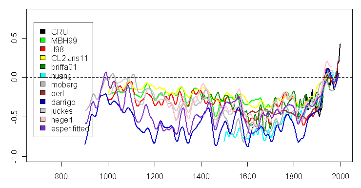
Plot of Archived Data with MBH99, Crowley, Hegerl and Juckes re-centered as discussed above.
| Year | Study | Archived | Reference | URL | Input Script |
| 2006 | CRU3- NH | 1850-2006 | 1960-90 | http://www.cru.uea.ac.uk/cru/data/temperature/hadcrut3nh.txt | source(scripts,"CRU3.txt") |
| 1999 | MBH99 | 1000-1980 (spliced to 1998 in Crowley spaghetti) | 1902-80 | ftp://ftp.ncdc.noaa.gov/pub/data/paleo/contributions_by_author/mann1999/recons/nhem-recon.dat | source(scripts,"MBH99.txt") |
| 1998 | Jones98 | 1000-1991 | 1960-90 | ftp://ftp.ncdc.noaa.gov/pub/data/paleo/contributions_by_author/jones1998/jonesdata.txt | source(scripts,"J98.txt") |
| 2001 | Briffa01 | 1402-1960(!) | 1960-90 | ftp://ftp.ncdc.noaa.gov/pub/data/paleo/contributions_by_author/briffa1998/briffa2001jgr3.txt | source(scripts,"briffa01.txt") |
| 2002 | Esper02 | 831-1992 | Chronology | ftp://ftp.ncdc.noaa.gov/pub/data/paleo/treering/reconstructions/n_hem_temp/esper2002_nhem_temp.txt | source(scripts,"esper.fitted.txt") as esper02 |
| 2002,2004 | Cook et al 2004 | 831-1992 | 1960-90 | Not archived. Emulation calculated using ftp://ftp.ncdc.noaa.gov/pub/data/paleo/treering/reconstructions/n_hem_temp/esper2002_nhem_temp.txt |
source(scripts,"esper.fitted.txt") |
| 2000 | Crowley 2000 | 1000-1993 | 1902-80 ? | Crowley and Lowery 2000 is not archived anywhere. There are two versions of Crowley 2000 one of which has an instrumental splice after 1870! This is the more common version.ftp://ftp.ncdc.noaa.gov/pub/data/paleo/gcmoutput/crowley2000/crowley_fig1_data.txt as CL2.Jns11
|
source(scripts,"Cl2.Jns11.txt") |
| 2005 | Moberg | 1-1979 | 1960-90 | http://www.nature.com/nature/journal/v433/n7026/extref/nature03265-s6.doc | source(scripts,"moberg.txt") |
| 2006 | Hegerl | 1251-1960 | ?? |
http://www.nature.com/nature/journal/v440/n7087/extref/nature04679-s2.xls saved in ASCII format at http://data.climateaudit.org/data/hegerl/nature04679-s2.dat
|
source(scripts,"hegerl.txt") |
| 2007 | Juckes |
http://www.clim-past-discuss.net/2/1001/2006/cpd-2-1001-2006-supplement.zip First series extracted from mitrie_new_reconstructions_v01.nc and saved |
source(scripts,"juckes.txt") | ||
| 2006 | D’Arrigo | 713-1995 | 1960-90 | ftp://ftp.ncdc.noaa.gov/pub/data/paleo/treering/reconstructions/n_hem_temp/nhtemp-darrigo2006.txt | source(scripts,"darrigo.txt") |
| 2005 | Oerlemans | 1600-1990 | 1960-90 | ftp://ftp.ncdc.noaa.gov/pub/data/paleo/contributions_by_author/oerlemans2005/oerlemans2005.txt | source(scripts,"oerlemans.txt") |
| 2004 | Huang | 1500-1980 | 1960-90 | ftp://ftp.ncdc.noaa.gov/pub/data/paleo/contributions_by_author/huang2004/nhtemp-huang2004.txt | source(scripts,"huang.txt") |


19 Comments
The links here are correct but the NCDC site is down for maintenance today.
Pairwise correlations between the (non-independent) reconstructions average 0.66.
Correlations between temperature and the (cherry-picked) recons average 0.61.
It’s too bad Wilson’s recon only extends back to 1700.
Here’s a spaghetti graph that I posted up a couple of years ago made entirely of red noise. These are PC1s from our red noise simulations/
Mannian PCs can be viewed as a way of data mining for hockey sticks. In his actual network, if you pick the most HS-shaped series (bristlecones) and average them, you get something just like his PC1. Any form of pick-and-average selecting by fit to a trend will yield a HS. David Stockwell has also written on this.
Steve M, could you post the dataset? I’d like to show you a crucial difference between THIS spaghetti graph and the graph above.
BTW I agree with the use of a red noise model. But one must recognize that there are two sources of redness. One is the autocorrelated nature of tree growth due to “physiological preconditioning” (carryover effects) – which we all agree on. The other is the red signal of climate, some of whom doubt exists. One must be careful in partitioning signal and noise not to conflate the two. Under the null hypothesis of red climate signal + red endogenous noise you need a model that allows for both.
Red noise is dangerous. 1/f noise is worse.
If those curves show that it is warmer now than at anytime in the past, they only show that it is about 0.2 degrees warmer, at most. Is that statistically significant?
I think that’s a good question, jae. To make that comparison you need proper error bars on the data now (instrumental) and then (proxy). We don’t have those error bars right now – possibly because there’s some uncertainty denialism happening on the AGW side of the debate. These error bars are what UC and the UHI auditors are working on. My hunch – and it is nothing more than that – is that the difference (if there is indeed a difference) is not significant. Maybe it will be in 50 years. But not until then would it be fair to use the term “unprecedented”.
Is there a link to the original data before anything was done to it for the figure in post #3? And R code for that figure?
What happens if you simply reverse the time-series, re-cherry-pick, then re-fit using the Mannian hockey stick-finder?
#7. The original post contains links to original data.
#4 was in reference to the graph in #3. So was #7. There’s no link to the red noise series that I can see.
#9 is correct.
I’m asking about the ‘red noise’ data & analysis.
@Steve, thank you for this compilation.
I created two graphs from this, showing the rate of warming within a 50/100yr sliding window.
50yrs window
100yrs window
According to some reconstructions the current rate of warming is not unprecedented.
Btw:
Need help with this: Given that in r-project I have obtained a linear model for every point of these curves drawn, how to determine this rate’s confidence interval from the model?
After all there are chances that the warming rate derived from the 50/100yr window is more or less steep than the best fit from the model so how to obtain these confidence intervals?
Just an update. Desmogblog is thanking Steve M for providing further proof that the hockey stick is correct and that we are experiencing a time of unseasonably warm climate. Supposedly, the proof lies here somewhere.
How easy it seems to screw things 180 degrees out of order. Oh well, being attacked by desmogdogmatism is almost like a badge of honour.
Re #11
Wolfgang Flamme,
Would you be so kind as to post the unsmoothed data? I’m curious what the unfiltered curves look like.
Thanks,
Earle
#13
Earle,
this isn’t smoothed temperature anomaly, it’s the rate of warming (given in °C/a) as derived from the reconstruction data Steve pulled from the web.
That is for every single reconstruction, for every year, I calculated the average trend (steepness, slope) of temperature raise (or decline) as derived by linear regression for the previous 50/100 years until that very year. There has been no smoothing applied to these results.
Of course there is a smoothing effect since to fit the regression line a window of certain width is neccessary. I consider 50+ years a reasonable period with respect to the changes in climate under discussion.
#11
summary(fit.lm)$coef[2,”Std. Error”]# where fit.lm is the name of your first order least squares model.
#4. I archived 100 PC1s in the SI to our 2005 GRL article. The link is in the MM05a paper.
Re#12,
I left a few posts over there. I’ll see if there are any response in the next day or two, after which I’ll have probably forgotten all about it.
#15
Thank you, Richard. That’s exactly what I’ve been looking for.
yesterday i was going through the post “The Impact of Yamal on the Spaghetti Graph”. Now i came to know about more Wilson Spaghetti Graph. Really very useful information. That’s what i was looking for, brief and graphical representation.