Gavin Schmidt recently told Anthony Watts that worrying about station data quality was soooo last year. His position was a bit hard to follow but it seemed to be more or less as follows: that GISS didn’t use station data, but in the alternative, as defence lawyers like to say, if GISS did use station data (which they deny), de-contamination of station data would improve the fit of the GISS model. It reminds me of the textbook case where an alternative defence is not recommended: where the defendant argues that he did not kill the victim, but, if he did, it was self-defence. In such cases, picking one of the alternatives and sticking with it is considered the more prudent strategy.
In this particular case, I thought it would be interesting to plot up the relevant gridcell series from CRU and GISS and, needless to say, surprises were abundant.
First, here is a plot of gridded data – HadCRU3 (black), HadCRU2(grey and GISS (red) – for the 5×5 gridcell centered at 37.5N 122.5W, which is the CRU gridcell containing Marysville. GISS gridcells are 2×2 gridcells centered at odd longitudes and latitudes – so this will pick up GISS 37N, 123W (and similarly below). One of the most obvious puzzles in this plot is that the two gridded series are in fairly close approximation throughout the remote early parts of the 20th century and then diverge greatly in the last few years – with about a 0.5 deg C discrepancy between GISS and CRU developing after 2000 in what is presumably the best measured few years in world history. (I’ve adjusted GISS from a 1951-1980 base to a 1961-1990 base to match CRU.) Elsewhere, I’ve observed that GISS unaccountably (and without reporting) appears to have switched their input data from USHCN adjusted to USHCN raw in 2000 in a number of stations – their own Y2K problem, as it were. Perhaps this contributes to the discrepancy. However the discrepancy appears to be real.
In this gridcell, the CRU series shows no trend whatsoever – even with the contaminated Marysville data. So whatever is done between the station data and the gridded data has in the case not resulted in any trend (though not in other gridcells). However, Schmidt’s claim that any de-contamination would improve fit seems implausible. If contamination is removed from the Marysville station, this will lower the CRU gridded data in recent years – perhaps not a lot, but it won’t increase the values. I presume that any further lowering of recent values will increase residuals and worsen fit.
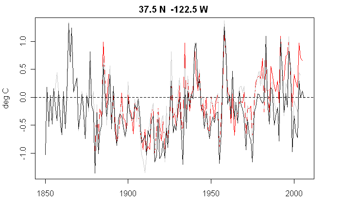
Figure 1 – red -GISS; black- HadCRU3; grey – HadCRu2. The GISS series (basis 1951-80) has been re-centered to basis 1961-90.
I also plotted the same figure for the adjacent gridcell to the east. Once again the GISS and CRU versions match fairly closely through remote regions of the early 20th century and then diverge in the 21st century – this time the CRU series jumps ahead of GISS, opposite to before. Once again, even though the two data sets match almost precisely in the 1950s, differences of over 0.5 deg C have developed since Y2K.
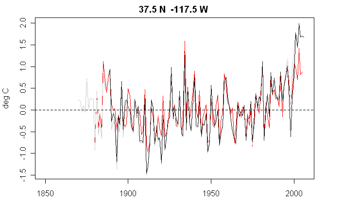
Figure 2- as Figure 1.
Third, here is a similar plot for a western U.S. gridcell with a very pronounced 20th century trend in CRU. Once again, we see the same discrepancy developing in Y2K, with the discrepancy reaching over 1.5 deg C in 2005. Additionally, the GISS gridcell is almost 1 deg C warmer around 1900 than the CRU version. Curiously the HadCRU3 gridded version does not include some 19th century data used in HadCRU2 (grey). I don’t recall any discussion of such deletions in Brohan et al.
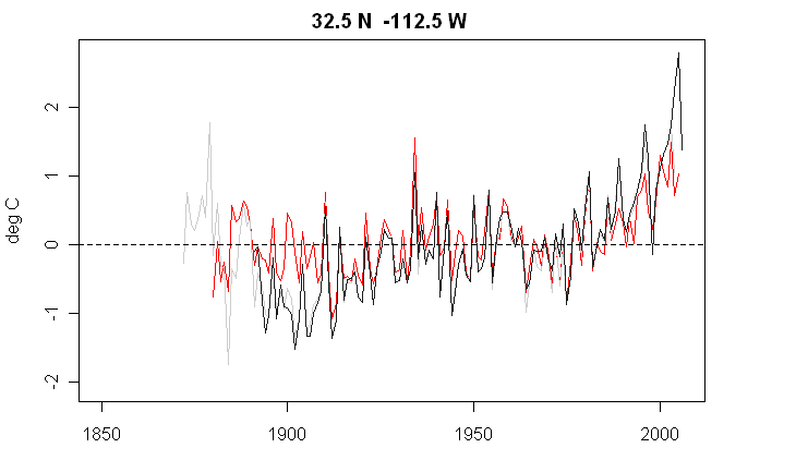
Figure 3 as Figure 1.
Warwick Hughes discussed a nearby gridcell last year in connection with Vose et al 2005 . Vose et al said:
The second problematic box, centered near southern California (32.5N, 117.5W), has a GHCN-CRU trend difference of 0.796C dec1. Although both analyses contain more than 20 stations in that box, the CRU network abruptly falls to 7 stations starting in 1997, a decline that corresponds to a sudden cooling (and negative CRU trend). In short, these grid-box examples indicate that many large discrepancies likely result from differences in the number of stations as well as data completeness. Consequently, it is recommended that caution be exercised when using only one analysis to assess trends at the gridbox.
Here’s a plot of CRU and GISS versions – in my opinion, the most curious feature is not the discrepancy of trends (although that is interesting) , but the large discrepancy in post-Y2K results, which wasn’t pointed out in Vose et al. Vose et al recommend caution in the use of gridcell data. However, if they don’t understand the discrepancies on a gridcell scale, then how can they estimate errors.

Something interesting from Vose et al – Phil Jones provided them with the information that he’s refused to provide to Warwick Hughes and Willis Eschenbach, as Vose commented on differences in station data availability in the gridcells examined. Vose works for NOAA. So there’s Jones data floating around NOAA somewhere.
At this point, I haven’t figured out the adjustments made to go from raw station data to adjusted station data, much less to go from adjusted station data to gridded data. I haven’t worked with these data sets at length and maybe I’m missing something – but the match of the versions over so much of their history suggests that I’ve collated everything correctly. The gridcell definitions are different but the results track closely up to recent years. It seems odd that they can claim to know global temperature in (say) 1040 to within a a couple of tenths of a deg C, when GISS and CRU gridded data in these gridcells disagree by over 0.5 deg in 2005.
I don’t recall Hansen reporting that the divergence between GISS and CRU gridded data in California is unprecedented in a hunnnnnn-dred years. 👿


46 Comments
These guys are the reason PhD means Piled Higher and Deeper. It’s becoming a joke to even refer to Team Members as “scientists.”
Mark
SteveM,
At the risk of saying something stupid, When I downloaded the Cru Grid for 61-90 and read the
Docs ( a while back), I swore gridding was done on even numbers.. so 35N to 40N. 5X5 grid. Is Hansen et all aligned with this?
or was he working a 2.5 * 2.5 grid ( I think USHCN reccommended this as it decreased Std. dev by half)
The reason I ask, is if you look at the 5×5 grid, ( 35-40, 115-120) I think some of it is in the Ocean.
And so, Jones, ( I recall) has a “method” of sorts for handling these grids that straddle the coast.
I have not read Hansen, so cant coment on his handling of the straddle issue. Maybe I’m just misremebering.
#1 Doctors doctoring the data
I’m guessing that 32.5N -117.5W is referring to the center of the grid cell, but I could be wrong.
I seem to remember some models use grids which are not on “even” boundaries, and some do, but I don’t remember which is which.
#4. yes this is the grid center for the CRU grid which is 5×5 gridcells. The GISS grid is 2×2 gridcells centered on odd lats and longs and is spatially smoothed. I’ve edited slightly to clarify this.
#2
The method currently used to combine land and sea data is contained in the document Uncertainty estimates in regional and global observed temperature changes: a new dataset from 1850 by P. Brohan, J. J. Kennedy, I. Harris, S. F. B. Tett & P. D. Jones (2006). A copy of it is available at the site
Click to access HadCRUT3_accepted.pdf
In this paper they describe how their methodology has been changed:
Sounds good, doesn’t it? It lowers the standard error of the estimator. Unfortunately, the authors do not seem to understand the principles of stratified sampling. This is equivalent, for example, to estimating the mean salary of a population of equal numbers of rural and urban residents. Since it is cheaper to sample in the city, 90% of my sample comes from there. Obviously, my estimate of the city stratum is now much better than the estimate for the rural, so my estimate for the entire population should be weighted, maybe 90-10, in favour of the urban value, rather than the correct weight in this case of 50-50.
What they are doing would be correct only IF the two values being estimated by the land and sea components separately were equal. But the SSTs are much lower, in general, than land temperatures. As in the example above this introduces a bias towards one of the two values based purely on how much information the estimates are based on. The bias makes the overall actual error LARGER, not smaller. Since the bias is ignored in the calculation of the final blended estimate, the standard error underestimates the actual error.
A second side-effect is that the “true” value being estimated from year to year depending on what stations you use in your calculations so comparisons over time become less reliable.
Don’t think so…
Roman M
Thanks Roman I knew I read it somewhere.
Hansen (and Schmidt, et al) has a modelE based paper from this year which admits, among other things, “…~25% deficiency in summer cloud cover in the western United States and central Asia with a corresponding ~5 °C excessive summer warmth in these regions…”
If modelE is predicting summer temps 5 degrees C higher than actual for the western United States, exactly how is removing a warming bias/contamination for these stations going to improve model fit? It can’t get much worse than being 5 deg C too high, but it’s certainly not going to get better!
Re#8, paper is in press and found here.
Re: 8
Michael J
I know it’s only raw data, but it’s 13C right now in the sunny Gulf Islands of southern British Columbia [10C below the norm]. Maybe Hansen, Schmidt et. al. should just double the bias.
SteveMc,
The CRUTEM2 file included the numbers of stations per each
gridcell for each month, i.e. how many, but not which ones.
Perhaps that was the source of Vose’ comment about the
change from 20 to 7 stations.
The cause of the warming–if there is warming–is not CO2. Can’t be. It’s either solar or comsmic rays or magnetics or ENSo/NAO TC or it’s not happening or if it is happening we can’t do wnaything about.
Those people aren’t scientists. Scienticians perhaps lol.
Dear sir OB,
The hot hot models need a cooling agent in the form of deepfreeze aerosols, which have been modeled but not observed.
Re GISS and CRU divergence in the 21st century, in his reply at http://www.realclimate.org/index.php/archives/2007/05/fun-with-correlations/en#comment-32570, Gavin says “There is a difference in how the interpolate between data stations, particularly in the Arctic – HadCRU does not estimate Arctic ocean temperatures from nearby coastal data, while the GISS analysis does”
Uh Oh! More use of modeling in science. I just hope they didn’t use the Mannian Methodology to come to their conclusions.
Sir OB:
You are right. AGW proponents inflated every effect and number beneficial to AGW theory – rate of warming, role of CO2, share of antropogenic GHG, rate of ocean rising, negative effects of warming, ice caps melting, ability of humankind to do anything about climate; and downplayed every effect and number they do not like ‘€” role of ENSO, PDO, solar irradiance, GCR modulation by solar wind, beneficial effects of warming and CO2 fertilization, Kyoto failure, etc.
Just hard to say where to start cleaning these Augean Stables…
As I understand it the CRU won’t release data, yet the CRU itself is part of East Anglia University. This is a joke, right? East Anglia? What the heck, it’s hardly the centre of any intellectual universe, maybe a political one, open learning and all that…
Giss claims 1200km as the distance a site’s data is useful. From their station list file I find there are only two sites still providing data to cover the North Pole. Both sites are between 1100-1200km from the pole and on opposite sides of the Arctic Ocean.
Being at roughly the same latitude and elevation. With anomalies that aren’t in sync. With temperatures that are very different. I see no valid way to calculate the temperature or an anomaly for the polar grid boxes.
Gridding the data appears to be a very suspect procedure.
#17 East Anglia returned 53.3 CategoryA/A* staff in Environmental Sciences in the 2001 RAE and gained a 5* result. You decide if that’s a joke.
13:
Aerosols have not been observed? That’s quite the puzzling statement.
Sir OB,
So you can provide data on precisely how many pounds of aerosols have been released into the atmospher, their distribution and mix?
You can provide exact data on how long different types of aerosols last in the atmosphere under varying weather conditions?
You can provide data on exactly how much radiation is reflected and absorbed by each type of aerosol under varying weather conditions?
“East Anglia University. This is a joke, right? East Anglia? What the heck, it’s hardly the centre of any intellectual universe, maybe a political one, open learning and all that”
UEA is a very fine University, I do not know the people in Environmental Sciences, but there Biochem Dept is world class. I do not know why you are attacking an Institution, as opposed to a specific paper, model or group of people who use the same/similar approaches.
I am quite convinced that the present models being used by climate scientists are wrong, but I would claim that all Institues who have researchers developing these models are “contaminated” with wrongness.
OK, points taken. All the same, given that UEA is a relatively new university, without the reputation of some of the more prestigious universities to trade on, and indeed risk, I would suggest this is a reason why the CRU and UEA should go out of their way to release the temperature data. It’s understandable that non-specialists outside academia, such as myself, will be suspicious when institutes of comparatively less history and achievement will not make data publicly available.
Boy, we were all wrong. It’s not humans that are causing global warming at all, it’s the WORMS!
If we are talking about 5 by 5 grid squares, or what have you, where “all” the stations are an average of x or add up to y.
The trillion dollar questions are:
1. How many stations are in the calculation for a given area, how many are rated ‘high quality’, and by what objective criteria are they rated as such?
2. How many areas, of what size, are there in total?
3. Out of those x areas, what percentage show a warming, and what percentage show a cooling?
4. For either warming or cooling, what is the percentage of water versus land in that area?
5. Where is the data for all this, and where is the software used on the data that we may easily download or gather?
Gridding the station data as explained above is as relevant as averaging telephone numbers to get a mean value. Both can be mathematically correct and spot on but physically neither mean anything.
Taken by itself, temperature is just a number, like a telephone number.
#15 They do appear to be more cautious there is certainly no one to heard saying the debate is over.
Re: #13 & #21 Hans and MarkW,
I do not understand Mark’s response. Hans said the effects of the aerosols have been used in models to reproduce an effect observed in the real world but that the aerosols themselves have not been observed in the real world.
Sir OB questions this.
Your response seems like a nonsequitor. I do not see how something can be precisely measured if it hasn’t been obsereved.
I agree with Sir OB’s question and therefore ask Hans to expand on his comment.
Not because I disagree but because I find this… what’s the word… gobstopping(?).
Is it true that some aerosols used in some climate models to reproduce an effect seen in the real world have not themselves been observed in reality?
#28 Jeff
I believe the aerosol issue may be related to modelers using arbitrarily selected quantities of aerosols to offset the excessive warming generated in their output. This modeled quantity of aerosols in the atmosphere has not been actually observed by anyone hence the entire calculus has not been validated.
#29.
Ha. Every “good” model needs a fudge factor knob. I noted elsewhere a paper done
on ModelE that indicated a .5C warming drift after 50 years or so during a control
study. Indicating, I would think, some sort of “forcing” due to disctrete modeling
of continuous functions.
Now, The odd thing is this. If one had such a “knob” to adjust output, one would
expect a robust hindcast. You’d just twist that knob till you hit the hindcast.
Then defend the knob settings as “reasonable” “within norms” blah blah blah
Are Aersols modelled as an attentuation factor on Watts coming in only.. eg global dimming.
If so, then I would expect that one could use that knob to hit the hindcast within a BCH.
hmm. something to look at.
Jeff,
While aerosols themselves have been observed, none of the issues that I raised to SirOB have been answered regarding aerosols. Until they ALL are, any attempt to put “aerosols” into the models, is nothing more than the modelers opinion regarding what the affects of aerosols ought to be.
Re#29, aerosols
As presented at CO2science, current (2007) article of Mischenco at al:
“…present a plot of the global monthly average of the column aerosol optical thickness (AOT) of the atmosphere that stretches from August 1981 to June 2005, which they developed from what they describe as “the longest uninterrupted record of global satellite estimates of the column AOT over the oceans, the Global Aerosol Climatology Project (GACP) record.” This record, in turn, was derived from “the International Satellite Cloud Climatology Project (ISCCP) DX radiance data set,” which is “composed of calibrated and sampled Advanced Very High Resolution Radiometer radiances.”
As can be seen from our adaptation of the eight researchers’ graphical results, which we have plotted in the figure below, “the green line,” as they describe it, “reveals a long-term decreasing tendency in the tropospheric AOT,” such that “the resulting decrease in the tropospheric AOT during the 14-year period [1991-2005] comes out to be 0.03.” And they add that “this trend is significant at the 99% confidence level.”
http://www.co2science.org/scripts/CO2ScienceB2C/articles/V10/N24/EDIT.jsp
Steve M Have you plotted the monthly data for these gridcells? My plots don’t have the seasonal variation one would expect and the min-max temp variation is much smaller than one would expect in these gridcells.
Phil B
Re #19 and #22 To start, I’d like to apologize for being off topic, but I feel it needs to be said:
While UEA may be a fine institution, it is home to the Tyndall Centre for Climate Change Research, which has as it’s goals “to pioneer new ways of carrying out research on climate change ‘€” research which would be shaped by both academic creativity and the needs of those outside academia. This is known commonly as policy-relevant’ research. Both the direction and content of research, and institutional structure, of the Tyndall Centre, have been crafted to deliver this objective.”
They also state “There is a need to build on traditional science and modelling and broaden research into issues such as the context, psychology, emotion and morality behind decisions”.
You can find their “briefing note” here.
It’s a worthwhile read, if somewhat appalling to someone who believes in “traditional science”.
Another worthwhile read is this Guardian article by Mike Hulme, who happens to be the current Director of the center, as well as dedicated to “post-normal science” it seems.
Here is a reasonably concise description of post-normal science in all it’s…..er….glory. I particularly like “These extended peer communities will not necessarily be passive recipients of the materials provided by experts. They will also possess, or create, their own extended facts’. These may include craft wisdom and community knowledge of places and their histories, as well as anecdotal evidence, neighborhood surveys, investigative journalism and leaked documents. Such extended peer communities have achieved enormous new scope and power through the Internet. Activists scattered among large cities or rainforests can engage in mutual education and coordinated activity, providing themselves with the means of engagement with global vested interests on less unequal terms than previously. This activity is most important in the phases of policy-formation…..”.
UEA is also home to a whole group of of centers, whose descriptions read like parrots of each other, always including those ever important forming policy and social ethics additions:
The Centre for Social and Economic Research on the Global Environment (CSERGE)
Climatic Research Unit (CRU)
Centre for Ecology, Evolution and Conservation (CEEC)
Centre for Environmental Risk (CER)
Centre for the Economic and Behavioural Analysis of Risk and Decision
Institute for Connective Environmental Research (ICER)
The Environmental School offers Masters in Applied Ecology and Conservation, Climate Change, and Environmental Social Science.
Even the descriptions for the Bachelors read like recruiting posters for Greenpeace/Sea Shepherds and the post-normal science brigade.
While I agree that the use of the term joke may have been ill-advised, and the comment was perhaps a little broad in its direction (ie the entire institution as opposed to the Environmental School in specific), these are the same people in charge of not releasing the CRU data, authoring and editing the IPCC reports, and forcing global environmental and climate policy…in light of their apparent biases, I think it’s very important that what they assert is questioned from a rational, skeptical and scientific viewpoint.
RE 34
Nice post. Just shows how some of these people have huge vested interests in “spinning” up climate change.
RE: #33 – 122.5 W is out in the ocean, very low range expected be it diurnal, or seasonal. 117.5W is, I believe, off the top of my head, at the San Diego coast, there again, I’d expect a quite limited range. On the other hand 112.5 W is smack dab in the middle of the desert, so there I’d expect a pronounced diurnal range and a pretty good seasonal range (although nothing like the even more extreme seasonal ranges one might find in the high desert country to the north of that zone).
117.5 W may actually also be offshore:
http://www.topozone.com/map.asp?lon=-117.228&lat=32.7139
Now that I think about it, the “Wreck Alley” dive spot has coordinates pretty close to that.
One additional a-ha … using topozone I looked at 32.5 N – 112.5 W, it’s a bit further south than I figured (I assumed Phoenix burbs) – it’s actually at the Maricopa – Pima County line, at ~ 2000 feet elevation, out in the boonies. At that latitude, while I wouldn’t exactly call it high desert, it’s certainly transitional and not the classic low desert by any stretch of the imagination.
#26 I’m talking about the anomalies, not the temperatures. The stuff they use to develop the average global anomaly trend. I rather more meant take whatever it is they do and however it is they do it, or whatever it is we want to do and however it is we want to do it, and rate the squares and compare the squares. 2×2 adjusted to 5×5, 5×5, every 20 miles, every 10 stations, whatever. So if there’s 100 stations and the mean, mode, log, trend, whatever of the anomalies is warming or cooling, how does that compare to the overall rating of the 100 stations, however you want to calculate it that makes the most sense for the comparison.
Oh I forgot re my #25:
Mix #1 and #3, how many warming grids are what quality overall, how many cooling grids are what quality overall (something like a ratio of “good” to “bad” stations).
Steve Mosher,, re station locations: Try emailing vernell.m.woldu [Vernell.M.Woldu@noaa.gov] and ask him to provide you the informaiton. Copy Thomas Karl .. Vite Vose [Karl et al 2 005]
Basically as I understand it, given how overblown and/or vague and/or misleading and/or purposly obfuscated by “THEM” many of the explanations are:
1. Measurements are taken, and compared to “before”.
2. A change from “before” is taken, the grand and great anomaly. This lets us compare changes rather than temperatures that change widely (e.g. snowy mountain area verus the gulf of mexico versus a city in Brazil etc)
3. Those changes for a grid of some size and shape are combined in ways known only to the high priests of climate statistics, a jealously guarded secret, after being massaged some according to where the data’s from and various other magical methods beyond human understanding.
4. That information is adjusted, again in mysterious ways, according to the amount of land versus water after equalizing all the various sized areas being combined to the same size area.
5. All that information is combined, yet again in these secret and dangerous methods, to yeild a change from “before”.
6. 30 years of this is then distilled and offered to the gods, and all new before/after is compared to this.
Or something like that.
Re #41
Sam Urbinto,
You forgot 1A: Measurements are adjusted, with adjustments for past observations often exceeding the presumed AGW signal by several factors.
I had noted from some earlier work with temperatures and rainfall effects on Illinois crop yields that the station temperatures for IL seemed to show a wide range of temperature trends over the past 100 plus and 50 year time periods. Thanks to the work that Steve M has presented on official temperatures I was able to locate the “fully corrected” temperatures online from USHCN. While I used Excel to download and analyze the data, I agree with Steve M when he admonishes us to us R for these chores.
I present below in table form the temperature trends (in degrees F) for the time periods 1895-2005 and 1950-2005 for all the USHCN stations listed for IL. I also included there latitude and longitude location indexes so that one can see the differences as they occur spatially over the state. There is a strong trend in the temperature trends from south to north with the positive increases becoming more prevalent and more positive as one proceeds north in the state.
The trend differences by station are very large (and over relatively very short distances) when compared with a state and a global average temperature trends. Of course the first consideration that comes to mind is how much of these differences are real and how much is due to temperature measurement error (even knowing that corrected values were used). I also noted that while the trends in all cases followed a cyclical pattern, the fit to a straight line trend was much better for those stations reporting the larger temperature increases over time and became poorer as one moved to the lesser increases.
If a major part of these differences are real one has to wonder about what a global average temperature means in context of these larger differences over small distances. What does it mean for climate models that cannot resolve temperature changes over these distances? What does it mean to “average” these temperatures?
re: #43. Answer is simple: Chicago has a lot of hot air.
The urbana station is particularly interesting, as C-U is a reasonably sized urban area.
I interrupt normal programming to announce that I have received answers to questions, generated in discussion at the ClimateAudit blog, directed to D.E. Parker concerning his study on the Urban Heat Island effect, and its effect (or lack thereof) on the perception of global warming through land-based temperature measurements.
You can find his responses at:
http://www.climateaudit.org/?p=1718#comment-119294 ,
starting at entry #386.
New data from NASA AIRS. Lets jump on it and see see what they have.
Here is a letter I get from NASA news people!!
New NASA AIRS Data to Aid Weather, Climate Research
There’s an old saying, “You can’t see the forest for the trees.” When it comes to global climate change, it’s not hard to spot the “trees”–they’re in the news headlines nearly every day. To see the “forest,” however–that is, to gain a more complete understanding of the climate variations we’re seeing–scientists use satellite remote sensing. With these technologies, they can directly measure factors that affect our climate, such as levels of water vapor and other greenhouse gases, ozone and concentrations of airborne dust. Scientists feed these data into computerized climate models to project how our climate might change in the future.
A key contributor to this new generation of climate change research tools is the Atmospheric Infrared Sounder, or AIRS, instrument on NASA’s Aqua spacecraft. Developed under the direction of NASA’s Jet Propulsion Laboratory, Pasadena, Calif., AIRS measures the key atmospheric gases affecting climate. It’s the first in a series of planned advanced infrared sounders that provide accurate, detailed atmospheric measurements for weather and climate applications. Its observations complement existing sensors from NASA and other organizations by providing broad global coverage day and night, even in the presence of clouds.
Newly released AIRS measurements include better temperature and water vapor profiles; profiles of carbon monoxide, methane and ozone; and warning ‘flags’ to identify concentrations of sulfur dioxide and dust.
“These new data will significantly improve our ability to observe and characterize today’s climate with greater accuracy, which is key to increasing our confidence in climate prediction models,” said Moustafa Chahine, AIRS science team leader at JPL. “With its nearly 2,400 separate frequency channels sensing different regions of the atmosphere, AIRS creates a global, 3-D map of atmospheric temperature, water vapor, clouds and greenhouse gases with the same accuracy currently possible only through direct measurements by sensors on weather balloons.” AIRS provides these measurements continuously, all over the globe, including over Earth’s vast oceans, where weather balloon data are extremely limited.
Highlights of the new AIRS measurements include:
– Ozone
AIRS provides a global daily 3-D view of Earth’s ozone layer, showing how ozone is transported. This is critical to identify events and places at risk of high solar ultraviolet exposure, which affects the health of humans and other living things. The new AIRS infrared imaging gives scientists the best view of the Antarctic region during the polar winter. It also allows scientists to image the transport of stratospheric ozone into Earth’s lowermost atmospheric layer, the troposphere, with broader coverage.
– Carbon monoxide
Carbon monoxide emissions from the burning of plant materials and animal waste by humans in rainforests and large cities can be seen from space using data from the new AIRS measurements. AIRS sees giant plumes of gas being transported across the planet from these large burns. AIRS provides better global coverage than prior instruments, allowing scientists to better monitor pollution transport patterns. See: http://airs.jpl.nasa.gov/News/Features/Features20060403/
– Methane
Methane is a much more potent greenhouse gas on a per molecule basis than carbon dioxide and is responsible for five to 10 percent of the greenhouse effect — the warming of Earth’s atmosphere that occurs when radiation from the sun is trapped in Earth’s atmosphere by gases. The first released AIRS methane product has not yet been validated, but will allow scientists to assess its value among the few other sources of global data on methane. Eventually, AIRS data will allow scientists to monitor the global distribution and transport of methane and to address key questions about how this gas affects our climate.
– Sulfur dioxide
Volcanoes emit large quantities of sulfur dioxide. AIRS tracks both ash and emitted sulfur dioxide plumes. AIRS provides global, daily coverage of sulfur dioxide day and night to complement other sensors with more sensitivity. AIRS data are currently being used to alert the National Oceanic and Atmospheric Administration’s Volcanic Ash Advisory Center in Washington of volcanic events in remote areas. AIRS data also help the airline industry fly safely and avoid costly damage to flight systems from volcanic emissions. The new AIRS measurements include a warning ‘flag’ to identify locations where volcanic events are occurring.
– Dust and Aerosols
AIRS measures dust and aerosols using infrared, or heat-seeking, detectors. Not only does this allow dust to be viewed day and night, but it also helps us better understand the role dust plays in maintaining Earth’s thermal energy balance. Dust storms can affect atmospheric chemistry and rainfall patterns, and can transport micronutrients and microorganisms. Changes in land use such as deforestation or overgrazing have contributed to more frequent dust storms worldwide. AIRS provides a global daily view of the infrared properties of dust, monitoring its transport and distinguishing between different types of dust. The new AIRS measurements include a dust warning ‘flag’ to allow scientists to identify regions of high-dust concentration, worthy of more detailed examination.
– Real-Time Data for Weather Forecasters
AIRS’ contributions to the field of weather forecasting have already been considerable. Weather forecasting centers around the world, using less than one percent of available AIRS data, have extended reliable mid-range weather forecasts by more than six hours. These centers have also demonstrated that AIRS can improve forecasts of the location and magnitude of predicted storms. The improved AIRS temperature and water vapor profiles are now available in real time to regional weather forecasters, giving them another source of daily weather measurements for the entire Pacific Ocean , once in the morning and once in the evening.
The new AIRS measurements are available on the web at: http://daac.gsfc.nasa.gov/AIRS/index.shtml.
For animations of the new measurements and more information on AIRS, please visit: http://airs.jpl.nasa.gov/ .
For more information on Aqua, please visit: http://aqua.nasa.gov/ .