Hansen has published an online letter entitled A Light On Upstairs? The letter concludes by saying:
My apologies if the quick response that I sent to Andy Revkin and several other journalists, including the suggestion that it was a tempest inside somebody’s teapot dome, and that perhaps a light was not on upstairs, was immoderate. It was not ad hominem, though.
I haven’t seen the original letter and don’t know who the comment was about. However, it certainly sounds like an ad hominem remark and one that is highly inappropriate for a federal civil servant. I have a number of comments about other aspects of the letter. Hansen says:
Recently it was realized that the monthly more-or-less-automatic updates of our global temperature analysis (http://pubs.giss.nasa.gov/abstracts/2001/Hansen_etal.html) had a flaw in the U.S. data. In that (2001) update of the analysis method (originally published in our 1981 Science paper — http://pubs.giss.nasa.gov/abstracts/1981/Hansen_etal.html) we included improvements that NOAA had made in station records in the U.S., their corrections being based mainly on station-by-station information about station movement, change of time-of-day at which max-min are recorded, etc.
Unfortunately, we didn’t realize that these corrections would not continue to be readily available in the near-real-time data streams. The same stations are in the GHCN (Global Historical Climatology Network) data stream, however, and thus what our analysis picked up in subsequent years was station data without the NOAA correction. Obviously, combining the uncorrected GHCN with the NOAA-corrected records for earlier years caused jumps in 2001 in the records at those stations, some up, some down (over U.S. only).
The first sentence “it was realized” certainly makes it sound like they identified the problem themselves (a position not taken in the webpage itself.) Moving on, Hansen says that the USHCN “corrections would not continue to be readily available in the near-real-time data streams”. If GISS is using USHCN adjusted data (as appears to be case from the description in Hansen et al 2001 and the website), this claim is incorrect. Readers in doubt of this may go to the USHCN website ftp://ftp.ncdc.noaa.gov/pub/data/ushcn/ ; the file hcn_doe_mean_data.Z contains three versions of USHCN data, included the version that Hansen says is unavailable. This file was most recently updated on March 1, 2007 and, for the majority of sites, contains adjusted USHCN data up to Oct 2006. At present, GISS has only updated USHCN records to March 2006. Thus, not only are the adjusted USHCN versions available, they are available more recently than presently incorporated into the GISS temperature calculations.
Data from the other major station archive (GHCN) can be downloaded from ftp://ftp.ncdc.noaa.gov/pub/data/ghcn/v2 . The GHCN raw data set and v2.mean.Z and the adjusted data set v2.mean_adj.Z are both updated all the time, most recently Aug 11, 2007. In the version that I downloaded in June, the USHCN record only went to March 2006, the period of the GISS record. However, readers can confirm that both the GHCN raw and GHCN adjusted versions have been archived concurrently and that the switch from one version to another was not required because of version unavailability.
In this context, the form of the present layer of GISS corrections seems extremely rushed and inappropriate. If GISS wishes to start with GHCN adjusted data, then it’s easy to do so. Just use it. There’s no need to estimate the required correction to undo the effect of switching data sets. Just stick with the data set that they started with. Far simpler and cleaner than throwing another “correction” into the mix – a correction which has required overwriting their entire input data for all 1221 USHCN stations prior to 2000.
1998
Hansen goes on to say:
Also our prior analysis had 1934 as the warmest year in the U.S. (see the 2001 paper above), and it continues to be the warmest year, both before and after the correction to post 2000 temperatures. However, as we note in that paper, the 1934 and 1998 temperature are practically the same, the difference being much smaller than the uncertainty.
Unfortunately, this statement is again untrue. The data online at GISS http://data.giss.nasa.gov/gistemp/graphs/Fig.D.txt immediately prior to the changes showed 1998 as the warmest year (admittedly by a negligible margin of 0.01 deg C), but still the warmest, contrary to the claim made here. GISS has overwritten this data file and did not preserve an online version of the uncorrected data that they had previously shown. However, by chance, I happened to have had the data in my R-session when GISS made the changes and I assure readers that the GISS data shown here purported to show that 1998 was the “warmest”. Hansen may have been for 1934 before he was against it. But now that he’s for 1934 once again, he can’t say that he was for it all along.
In the NASA press release in 1999 , Hansen was very strongly for 1934. He said then:
The U.S. has warmed during the past century, but the warming hardly exceeds year-to-year variability.Indeed, in the U.S. the warmest decade was the 1930s and the warmest year was 1934.
This was illustrated with the following depiction of US temperature history, showing that 1934 was almost 0.6 deg C warmer than 1998.
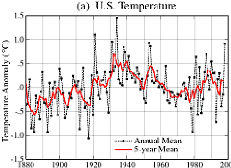
From Hansen 1999 News Release: http://www.giss.nasa.gov/research/briefs/hansen_07/fig1x.gif
However within only two years, this relationship had changed dramatically. In Hansen et al 2001 (referred to in the Lights On letter), 1934 and 1998 were in a virtual dead heat with 1934 in a slight lead. Hansen et al 2001 said
The U.S. annual (January-December) mean temperature is slightly warmer in 1934 than in 1998 in the GISS analysis (Plate 6)… the difference between 1934 and 1998 mean temperatures is a few hundredths of a degree.

From Hansen et al 2001 Plate 2. Note the change in relationship between 1934 and 1998.
Between 2001 and 2007, for some reason, as noted above, the ranks changed slightly with 1998 creeping into a slight lead.
The main reason for the changes were the incorporation of an additional layer of USHCN adjustments by Karl et al overlaying the time-of-observation adjustments already incorporated into Hansen et al 1999. Indeed, the validity and statistical justification of these USHCN adjustments is an important outstanding issue.
Arctic Changes
Changes in the relationship of the 1930s to recent values have not merely been made in the United States. In the Arctic, there has also been a progressive change in the relationship of temperatures in the 1930s to recent temperatures, a point previously discussed at CA here . Hansen and Lebedeff 1987 showed very warm 1930s in the Arctic, as shown in the excerpted figure showing the 64-90N temperature history.
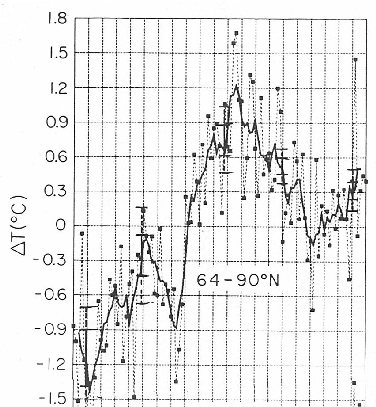
Excerpt from Hansen and Lebedeff 1987, showing 64-90N temperature. The horizontal plot is from 1880 to 1985 (as seen in the full Figure 7 of the original article shown here )
The graphic below compares the most recent version of the same graph (plotted from online data at GISS), marking two bold points for 1937 and 1938 obtained from the printed information in Hansen and Lebedeff 1987 (which prints out the data now shown online). For both 1937 and 1938, the GISS estimates have been reduced by approximately 0.4 deg C. Despite recent warming, 2005 was the first year in which 64-90N values exceeded the former 1938 value – see dotted line – (indeed, 2003 was the first year that exceeded the “adjusted” 1938 value). While there are undoubtedly “good” reasons for these adjustments (and I am not here arguing the point one way or the other), the net effect of the adjustments has been to consistently lower temperatures in the 1930s relative to more recent values. Whether these adjustments prove justified or not, modifications to the temperature record of this magnitude surely warrant the most careful scrutiny before turning the “lights out upstairs.”

64-90N from Hansen 64-90N zone downloaded today. Thick – 5 year running mean (often used by Hansen). Points are selected values from Hansen and Lebedeff 1987. Dotted line compares 1938 value from Hansen and Lebedeff 1987 to other values.


19 Comments
Steve:
Is the Arctic data just for NA or for NH? If the latter then the Global profile looks even more
in need of more detailed analysis.
This post is the very definition of “the pursuit of diminishing fleas”. Look it up.
Actually, its the “law of diminishing fleas”, but the point still holds.
Re: 2&3 Bigcitylib.
No. The point is that substantial and material adjustments are being made to the temperature “record” relied on by climate scientists, the adjustments support the hypothesis of AGW, and the adjuster refuses to disclose the data and calculations which he assures the public justify his adjustments.
In law, this would not be allowed. Let me quote from Florida Rule of Evidence 90.705 (actually Section 90.705, Florida Statutes):
The Federal Rule is similar. In other words, Hansen’s “adjusted” temperature “record” would be inadmissible in a court of law almost anywhere in the United States, as would any evidence based on his temperature “record”.
Re #4
Will – If NOAA were a corporation and Hansen, Mann, et al, were officers in that corporation and they tried a stock issue based on this kind of record keeping I am reasonably sure that once the SEC investigators stopped laughing there would be indictments coming down like raindrops in a hurricane. Enron was a big backer of AGW based energy policies, maybe Lay and Skilling learned record keeping from NOAA.
Please try this url:
And tell me what you get on the screen, is it a graph, or something else?
Dear Mr. Watts,
Two graphs, US Temperature and Global Temperature, different scales.
Regards
graph
Ok thanks, I’m getting a “+” sign…instead of the graphs. May be some sort of image protection on the server.
I saw something similar somewhere else, same site.
I had posted the article that thanks Steve. My “opponent” kept posting links to older NASA sites showing the old temp leader boards, saying that was the NASA numbers. i.e. posting January’s numbers to show my link to the August numbers was wrong.
At one point his post also showed a “+” symbol.
So bigcitylib, I guess that a 0.4C “adjustment” in the temperatute record is but the smallest flea compared with the overall change- 0.8C?
Keep up the good work- your posts always give me a good laugh
RE: 6
Two graphs which demonstrate a good correlation of US and Global temperatures until post WWII Soviet Union policies and the Chinese Cultural revolution destroyed the reliability of weather records in Siberia and China.
EOM
Really EOM.
Anthony, Steve and/or John, it would be more powerful for the graphs if you took Hansen’s first US temp graph (where 1998 was in 5th place) and the last one (before the error was discovered with 1998 as the record year) …
… into a Before and After GIF animation like one person did with the Arctic sea ice data changes made in January as below.
Why do bigcitylib and other alarmists downplay Steve’s error correction as insignificant, yet clamor for the US to pony up billions for Kyoto when the temperature reduction would only be 0.07 degree C by 2050?
I believe that’s called the “law of diminishing returns,” bigcitylib. Look it up.
Actually, it’s the law of diminishing credibility.
So. If the more sparse and less controlled global data are seriously influenced by cack SU, FSU, China, etc data and political IPCC methodology, such that if I assume approximating overall US data as a sample point to form the reasonable equivalent of a fixed sample point on a (pseudo)homogenous world, this might be an as-reasonable estimate of the world situation as screwed data and IPCC analysis uncertainties? We are being asked to pony up irretrievable trillions, and drastic permanent governmental control structures, on a peak-to-peak basis of ~0.15 degrees C increase across 7 decades with Hansens’ new 5 year averaging and -0.0x degrees on the annual temperatures??? (per the anomaly graph in his “A Light On Upstairs”)
Given a highly varying planet, I think I want to wait the 20 years to see the rest of the US “cycle” datawise and, of course, a 20 years review of methods and (new) investigators.
I have always discarded data without provenance. This must include data that has been adjusted by algorithms that are undisclosed.
What Steve has shown by his research is that data and data manipulations MUST be open to critique. Any data that is ‘shady’ must be excluded from scientific discussion and the ‘scientists’ ostracised until their full data sets and manipulations are made available to critical review.
According to Anthony Watts’ graph, the rest of the world should emit as much CO2 as the US to cool down.
My question is if the “monthly more-or-less-automatic updates” James refers to are the same adjustments that Gavin said over at Real Climate were in badly written fortran, done by one person and are a mixture of scripts, programs, utilities, dead ends, previous methodologies and unused options and therefore not ready to run out of the box and useless in and of themselves? The ones they refuse to give up because what they think about the code (better to replicate the method) is the only valid viewpoint and any other viewpoint must be “proven” first?
Or does “monthly more-or-less-automatic updates” mean just TOBs that some other software handles? Or what?
2 Trackbacks
[…] and recovered the graphs from Hansen’s 1999 press release. This was originally part of “Lights Out Upstairs” a guest post by Steve McIntyre on my old original blog. Just look at how much warmer 1934 was in […]
[…] I’ve recovered the graphs from Hansen’s 1999 press release. This was originally part of “Lights Out Upstairs”a guest post by Steve McIntyre on my old original blog. Just look at how much warmer 1934 was in […]