I’ve got to get back to the NAS presentation and this will be my last post on Polar Urals and Yamal for a while, but it is all quite delicious. Anyway, here is a spaghetti graph of 3 Polar Urals results – including the results from Esper et al [2002] just disclosed by Science, all standardized on 1902-1980 in standard Hockey Team fashion. Just put on your Hockey Team 3-D spectacles and you’ll be able to see that the spaghetti graph shows a remarkable similarity between the 3 reconstructions.
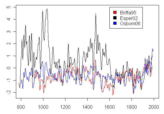
Figure. Spaghetti Graph of Polar Urals – Briffa et al [1995]; Esper et al [2002]; Osborn and Briffa [2006] using Briffa [2000].
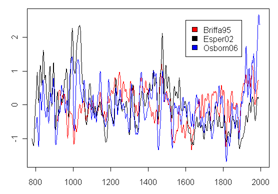
Here’s what it looks like if it’s scaled on the full series.


19 Comments
If those were oscillating circuits, then a most remarkable thing took place during the late 1600s. Magically, the circuits synched up and were no longer out of phase with each other. I really like analogies to electrical engineering when I look at this stuff. It would be interesting if “climate scientists” were forced to take such an approach.
What’s remarkable is that they’re the same underlying dataset and yet are scaled differently so they look remarkably unlike each other.
#2 – no, you’ve missed the nuance. They are different data sets all purporting to represent temperature in the same area scaled identically. One data set is the old Polar Urals density used in Briffa 1995 (russ021x); one is the updated Polar Urals ring width used in Esper 2002 (russ021w + russ176w); one is the Yamal ring width data set.
Steve,
I want to make sure I understand. Each of the three series are from the same geographic location. If each series is from the same location, and tree ring widths have a temperature signal, wouldn’t the signal be more apparent between series? Why the dramatic differences? Different trees? Different locations? Tree rings aren’t good temperature proxies?
Why is it that I never can find my Hockey Team 3-D spectacles when I need them?
I certainly don’t want to hurt anyone’s feelings, but I just cannot see how any meaningful results can come from studies that require so much data manipulation: correcting for age, correlation with gridcell temperatures, smoothing, scaling, PC analyses, adjusting variances, etc. etc.–not even considering such problems as filling data gaps, truncating series at will, cherry-picking. There is no hope for all this tree ring stuff.
RE: #3. Bingo! So, now, to enter the next phase (pun intended?) of my electrical circuit analogy, what we have here are 3 response outputs of the same circuit, measured simultanously, but using 3 different sets of “test equipment.” At least one set of measurements is clearly erroneous. All would be affected by whatever bias levels and noise innately have accrued to the circuit. Plus, each test set has an innate maximum error and accuracy. Etc.
Anyone ever done a direct correlation of tree-ring data to the instrument record.
I don’t mean a calibration I mean some form of deviation results. I.e tree says it’s 14.5 C instrumental record in that area is X.X C.
Just think what you could do if you applied a powerful microscope and examined cellular structure.
Thursday June 9th 1865 was 23C in the morning with night time lows of 18C, partly cloudy, with 1/2 inch of precipitation. CO2 count was 362ppm
Re#8,
Not that I’m aware of.
See if you can find the “Bring the Proxies Up to Date” thread on this site from last year.
#8 I wondered the same thing and this was the closest I could find http://simple-software.ca/downloads/treedensityringtemperature.pdf
It shows a very good correlation. I think that if a tree has enough of everything it needs (food, water, sunlight) and is not stressed (bugs, desease, etc). Then yes it ‘can’ under ideal conditions have a very good correlation.
So… How many of the trees in those sampled fit the requirements mentioned in #10? How do they know? And, if they’re looking at sub-fossils, it makes it even more less likely that they’re able to correlate temperature to ring width.
Linkee no workee here.
Might be my end though. Been a bit on the wonky side today.
#12 I also have problems downloading PDF with firefox. Try IE, or Opera, etc.
If you look at our Reply to von Storch, we show a histogram of correlations of Mann’s network to gridcell temperatures. The typical correlation is very poor and bristlecones are especially bad. Jones and Mann 2004 (followed in Osborn and Briffa 2006) claim a very high decadal correlation between bristlecone ring width and temperature. I can’t replicate this correlation; Graybill and Idso said that the growth was unrelated. An identical criterion was stated in D’Arrigo et al 2006 and foxtails were not used. So there’s more to it than the article that you quoted.
Steve,
Is the BCP series that supposedly achieves a high decadal correlation the one with Mann’s magical mystery CO2 fertilisation correction factor? Or is it the plain old uncorrected version – or are we left guessing?
I still find it funny that when asked to provide references on how he determined this correction on RealClimate, he told the person asking to go look at google scholar. You’ve got to give him good marks for the use of bare faced cheek to escape from an awkward situation. Doesn’t rate highly in terms of scientific debate, though.
It presumably is the twice-spliced series – they spliced the AD200 PC1 with the “fixed” AD1000 PC1. So the results from the “fixed” AD1000 PC1 is used to benchmark the AD200 series.
Steve,
Thank you for your reference to your previous post (Reply to von Storch). That is exactly the kind of thing I was looking for earlier. Everyone keeps ignoring the elephant in the room — the fact that tree ring measurements correlate so poorly with temperature (except in very rare conditions such as in the paper I posted a link to previously), that they are for all intents and purposes — useless. So much time and effort expended on such bad data.
On the other hand I think I finally understand the rationalization (in the mind of hockey stick lovers) on using principal component analysis instead of simpler more robust averaging or low pass filtering schemes. They know the proxy data is poor, and therefore they feel they need to use principal component analysis to select the good data from the bad. Funny, that wasn’t clear to me before. I understand this rationalization now and it seems almost logical — except of course you have shown in abundance why it is not.
And meanwhile, Steve Latham tries to suggest to me that I should ignore the cumulative global impact of going from the population of 1850, living in the dark upon area A of the earth to the population of 2006, living the way we do upon area A*B. He says that the impact of thermal dissipation wrought by 6 plus billion souls and their and places of living, farming and work, must be discounted. He says that applying a simple “correction factor” bases on norming to so called “rural baselines” can be used to subtract the UHI effect straightaway. A baseline that is itself a rising curve? How can that be? Latham and ilk would pretend that the few people living in the dark, in places carved out of the wilderness, had almost as much impact on that “rural baseline” as the many now peopling the farms, ranches, hamlets, cabins and estates which now sit where the rude wilds once were. Am I missing something here? It’s OK to “derive” a signal from heart rotted trees but I am too ignore the other elephant in the room, the not-so-good, not-to-flat “rural baseline!”
Re #7-
I’ve had some conversations with an electronic engineer about using some of his signal processing software to analyze climate data. Hey, just another kind of waveform, eh? That’s why statisticians, economists, and engineers should be involved in some of this (and why Steve and Ross are so valuable): this is just a bunch of numbers, and some of you folks from other professions do a much better job at crunching numbers than we climate scientists do!
One Trackback
[…] Polar Urals Spaghetti Graph […]