In the NAS press conference, Bloomfield said that you could get a Hockey Stick from an average of the proxies. This was a pretty misleading comment. You CAN’T get a HS from averaging the MBH98 proxies. We showed this to the NAS panel on our presentation as follows:
The simple mean of the Mann et al.[1998] data is in the top panel of Figure 2. One notes that the 20th century is unexceptional and, for what it is worth, that there is a downward trend over the 20th century. The final reconstruction, shown in the bottom panel, yields a remarkably different story, in which the historical values were low prior to the 20th century, and the data have a strong upward trend after 1900.
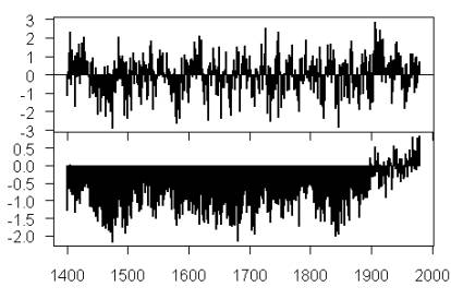
Original Caption: Figure 2: Top — Average of 415 series in MBH98 “dataall” dataset archived in July 2004. Bottom — MBH98 reconstruction.
This idea that you can get a HS by averaging the Mannian proxies seems to be an urban myth among climate scientists. Marcel Crok told me that Nanne Weber of KNMI in Holland told him the same thing.
The only way that you can get a HS by averaging MBH98 proxies is if you previously pick proxies. Arguably a process like this takes place in the “other” studies that don’t use principal components. We’ve never suggested that Mannian principal components, plus partial least squares regression, is the only way to cherry pick data. It’s just a mechanized method of data mining, which has the appearance of objectivity. There’s always the old-fashioned method – pick series with HS by hand. For example, in the North American tree ring network that we’ve discussed so much, the average of the 14 most HS-shaped series (all bristlecones) is pretty much identical to the PC1 (naturally so, since the weights in the first eigenvector essentially wipe out contributions from all other series.)


26 Comments
Steve
This is as clear as it gets. The top panel says “this is the data” and the bottom panel says “this is what they do with it.”
Right now you and Ross are credited with the proposition that MBH98 and MBH99 produce bogus hockeysticks. But the conventional wisdom is that it doesn’t matter because later studies have verified a hockey stick. IMHO you should now work to establish the following proposition for others to attempt to refute:
“As Mann says, we must not throw away data. And I can say categorically that using all of the dendro data, there is no hockey stick. Where an author claims one, it is due to use of partial data. Whether that data was cherry-picked to get a result is beside the point. It is partial data and cannot establish a hockey stick if the universe of data do not show it.”
The figure shown here shoud be used in the same way as the HS has been used in the IPPC report III(at least seven times although Timmy never got the possibility to see the whole report; oil industry and nuclear industry never sponsored him enough).
Given the divergence “problem,” maybe a simple average of all the chronologies (if updated) would give an upside-down hockeystick! Now, that would be a hoot.
I think this starts from some remark of the Hockey Team. Do they define the average of some different set of proxies? If I know that then I can see the crux of the difference and make some judgement as to who’s average makes most sense.
Further to this averaging of all(415 series), I have another question – When we see the hockey stick or Jones’ temperatures going upward – Is that the GLOBAL mean or is that the NORTHERN HEMISPHERE mean? Again, are we using part of the globe?
In addition is anyone able to read the studies and comment on my post(#13) in the Rutherford 2005 and the Divergence Problem thread? That is where the solar effect seems to diverge from the temperatures in the 1990’s.
I hope you don’t mind I post this article about the carbon credit casinos, I know at least some of your usual readers are interested in the topic and it does come from a science magazine, “New Scientist.”
Carbon trading: Keeping the green dream alive
24 May 2006
“ONE of the world’s flagship projects to tackle climate change has reached crisis point. The scheme, which allows European companies to trade their emissions of carbon greenhouse gases, was designed as a cost-effective, economically liberal solution to global warming.”
–Scheme indeed. Cost effective? What a hoot. Cost effective would be a tax on coal and petrol or direct tax benefit for converting petrol generators to methane and such. Economically liberal? In the USA that would be called a “conservative” pro-big business set up.
“”Now unforeseen market forces and the self-interest of some member governments are in danger of wrecking the dream.””
Darn those unforeseen market forces. Actually they were foreseen by those who understand the game. Self-interest? Imagine that!
“”That at least is the fear of climate negotiators, who are reeling from a week of bad news that suggests the very notion of trading in carbon permits may be impractical.””
Not impractical but blatantly stupid. Those climate negotiators must be the naive greenies not the in-the-knows of Kyoto.
“”However, many traders and analysts say the scheme still has a bright future, as long as members respond to the current crisis.””
They’re out of jobs. Should move back into commodities markets. They’re hot, and they deal with real stuff you can see and use like oil and wheat.
“”The European Union’s emissions trading system was launched at the start of last year. Under the scheme, more than 11,000 manufacturers and power companies responsible for almost half the EU’s greenhouse emissions receive annual pollution permits from their governments. They … To continue reading this article, subscribe to New Scientist. Get 4 issues of New Scientist magazine and instant access to all online content for only USD $4.95”
I think I’ll save my $4.95. Otherwise I would only feel more empathetic embarassment for the writer.
Has Mann ever given an explanation of why he decided to process the raw data through a secret fortran computer program?
When I studied college statistics, (a small part of the course), you graphed the raw data, and looked to see if there was any pattern, you might also do a multi year moving average to iron out any short term spikes, and you might do a correlation test to see if the data correlated to any other data.
After doing that you had a really good idea of whether there was a pattern/trend or not.
Nowadays this a really easy thing to do. I did it myself with several of Manns archived PC files.
Download the files, rename them with ending .csv, open them with Open Office spreadsheet, use space as field delimiter,(some of the data columns come out misaligned, but just create a third “total” column), graph the results with a ten year moving average.
Looking at the results it is blindingly obvious that apart from the Bristlecone proxy, there is no trend in any direction.
It is also obvious that there is no correlation between the Bristlecones, and any of the other proxies.
The conclusion is that either the Bristlecones, or the other proxies are not correlated to temperature change, they can’t both be because they graph so differently.
Even assuming the Bristlecones were an equal value proxy, a true weighted average does not produce any trend or pattern at all.
For Mann (and his co Authors, and followers) to produce the results he did indicates that either they had no basic understanding of statistics, or willfully manipulated the data.
Well, if he said that, it was careless of him, because one method produces a hockey stick, and the other doesn’t.
I’d certainly be embarrassed if I chose the hockey stick way.
That’s interesting. I kind of believed the myth myself: I thought that the bristlecone pines dictated the average because there were many of them. Your graph with the pure noise is a pretty strong bomb. How is it possible that this was never discussed before? Greetings from Pilsen, Lubos
#11. Luboà…⟬ which graph with “pure noise” do you mean? Do you mean the average of all the proxies in this post?
Like others, I agree that the comparison of these two graphs is one of the most powerful illustrations you have. In particular, seeing the downward trend during the 20th Century in the first graph demonstrates that the proxies used in the ‘result’ are not representative of the majority. While Mann and co have accused you of ‘throwing away data’ (eg. by taking out the bristlecones), using proxies but with a very low weighting is just a very sneaky way of discarding unwanted data.
Steve M. There is something wrong with your MBH graph. No points above 0, and completely level???
re # 14
Come on, jae, surely you’ve seen that sort of graph before? The 0 line is just used as the point from which to be colored in either above or below the line to indicate the location of the point. Of course it does look like there’s some sort of error bars built in which don’t show except at the end because of the black & white rendering of the thing here.
The zero line is for the “mean temperature” in 1900
So there were no temperatures above the mean from 1400 to 1900? Come on, the thing is goofy.
I also agree that these are powerful graphs.
Oh, now I understand the graph. I guess using the 1900 mean emphasizes how skewed the data really are.
Maybe the reason that they look funny is that there is a common zero in the two different panes? Thus it is impossible to have both graphs symmetric?
Dear Steve #12, sorry for the delay. By “noise”, I meant the first upper graph in Figure 2 – claiming to be the average. Do I misunderstand something? All the best, Lubos
Steve,
Possibly one of the problems with hockey stick assertion about average proxy data is that there is no agreed upon measure of a hockey stick. The graphs of the full set of proxies (which I do not have – URL?) show very little hockey stick tendency for the proxies average, but if one restricted the analysis to just the North American tree ring data of 70 series, the average shows a slightly hockey stick. My measure of it according to the MM hockey stick test is 0.84, which fails to be a hockey stick. But this value is still about 45% of the test value for the MBH98 PC 1 of the NOAMER data. Thus, if Bloomfield were looking at the NOAMER tree ring data, he could concievably make the claim. Of course, such a claim should have been qualified by the quantitative differences in the degree by which the hockey stick varies from a random pattern without serial correlation.
I visited Plzen in 1993 and thought it was a hole. Hopefully its improved since then.
Over at RC Gavin has again attacked the MWP. My riposte:
“Gavin I am surprised that you do not undestand why knowledge of past climate variability is important. Without knowledge of it, how can we do a good MSA of our current data collection network and past networks? Without knowledge of it, how can we assess the degree of current and projected abnormality versus which baselines, “control limits” and “spec limits?” If we don’t understand the innate “natural capability of the process” then we are hopeless in terms of understanding what might be deemed “Green”, “Yellow” and “Red” status. But of course, this is the true crux of the issue. To continue the Six Sigma analogy, there are three camps. One camp would be those who want to invest maximal effort “fixing” all root causes, whether or not they are capable of resulting in anything that is truly serious long term. The second camp, in which I reside, says, determine the Cpk, determine control and spec limits, and consider excursions beyond spec limits warnings and anything beyond the spec limits a disaster. Then of course there is the third camp, who would say “ship it” – I have to of course acknoledge that yes, there are actual real world despoilers out there who really would destroy the Earth. But to be in camp two, to me, is actually the best. Camp two is the most likely one to be good stewards while not being ideologically charged overreacting maniacs.
by Steve Sadlov”
Interesting paper w/ Mann et al that Gavin referenced. On their take on Holocene variability. He was pretty quick to respond to my post w/ in text commentary. That paper, at a quick glance, may be one of the things underpinning the Hockey Team’s attack on the MWP.
Prof Dennis: Very elegant idea (the bonding of the isotopes). I would push that thing and get some funding. Consider other sources, analytical chemistry at NSF, etc. etc.
On that “tipping point” thread over at RC … I am in a duel w/ Dano. My lastest thrust:
“RE: #175 – Specifically, you speculated that our future will bring an abnormality that rivals the 5 great extinction events. Without understanding innate variation levels in the system how can you say whether or not the effects of the projected range of abnormality rivals the effects of the abormalities that are believed to be potential root causes of those extinctions? You may notice I am really hammering this theme. Sorry to say it, but when a faction spends energy trying to downplay or discredit certain ranges of past variation (by trying to make the variation simply go away! or by saying it’s only regional!) that may well be within the normal variation of the “process,” it indicates that there is a sort of doctrine at work. The doctrine purports to describe some mythical “stable state” – almost a sort of Eden. Of course, against such a idealized stick like “flat” framework, the range of possible future innate variation or even, bona fide “subcritical” abnormalities, would appear to be disasterous. If, on the other hand, innate variation is in play, and the long term state is oscillatory, or even a quantum, semi chaotic sequence of events, with a myriad of states which we quite normally and expectedly flip between, then, even some of the worst case things being projected by models may fall well within the innate level of variation. Pause on this last bit, this “chaos and quanta” idea. Juxtapose it with Erwin et al and the notions of highly nonlinear evolutionary history – hopeful monsters – etc.
by Steve Sadlov”
Steve, every 5 lines, stick in a carriage return.