I’ve plotted up some USHCN station information for the 18 sites closest to Susanville (why Susanville – it’s one of the Anthony Watts- Russ Steele sites that they happened to post on lately.) I’ve been reading Karl and Williams 1987 which sort of describes the USHCN Station History Adjustment method. I’ll talk about Karl and Williams 1987 on another occasion – it deserves a very close reading as its adjustments are embedded in all the present gridcell calculations. Karl and Williams say that they consider the 20 nearest stations in their Station History Adjustment. I plotted 18 to fit in 3 columns and the graphics are already very cramped. I’ll show 3 of the 7 versions below:
1) the USHCN “raw” (Areal) version
2) the GISS adjusted version
3) the USHCN time-of-observation adjusted version. This is the most lightly adjusted method and there is a valid argument for a time-of-observation adjustment. But the Team tends to show this relatively well-argued and documented adjustment and then lever a lot of other adjustments on the back of this.
First the unadjusted USHCN data for the various sites (this would equate to what one is the starting point in the rest of the world, where USHCN-type adjustments are not done. In this version, Reno and Quincy warm relative to the other sites. Warming in the 1930s is most prominent at Susanville and Cedarville, while late 19th century warming is most prominent at Chico and Orland.
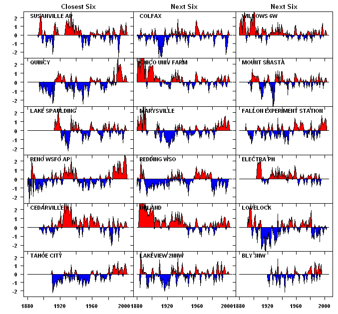
USHCN “Area” versions.
Next here is the version adjusted only for Time-of-Observation bias. Late warming most prominent at Reno, Quincy, Fallon and to some extent, Marysville. Nineteenth century warming is prominent in a number of series: Chico, Marysville, Orland, Willows and the 1930s are warm in Cedarville, Susanville, Willows, Electra and some other sites. The alternations between the TOBS-adjusted series shown above and the GISS adjusted series below are all to do with changes of station location and urban heating. At the Cedarville, Susanville and Willows stations, there is no evidence of major station relocations nor is there any obvious justification for reducing their 1930s temperatures as an urban heat island adjustment.
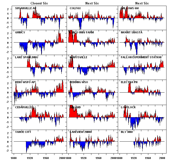
TOBS-adjusted Stations.
Finally here is the GISS adjusted version, incorporating both USHCN and GISS adjustments (which in some cases undo USHCN adjustments). Susanville, Cedarville, Orland and Willows – all pretty decent looking sites from the northern California site information – are now cooler in the 1930s than at present. The warm 19th century record at Marysville and Willows are deleted.
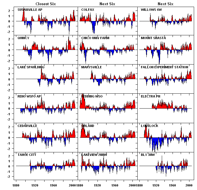
GISS Adjusted Stations.
PICTURES
According to my count, Anthony Watts and Russ Steele have pictures and microsite information of 20 stations in northern California, which all happen to be relatively close to one another. I’ve collected links to these pictures below. I’ve listed the 20 USHCN sites closest to Susanville. There’s nothing magic about Susanville, except that the USHCN Station History Adjustment method compares stations to their 20 nearest neighbors and Anthony Watts and Russ Steele have collected microsite information from a number of sites in northern California, which are in the Susanville list. I’ll add to the information as more turns up or am reminded of omissions.
[1] BLY 3NW
[2] CEDARVILLE
[3] CHICO UNIV FARM discussion
[4] COLFAX picture
[5] DAVIS EXP FARM 2WSW
[6] ELECTRA PH
[7] FALLON EXPERIMENT STATION
[8] KLAMATH FALLS 2SSW
[9] LAKE SPAULDING pictures1 pictures2 spaghetti
[10] LAKEVIEW 2NNW
[11] LOVELOCK
[12] MARYSVILLE pictures
[13] MOUNT SHASTA
[14] ORLAND pictures
[15] QUINCY 1 2
[16] REDDING WSO pictures
[17] RENO WSFO AP
[18] SUSANVILLE AP link to pictures
[19] TAHOE CITY pictures spaghetti
[20] WILLOWS 6W pictures spaghetti
Hansen’s Unlit Seventeen
Here’s a list of Hansens unlit California 17 (overlapping somewhat with links identified to date.)
BRAWLEY 2SW,
CEDARVILLE,
CUYAMACA ,
DEATH VALLEY, John Daly
ELECTRA PH,
FAIRMONT,
FORT BRAGG 5N,
HAPPY CAMP RS,
INDEPENDENCE,
LAKE SPAULDING, pictures1 pictures2 spaghetti
LEMON COVE,
NEEDLES FAA AP,
ORLEANS,
SUSANVILLE AP, link to pictures
TEJON RANCHO,
WILLOWS 6W, pictures spaghetti
YOSEMITE PARK HEADQUARTERS.


104 Comments
Is there any documented explanation as to why data can just be deleted?
If there is no explanation needed, I could go through and delete certain data and come up with an inverted hockey stick and start alarming the world of how an Ice Age threatens the survival of the human race as we know it.
But in the process I’d have to be honest with myself, knowing full well I had doctored numbers to fit my agenda, and I’d have some fun in process by correlating the dramatic temperature drop with a variable that has absolutely nothing to do with mean global temperatures. I’d personally choose to blame plummeting mean global temperatures on the rise in people calling anyone who disagrees with their point of view either a “skeptic” or in “denial”. I’d probably include the use of the word “consensus” in the variable driving us to the next Ice Age.
#1. Well, if you want to be shocked, look at the deletion of post-1960 Briffa in the spaghetti graph(which goes down). By deleting it, they can say – look, all the proxy reconstructions go up (except the ones which go down – the Team deletes them.)
Steve:
Is it an optical trick or plotting issue that the GISS added additional data for the most recent years?
SteveM thats great work, its very easy to spot where data has been attenuated or amplified. Today I visited my friend Jim Goodridge, former California State Climatologist and the man with a garage full of data going back to before the gold rush.
He’s been quietly toiling away on his computer for the last 15 years or so making all sort of data comparisons. He gave me two CD ROMS full of data that I’m just now wading through. One plot which he shared with me today is a 104 year plot map of California showing station trends after painstakingly hand entering data into an Excel spreadsheet and plotting slopes of the data to produce trend dots.
He used everything he could get his hands on, no adjusted data, only raw from CWO’s, CDF stations, WSO’s and municipal stations.
Here it is:
Now the next step is for SteveM if you are interested, I’ll get you his data files and you can run USHCN and GISS “corrections” on it and see what we get.
Steve M said,
#1. Well, if you want to be shocked, look at the deletion of post-1960 Briffa in the spaghetti graph(which goes down). By deleting it, they can say – look, all the proxy reconstructions go up (except the ones which go down – the Team deletes them.)
What would their reasoning be other than it fits their agenda? And why in God’s name are the Hansonites cooling the 1930s? Keep up the good work Steve M
et al.
And to see all the handwringing in the media about AGW, all based on a crapload of spurious data. Wow…what a Science! Makes me proud to be a
meteorologist, not a climatologist.
Anthony, that also looks like a CA population growth map with red being areas of greatest population growth.
“Anthony, that also looks like a CA population growth map with red being areas of greatest population growth.”
…Houston, we have reality…
With these data it should be possible to see how much of the spatial variation in warming trend is attributable to macrogeographic distribution of human population (straight up linear regression, using spatially autocorrelated error term), with the residual trend representing microsite effects + actual temparature trend. Measure the microsite effects experimentally (which you’re already doing), subtract those from the residual trend above, and you;ve got your true temperature trend. Way more statistically robust than what Jones et al. have been doing.
That is a real nice map.
The USHCN data that I downloaded stops in 2002.
Re #8: Anthony, thanks for posting all the pictures and info. Doubtless you remember the famous graph created by our friend Jim Goodridge, showing very different long-term trends in large, medium and small Calif. counties:
By the way, I’ll be sending pictures very soon showing Oregon weather stations.
For now, here’s a teaser — an Oregon HCN station:
George
Hi George, thats a familiar graph from Jim. He’s been chasing this UHI for years.
Nice pix, thats Forest Grove above, 45.5 N 123.1 W GISS ID 425726980040
Stay tuned, I’m just about ready to make a publice USHCN photo database ready for people to use so we can get picture all in one place rather than spread around on threads of blogs and BBS’s
Steve M,
This is such an educational website. Where else could I learn that the 1930’s are much cooler now than they were back then?
Re: #4 Anthony Watts,
As bender says,
But I do have a nit to pick about the presentation bias.
Cooler colours (light blue and green) are used to represent warming trends (very small warming trends but warming trends nonetheless), despite the subtitle saying “blue areas no heating trend”. This makes the map look cooler than it should.
It is not clear what the blue dots represent. Two slightly different colours of blue the same size are supposed to represent “Zero to .01” and “Zero to .006”. Is this right? If yes than you are double counting making the map bluer than it should be.
What are the very large blue dots? Are these the same as the “Zero to .006” dot in the legend? If yes, then these very large dots represent a negative trend up to .006 while the largest red dot (which looks smaller on the map) represents a positive trend ten times higher (delta .06 versus .006).
I believe that “our side” should try to not play the games the “other side” uses. I remember a GISS or CRU (I cannot remember which) showing a global map with red dots all over it representing global warming over some given period. The smallest red dots actually represented the smallest cooling trend if you got close enough to red the legend. IIRC we discussed this at John Daly’s site long, long ago in a century far away.
Re #14 I don’t think the coloration scheme is a tactical device designed to deceive. I think the neutral color likely equates to the *average* trend, which is likely slightly positive. In a normal world this wouldn’t bother any one, especially if it said so in the caption (which is missing). But after a week at RC I agree that that’s exactly what they would say. They see the devil everywhere. Even in this map.
So present them the statistical analysis suggested in #9. No devil in a stock ANOVA table. Just hard, numeric reality.
Re #14
Jeff Norman,
Good points about the color spread on the dots. As to the two darker blue ranges, note that the first one is zero and greater, whereas the second one is zero and less. A better way to represent it in the legend would be -.006 to 0.0
Russ Steele writes:
Steve:
Here is a picture of the Colfax site.
The site history: The Colfax WX station has been up and running since 1870, At that time it was located at the railroad station close to the current renovated station downtown Colfax. From the 1970 ‘s up to the early 1990 ‘s it was located in a vacant lot next to a funeral home. For the next 6 years it was located just out of town at the home of Mike Crum just off highway 174. 2001 to 2005 it was located at The Colfax Record downtown. 2005 to present location it was relocated to the Colfax CDF Fire Station on Iowa Hill Road.
In the Forest Grove station, is that a window AC unit exhausting toward the (I assume) temperature sensor?
In David Archibald’s paper http://www.warwickhughes.com/agri/pastandfuture.pdf (which has a lot of great graphics), he presents an average 100 year temperature chart of several rural California stations: Hawkinsville (32.3N, 83.5W), Glennville (31.3N, 89.1W), Calhoun Research Station (32.5N, 92.3W), Highlands (35.0N, 82.3W) and Talbotton (32.7N, 84.5W) representing US temperatures away from UHI effects. The data source is NASA GISS. Not surprisingly, it shows no significant warming in the last century and the higher temp 30s and 40s are clearly evident. I wondered after reading this thread if photos were available for these stations and what others in the know might think about the quality of this station data. Keep up the great work Steve and Anthony. This is really good stuff.
RE14 Jeff – I have the Excel file used to make the plot, I’ll see if I can tweak it to be more presentation accurate. My company produces computer graphics for TV http://www.intelliweather.com so I’m sensitive to what your are talkign about.
RE18 Mike – Yes thats an air conditioning unit exhausting directly over to the temp sensor. If you look at the GISS plot I provided, you can venture a guess as to when something like this happened at the site. About 1985 you’ll notice a positive offset jump of about a degree that holds today.
I have a photographic database I’m building as part of http://www.surfacestations.org which isn’t quite ready yet but should be no later than Monday. Once completed, it will enable volunteers to upload thousands of site survey pictures and documents to be stored in one searchable database. Then a broad qualitative analysis can begin.
Re #14 MikeinApp-
Yes, it’s a window air conditioning unit to the east and the edge of a large asphalt parking lot to the north, northwest, and west. The pic is shot looking northeast.
Not only that, but Forest Grove is located in Washington County, Oregon’s fastest-growing county (in terms of population growth, not percentage) for the last 40 years. No wonder it’s seeing unprecedented high temperatures…
Re: 19
These are not California towns, according to the Lat/Long. He must have mislabled them as California. See Anthony’s chart in #4.
#22,
Sorry, that was my mistake. Still curious about the data quality, however, and I suspect it’s pretty good.
Steve M – the deleted North Sacto Valley 19th century warmth was in a relatively regional radius. Chico(ville) …LOL, Orland, Willows ….. no justification to delete it, given how it is seen at all three stations it was likely real. As for root causes, well, that would be an interesting further study.
I meant Redding, not Willows.
Re: #20 Anthony,
My company produces computer graphics for TV http://www.intelliweather.com so I’m sensitive to what your are talking about.
That reminds me of a similar complaint I have of a graphic on the Weather Network which shows regions coloured according to the temperature.
As shown in this chart, much of Canada is coloured in reds, oranges and yellows which in my opinion are hot and/or warm colours. Only the very far north gets a hint of blue which I connect with cold. So it looks like Canada is a hot and steamy place until you look at the actual temperature scales. The spectrum with my colour/temperature “feel” runs as:
1 Deep red ‘€” very hot
2 Orange – hot
3 Deep yellow ‘€” very warm
4 Yellow – warm
5 Greeny yellow ‘€” luke warm
6 Greeny blue – cool
7 Blue – cold
The matching temperatures (in Celsius) appear to be (including my colour pick):
1 >30°C (red)
2 20° to 30°C (room temperature is ~20°C) (yellow)
3 10° to 20°C (green)
4 0° to 10°C (possibility of frost) (light green)
5 -10° to 0°C (frozen water) (white ‘€” there might be snow)
6 -20 to -30°C (light blue)
7
RE21 George I’m trying to do a Google Earth on this station, but as usual the lat/lon is too coarse to find…I lloked at all the usual suspects for government offices within about a mile, but couldn’t find it. I’m guessing some sort of public works building, maybe highway dept, due to the errant road cone in the picture. Care to share?
RE 26 Jeff, Yes I know exactly what you are speaking of, we routinely change color schemes of products sent by the NWS because they make no sense when presenting to a viewer on TV.
#27: check it out: 45deg 31′ 28.77″ and 123deg 06′ 9.30″
Look for the white box.
Thanks George, here is the picture
Looks like the temperature of an historical parking lot.
It’s amazing that you can locate one of these little weather stations on Google Earth. Anthony and Russ and others, when you visit these sites, you should make sure that you get the location to the same number of significant digits as above so that Google Earth can find the location. Even if it doesn’t show up on the current frame, it surely will pretty soon from this example.
Thanks Steve,
There is an opportunity here to do a spatial analysis, much like Hansen did with DOD night sat pix for lights=x
We can assign a weighting factor to things seen in the Google Earth pix, related to their distance from the station. Buildings, trees, asphalt, etc. and come up with a qualitative bias coefficient for each site.
we could call it the CRAP factor for Climatological Rendering of Areal Population 😉
#31. Anthony, how do you guys go about finding these boxes in people’s back yards?
BTW there’s a Land Use file at USHCN with their usual funny codes left over from Fortran days when memory was precious. I’m about to decode this and will post up the USHCN results for these sites.
Re#11, nicely located right next to a metal chain-link fence…
Anthony the Weather Station Histories prepared by Stephen Doty ought to be part of your database.
RE32 “How do we find these?”
Well its not easy, and requires a bit of CSI. The lat/long that are posted on GISS are pretty much useless as they are coarse. So what we do is first do web searches on key words where somebody might reference the weather station, if we are lucky, we find a reference, and maybe an address. Orland was like that with the Water Users Association. Failing that, we ask questions. What I’ve been doing as of late is going straight to city hall and asking around. Sometime I stop a city employee I see on the street. I located Colusa by asking the garbage collector and then showing him a picture of a Stevenson Screen, and also a MMTS Infrared shelter. Once he saw that, he then knew where to point me.
One thing I’ve learned is that the first choice for placement of these stations usually is with some local government entity because they can guarantee a continuance of observations by making it somebodies job. Water treatment plants seem to be high on the list, followed by fire stations, police stations, Highway departments (which is what Forest Grove seems to be) and schools/universities. Then of course airports are easy if that’s where its at, if I see an airport within a mile of a Google Earth lat/lon search (from GISS lat/lon) I try that first, then look for other places.
I wasn’t joking when I said we have an opportunity here to quantify UHI bias like “lights=x” of Hansen et al. Steve if the entire Land use file for the USHCN is decoded, then we can apply a Google Earth photo analysis on it and quantify what has changed of whats not listed in the file.
Opportunity knocks, all we need to do is locate the sites accurately.
RE34 I’m posting the link on surfacestations.org to the historical summaries, thanks
#1, don’t forget about the modelling that is only fairly accurate for 100 years, so it obviously is missing many of the forcings and feedbacks. — John M Reynolds
Anthony
I’ve just been taking a Google Earth look at my local station, the Royal Observatory in Edinburgh. I think I’ve found the station, at 55°55’22.71″N 3°11’17.69″W.
It seems to be located in the middle of a 9m circle of grass which I think is what is recommended by the EPA. I don’t know if this is the same as the WMO, whose guidelines don’t seem to be online. Can you throw any light on them? You might think about adding them to the resources page on your new site.
There are roads and carparks around the 9m circle which is presumably questionable?
An interesting way to show growth.
This is a new service so it may be a little slow at times. It seems to work best if you search on a zip code. Zooming in will further limit the amount of data it needs to find before it starts the animation.
RE: #39 – Do that map for the 92557 zip code (folks in Europe may find it particularly disturbing, compared to what they are used to) ….. 😉
92553 is nearby and another good one ….
RE 38 Bishop, Yes that appears to be the Stevenson Screen, here is the picture
Of concern is not just the roads, but also the buildings. It appears the station is almost completely encircled by tall buildings. You’d think top scientists would know better?
Oddly though, the data stops at 1960 as shown in this GISS Plot
Perhaps the Royal Meteorological Society declared the site useless becuase of the placement, and it only remains as some osrt of historical artifact?
39: Amazing…
Is there anyway that you could get a satallite IR picture from these sites?
I know the military had a lot of these in orbit to look for the launching of ICBMs and to look at airfields.
I am at MSU (Biochem) and I know that they have some satallite data. Could we not look at the heat ploum of the sites, rather than look at the amount of ground light?
Actually, most of the growth has already bypassed the two zip codes I mentioned … things change fast out in the Inland Empire …. 92220 is now the hot spot …
#41. Anthony, the USHCN station history reports the distance of each site from the local Post Office and the direction. I’ve excerpted this information here http://data.climateaudit.org/data/ushcn/PO.dat ASCII tab-separated, should be Excel readable.
Thanks Steve, I’ll work up an import to populate my online database with.
Anthony, a bigger set of details is at http://data.climateaudit.org/data/ushcn/details.dat . It would only take me a couple of minutes to make up a tab-separated file of available particulars on over 6000 GHCN stations (which includes the 1221 USHCN sites) Would that help you populate the site?
Yes it would, but we’ll have to do some programming first since we’ll have to create additional data fields for the extra metadata.
I’d prefer to keep USHCN and GHCN sites separated if at all possible, since I don’t want duplicates. If you can make the tab-separated file grouped by country in order, it would make it easier.
My plan is to get USHCN up, then attack GHCN
#48, Anthony, I think that it would be useful to have the GHCN id for the GISS sites as well, I did a collation (which surprisingly doesn’t seem to exist anywhere online) and added that into the file http://data.climateaudit.org/data/ushcn/PO.dat; it was also in details.dat(also altitude). All the USHCN sites are in the GHCN.
Re: #35 Anthony Watts,
Climate
Science
Interogations?
Jeff,
Everyone knows that CSI stands for Crime Scene Investigations.
Which given the context of climate science is highly relevant.
How can I find out if a weather station at my local science center is in the GHCN list? I used google maps to get its gps coord to be 46.47056, -80.99362. I hope to take a drive out to the Sudbury airport to try to get a picture or two of at least one of its weather stations. That station is:
Latitude: 46° 37′ N
Longitude: 80° 48′ W
Elevation: 347.50 m
Climate ID: 6068150
WMO ID: 71730
TC ID: YSB
If possible, I want to track down the same info for the station at Science North. — John M Reynolds
Sorry, I should have also posted the Science North coordinates as follows: +46° 28′ 14.02″, -80° 59′ 37.03″
John M Reynolds
The GHCN list is at ftp://ftp.ncdc.noaa.gov/pub/data/ghcn/v2/v2.temperature.inv . Sudbury is in it. I’d be surprised if the Sudbury station has the trailer park problems of so many USHCN stations, but it’s also in a fair-sized city.
I was looking at Sudbury Airport on Google Earth, and I got to thinking.
When most ground stations were moved out to airports, the traffic was all propellor planes. Standing say a hundred feet behind one of them, all you get is a mild blast air at essentially ambient temperature and humidity.
Stand 100′ behind a modern jet, on the other hand, and you feel a strong, hot, wet wind …
Seems like airports might not have been the best place to re-site the temperature stations.
w.
Though this probably isn’t news to the posters on this blog, I just found out that NOAA is “re-adjusting” their adjusted data with the new datasets available in July of this year.
USHCN Version 2
Some politician once said that a person was entitled to his own opinion but not to his own facts. Seems that this might not be true.
This is a very interesting link and we may have stumbled onto a very good test of USHCN micrsosite. Their example here http://www.ncdc.noaa.gov/oa/climate/research/ushcn/#urbanization purports to show that their Station History algorithm deals with UHI by their analysis showing little difference between Reno and its 10 nearest neighbors. See this figure.
Figure 1. Difference between annual minimum temperatures at Reno, Nevada and the mean from 10 nearby stations. The red line indicates TOB adjusted data; the green line is based on the fully adjusted data. Units are °F.
Now Reno is on the graphic shown in this post. The 10 nearest sites to Reno are: Tahoe City; Lake Spaulding; Fallon Experimental Station, Susanville, Colfax, Quincy, Electra PH, Lovelock, Yosemite Park Headquarters, Marysville.
This is an unbelievably ideal choice by USHCN for benchmarking given Anthony and Russ’ location. They have already got about half these comparison sites in hand. But, Anthony and Russ, if you’re trying to decide between candidates for your next CSI investigation, I would recommend sites in the above 10 that haven’t been surveyed yet. This will give a nice test against the new USHCN adjustments.
From that link:
I think this algorithm simply has the effect of leveling any curve with a strong trend. That’s crazy, since some of the trends are real (1930s, e.g.).
Now I get it, they applied an ALGORErithm.
Steve,
Could you make a separate category for posts on this near surface air temperature station issue?
Thanks for all the hard work.
Geoffrey Plauche
Did you know his name means “cold” in Latin?
Algor, Å?ris, m [algeo] , cold, chilliness: corpus patiens algoris,
RE57, Steve I’m on it and will get those next week. I’ll be taking my laptop on the road and posting as I go.
In the meantime, feast your eyes on #97 in “Quality Control – Jones and Hansen Style ” which I asked Russ to post for me today since the Starbucks I was using Tmobile WiFi in wouldn’t let me post for some reason, probably a firewall.
Anyway, I was in Lodi today, and we have more follies with fire stations and municipal districts.
I have posted our “weather station photo files” for western Oregon at
The HCN stations are identified separately. The most interesting, IMHO, are Forest Grove, Ashland, and Roseburg. Note the location of the MMTS in Roseburg — on the roof!
Trying again…here’s the link:
http://www.ocs.oregonstate.edu/page_links/climate_data_zones/station_climate/climate_stations.html#station_images
Re #65 George, these photos too are jaw-droppers. These stations seemed to be attracted to asphalt, buildings and trees. I especially liked liked the temperature gauge beneath the tree – that has to be someone’s prank.
George:
Great pictures. I thought the Astoria WSP was intriguing because it looks like as ideal WS set up. No buildings, no trees, no tarmac. I then plotted the figures and guess what no trend over the last 30 years. But one station, I know, but it would be interesting simply to classify the sites as meeting and not meeting guidelines and see what the differences are across the two types of sites.
#67 Bernie-
It’s an ASOS station, near the runway, as are many modern stations (Salem, Eugene, Portland, etc.). The problem is these are relatively new (mid-90s) and replaced long-term stations that had been there quite awhile. In addition, the stations they replaced were mostly manually-read. So the station may be nearby the previous one, but it’s *different*.
That’s why metadata become so important. I wish we had had these photographic records a long time ago, and take some responsibility for not being aggressive about it in Oregon. In many cases, the Weather Service has taken photos or created hand-drawn maps of sites. But that may not tell us much about activities near a site or important things like trees getting cut down.
case in point:
Take a look at our 2005 survey, and select McMinnville:
http://www.ocs.oregonstate.edu/page_links/whats_new/2005/stations.html
Now compare it to the 1996 survey for McMinnville — note the view to the west:
http://www.ocs.oregonstate.edu/page_links/climate_data_zones/station_climate/zone_2/McMinnville/index.htm
Not your typical land use change, and maybe inconsequential, but who knows?
This may have been posted already, but here it goes anyway:
Click to access BAMS_Davey&Pielke_Apr05.pdf
#69 DG has linked to a relevant paper by Pielke Sr. Microclimate Exposures of Surface Based Weather Stations Implications for The Assessment of Long Term Temperature Trends
I checked what I believe to be the Liberty, Texas USHCN site and recorded some photos and comments here . Nothing jaw-dropping but it’s certainly not a high-quality site.
Especially not with that air conditioner condensor a few steps away …
Interesting experiment here. Get blind ratings of the degree a site would be influenced by local factors based on pictures and history then compare the site records based on the rating.
Philip, ideally it would be a blind test, which I think is what you are implying… the person who looks at the documentation (photos etc.) and selects which sites are good, and which are rural, etc. has not previously looked at any of the station data.
This person assigns a quality score and a description (rural, urban, suburban, industrial, etc.) based on the appearance of the surrounding. Then, all high quality rural stations and high quality urban stations can be averaged separately and compared.
I would be fascinated to see what the results would be, and would trust this a lot more than the current crop of cherry-picked studies.
#67
Bernie.. Plotted?? From USHCN?? Don you trust
Little Big Jimmys “House of the warming…sun on tarmac
whatever…”?? Anyhow Nasa-Giss seems to be mostly
0.2-0.5C warmer regardless of type of adjustment…
In the case of Astoria OR some months are colder
in NG already after one year compared with TuTiempo
numbers…!? NG from March 2006 999.90, 999.90…until
now…That 999 is 666 upside down or 1.5 times 666 is
that a sign??? “Serious” question: At least two of
the sites had rhododendron bushes very close so we must
also be aware of the latest local vogue in rhododendron…
I was to Bergen Norway 1997 and they had some 200 different
types of rhododendron, also mild and humid although some 2C degrees
colder than Astoria. But they are quite cold-sustainable,
aren they?
# 63 Regarding Roseburg
George…The walls are normal-sized? eternite tiles but
the roof is smaller sized dito, right!? Terrific!
More of this…Well checking USHCN: 1961-1990 Annual
average 65.3F…1971-2000 67.0 thatⳳ not bad although
we know 1961-1990 was quite a cold period NH-wise…
What is grey eterniteⳳ albedo someone??
#74.
What we need to do is scale down a GCM to micro site dimensions and then use the model to study
the impacts of locating a site on asphalt or in a steveson screen that is painted with latex
rather than whitewash. The IPCC would not look at something as mundane as an actual experiement
We need models, MGM.. Micro Climate model, for studying the micro climates of weather stations.
So we take a GCM and replace the Ocean Model with asphalt ( circulation patterns are simple)
We model the stevenson screen kinda like a cloud system with different band pass filters, Preciptation
should be negligible. Winds? Well, we have to account for possiblity of air conditioners blowing
hot air. Should be a very simple tweak to ModelE.
just Kidding,
Anyways I found this abstract, seemed interesting but I wasnt going to cough up 30 bucks
Heat flux at the air/ground interface was observed and analyzed for various pavement materials on summer days. The surface temperature, heat storage and its subsequent emission to the atmosphere were significantly greater for asphalt than for concrete or bare soil. At the maximum, asphalt pavement emitted an additional 150 W m’ˆ’2 in infrared radiation and 200 W m’ˆ’2 in sensible transport compared to a bare soil surface.
Analyses based on a parallel layers model of the atmosphere indicated that most of the infrared radiation from the ground was absorbed within 200 m of the lower atmosphere, affecting air temperature near the ground. With large difference between air and ground surface temperature at noon, the rate of infrared absorption by the lower atmosphere over asphalt pavement was greater by 60 W m’ˆ’2 than that over the soil surfaces: or concrete pavement, a figure comparable to the absorption by turbulent transport.
#76 Steven-
Looks intriguing; will you send the reference, please? Author, year, pub…
#77
http://www.ingentaconnect.com/content/els/13522310/1996/00000030/00000003/art00140
#78 Joe-
Thanks!
Nicholas, yes that was what I was thinking.
You could even go a step further and eliminate any bias in the site documentation by doing a double blind experiment. Send out teams who know nothing about the sites temperature record to do micro-climate evaluations on selected sites = first blind. Then the rating is done by a second group = second blind.
#80
Philip B
Why not “Three Blind Mice” from Tennesee??…
George. I checked the gps coord for Astoria. Your site gives 46.15, -123.88, but I used google maps to figure out that 46.157, -123.8833 is more accurate.
It seems to me that Mount Shasta is most likely to be the most rural station of the 18 stations plotted above and the probably the one that should be used for climate studies. The time-of-observation adjusted values should be used. It appears the GISS adjustments puts some urban heating in the Shasta record perhaps by adjusting it to agree with nearby UHI contaminated sites.
Does anyone have a picture or information on the USHCN site in Boulder CO? The coordinates at USHCN (only 2 significant digits) show a location in the middle of the city while Eli Rabett’s website shows a rustic site which looks unobjectionable. Is the Boulder station in the location shown by Eli? If so, has it always been there/when did it move there?
Steve,
No picture or info that I can provide, except to note that the GISS Temp plot for Boulder shows a break in 2001 and a marked increase through 2006. See the plot here.
Google shows the NIST labs at 325 Broadway, Boulder, CO which is 39 59 48.28 N 105 15 40.89 W does that come close to any of the coordinates you have?
Link to the history of Boulder CO weather observations
#87. Louis , tried those coords in Google Earth and came out on the middle of a road. CAn you doule check. (It’s obviously very close)
#82 – our guy logged in the GPS locations, but agencies like the Weather Service are pretty sensitive about publicizing locations too specifically. Believe it or not, sometimes folks vandalize weather stations, or they bother the observer. We have to be really careful not to abuse the privilege of getting “free data” from volunteer observers, many of whom collect data from their homes.
Link to Map of NIST Campus Boulder Co. This shows that the NIST building are the ones located at 39 59 44.68 N 105 15 43.08 W
this Page at NCDC gives this information on the Boulder site. This was not helpful to me.
42572469007 BOULDER 40.00 -105.27 1671 1821U 1970MVxxno-9x-9COOL CONIFER
My eyes are not good enough to spot the weather data collection site on Google Earth at the NIST Campus
So Eli used photgraphic trickery to try and make an urban campus site look more “rural.” I can make certain pockets of San Francisco look “rural.” Angles, depth of field, good use of landscaping as background, etc.
I looked at Eli’s blog. The station pictured there is no where near Boulder. It appears to be way back somewhere in the mountains. Appears to be some sort of university run remote site.
Some locations may be far from geographical coordinates that are listed. Bruce Mines, Ontario may be at the lighthouse ten kilometers east of the listed location.
re: photo on Eli’s blog. As the caption says, it is a photo taken at INSTAAR’s Mountain Research Station. That’s familiar to CA readers as Niwot Ridge. See here for a map of the location including location of the three climate stations. I believe Eli’s is the one in the bottom right corner of that map. (The other two are above treeline.)
This site has nothing to do with Boulder except by affiliation (or perhaps teleconnection?!)
In Google Earth, see the marker at 40 02 11 x 105 32 36 (9900+ feet). It’s about 4000 ft higher than NIST, and about 13+ miles away. I can almost see the layout and how Eli’s photo is oriented.
If someone is visiting Rocky Mountain National Park, this site is just off one of the beautiful alternate routes to/from the park. Take a moment to visit Nederland and do a site survey of this site to help Eli out!
RE: #96 – I’m well overdue for a return visit to the Long’s Peak portion of the Front Range. Yet another thing to do once I eventually get around to it. So many mountains, so little time.
Signed,
The urban, latte sipping auditor ….
Is this about the Eli Rabbet(sp??) who can’t examine a photograph and not realize that it is evidence of actions that happened in the past that could affect the observation of when the picture was taken?? That plants take time to grow, that air conditioners don’t all of a sudden appear but must be installed, and in the case of a government facilities had to be approved and dates of installation and cost appropriately accounted for?
>#87. Louis , tried those coords in Google Earth and came out on the middle of a road. CAn you doule check. (It’s obviously very close)
When I visited the main NIST building last week on business, I looked around a little for the site, but did not see anything. The whole area around the building was undergoing some major construction, so I would not be surprised if the measurement site has moved again.
RE100 Steve did you recently try to register with surfacestations.org? Was it successful?
Outting in some new security tools and I recal your name so thought I’d do followup
100 According to the MMS Site the Boulder Station is
Here
I used the coordinates from the MMS site and Google Earth. I don’t have much confidence in the two. You probally are going to have to talk your way in if you want to find the site. The COOP number for Boulder is 050848. Hope the helps.
How many straw man can you fit in one blog posting? Answer from RC.
RE 89 Try this for the boulder site : Lat 39.99194444444444 Longitude = -105.26666666666667
perty interesting stuff Im a California insurance agent and I wonder how climate will effect my industry. Its main effect will have to do with homeowners insurance, maybe car insurance over time.
One Trackback
[…] More ISO-2000 Weather Stations from Jones and Hansen Quality Control – Jones and Hansen Style Some Northern California Station Plots […]