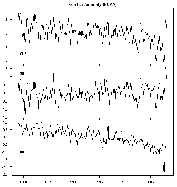
Sea ice continues to get lots of attention. I previously discussed March 2008 results here. June 2008 results should be available soon, but in the mean time, I’ve updated my own graphics showing a tripartite image of global, SH and NH, instead of only showing NH sea ice, as done in other recent comments e.g. Phil here, the UK Independent and Michael Tobis here.
First, I’ve uploaded a script that collates the SIDADS information into coherent time series (see http://www.climateaudit.org/scripts/seaice) and can be a tool for people wishing to carry out their own analyses.
Here is a tripartite plot of global, SH and NH sea ice, expressed here as monthly anomalies (in million sq km). On a global basis, sea ice anomalies in May 2008 continue to be above the long-term average during the 1979-2008 satellite period – the 10th highest on record. SH sea ice is off a bit (in anomaly terms) from record levels earlier in 2008, but remains at near record levels (3rd highest May anomaly). In fairness to last year’s commenters on Arctic sea ice, 2007 sea ice levels really do stick out relative to other values during the satellite period; May 2008 NH sea ice are not as extreme as last year’s (10th lowest.)
Re-examining the schedule of last year’s melt to see when milestones could be expected for this year, I was a little surprised at how late in the season the separation from other year’s took place. As of June last year, the year had been a relatively high melt year, but looking at the monthly data in retrospect, I don’t see how one could have predicted the August and September melts at this time least year. If anti-alarmists happen to read this post, I would urge you to defer any conclusions until the summer is over.
Update: Daily NH sea ice concentration data is available here http://www.ijis.iarc.uaf.edu/seaice/extent/plot.csv calculated differently than the monthly data previously shown but highly correlated. The mean of June 2008 daily sea ice in this data set was 0.11 MM sq km greater than the corresponding value in June 2007. I used this to estimate the June 2008 monthly value in SIDADS methodology yielding a SIDADS estimate of 11.64 MM sq km, plotted below.


131 Comments
There seems to be discrepencies in the area of sea ice. http://arctic.atmos.uiuc.edu/cryosphere/IMAGES/current.365.jpg puts this year at about 600,00km2 higher than last year while other posts show them the same. If there are fundamental difference like this occurring, what hope is there for analysis, even within the same data set?
If you want to see a daily update of sea-ice levels go to
http://arctic.atmos.uiuc.edu/cryosphere/
Nth Hemisphere data is at the top of the page,
Sth hemisphere is at the bottom.
Gavin at RC has a post on the topic.
He says the following,
[Response: Yes. Arctic regions are expected to warm faster than the global mean. Global values are not particularly useful since they conflate the two disparate and out of phase seasonal cycles. Antarctic sea ice has both a larger seasonality and bigger year to year variability and so dominates the much more significant Arctic changes. – gavin]
Curious use of the word disparate. How exactly are NH and SH sea ice fundamentally different? Apart from the fact one is increasing and the other decreasing. Otherwise, I agree that in a statistical sense the NH sea ice reduction is more significant than the larger SH increase. RC leaves alone the interesting question of how a supposed global effect has opposite consequences in the 2 hemispheres? The answer of course it can’t (models not withstanding). Therefore the RC thinking is that SH sea ice must be a statistical anomaly that should be ignored because it will go away in time. We shall see.
How exactly are NH and SH sea ice fundamentally different?
One supports the cause, the other doesn’t.
Not having any expertise in this area I thought I might run this by you folks. Is it likely that large volcanic explosions under the Artic have not contributed to whatever melting has gone on?
Steve: Not likely that they’ve made any contribution.
Simple, the NH sea ice is over a polar ocean surrounded by land which until recently was largely multiyear ice mostly further north than 75ºN
whereas the SH sea ice is a ring of mostly annual ice, which is further north than 75ºN, surrounding a polar continent . Given that it’s not surprising that the behaviors at the two poles should be different, in fact over the last few years it appears that the NH is transitioning to predominantly annual ice coverage.
Steve, I think you mean 2007 instead of that last 2008, although I agree that it would be prudent to wait until later in 2008 (September or so) to see how things pan out.
Pierre (5). Steve does not want that topic introduced, and while I think it could be part of the explanation for what appears to be in increase in the melt rate, this is his blog and his focus is on auditing IPCC results, so we should respect his wishes.
“…Nghiem said the rapid decline in winter perennial ice the past two years was caused by unusual winds. “Unusual atmospheric conditions set up wind patterns that compressed the sea ice, loaded it into the Transpolar Drift Stream and then sped its flow out of the Arctic,” he said. When that sea ice reached lower latitudes, it rapidly melted in the warmer waters…”
http://www.nasa.gov/vision/earth/lookingatearth/quikscat-20071001.html
my understanding is, that the high thin ice percentage may lead to a further reduction of summer ice this year, even if the arctic ocean would be cooling. northern sea ice area is a lagging parameter and may “mask” global cooling.
.
#2. I’m having troble locating exactly where the daily sea ice concentration is located on an apples and apples basis to the monthly data. Can you provide an EXACT url within the website and I’ll update?
I understand that the NH and SH are different, but surely the anomalously high SH levels deserves at least a raised eyebrow.
In Sept 2007, the month of the lowest satellite period NH sea ice, SH sea ice had the second highest monthly area (19.16 million sq km) in the entire satellite period.
Most people would think something like that is worth noticing and reporting. But apparently not the climate science community which is so breathless to talk about decreased sea ice in one place, that the record levels elsewhere are not reported.
In 1980, SH sea ice at the end of May was over 2 million km less than end May 2008.
Hi Steve Re: (9)
At the top of the page, to the right of the banner are
some thumbnail pictures. Click on them to get the
better pictures.
Down the bottom of the page one sees Sth Hemisphere
…………………
My interest is the pictures so we may be corresponding at
cross-purposes. I do not know where the underlying data is
and how daily relates to monthy and so on. The polar research
group has some automatic algorithm that just updates the
figures. There is some similarity between their pictures and
those you posted as a result of your own analysis.
The site is a useful antidote to people who panic when they
read the latest news that 150 km^2 just broke off the Wilkins
ice-shelf due to global warming.
I’m well aware of the pictures, but for statistical and time series, you need the data. I can only locate monthly data. I presume that the daily data is somewhere but it’s not easy to locate.
The SH does have more annual ice (melt) than the NH. A little over 13 million SqK versus 11 million SqK for the NH, so the difference in annual ice between the hemispheres isn’t that large. The maximum melt in the NH was 3 million SqK (below the average and hence the amount of multiyear ice that has melted, more or less) and is now 1.5 million SqK.
The SH anomaly is currently running a little over 1 million SqK increase. An amount that automatically becomes multiyear ice if sustained through the southern summer.
So while the NH is losing multi-year ice, it looks like the SH is gaining a comparable amount of multi-year ice. The gain or loss of multi-year ice results from whether more ice is forming or melting in a year and is not an explanation of why the NH and SH ice are ‘disparate’ nor somehow a defining difference between the 2 hemisphere’s ice. It’s just a consequence of whether there is a year on year gain or loss of ice in a region.
I’ve read some suggestions that the models predict increased precipitation for Antarctica and that this explains the increase in sea ice. I haven’t seen convincing evidence that there has actually been increased precipitation and I wonder if this is another case of models trumping reality.
I also wonder what the models say about precipitation in the Arctic.
“…Nghiem said the rapid decline in winter perennial ice the past two years was caused by unusual winds. “Unusual atmospheric conditions set up wind patterns that compressed the sea ice, loaded it into the Transpolar Drift Stream and then sped its flow out of the Arctic,” he said. When that sea ice reached lower latitudes, it rapidly melted in the warmer waters…”
http://www.nasa.gov/vision/earth/lookingatearth/quikscat-20071001.html
my understanding is, that the high thin ice percentage may lead to a further reduction of summer ice this year, even if the arctic ocean would be cooling. northern sea ice area is a lagging parameter and may “mask” global cooling.
A concise description of what made 2007 different in the Arctic was published by National Geographic online:
http://news.nationalgeographic.com/news/2008/06/080620-north-pole_2.html
“Scientists say the record loss last year was due to a combination of warm ocean currents, fluke winds, and unusually sunny weather.”
“It’s unlikely that such a mixture of conditions will occur again, University of Colorado’s Drobot said.”
As Steve McIntyre surmises, it’s too early to know what this summer will bring in the Arctic. (But I look at that “Cryosphere” site often anyway.) If the rare combination of ocean currents, wind and sun doesn’t hit again, then there should be less ice melted — but still more than the average, apparently, because of the loss of thicker ice last year.
I’ve read that the Antarctic sea ice behaves differently because of the currents (wind and sea, if I recall correctly). It isn’t pushed up into the warmer waters where it would melt — unlike the Arctic ice, which is pushed down into the Atlantic.
Steve, ask Will Chapman.
Sorry but the SH doesn’t impress me.
And in ’79 it was higher than in ’08, it fluctuates a lot:
With respect, it’s not a matter of whether the SH “impresses” you or not. If people are going to report sea ice areas, then surely they should consistently report both NH and SH results, and explain SH values to the best of their ability. While Gavin Schmidt and his ilk purport to rationalize away the relatively high SH values are rationalized , this rationalization may not be the end of the story.
Surely a tripartite graph of the type that I did is more objective than selectively reporting only NH results, as you did in your previous comment, merely because they “impress” you more.
#9 Steve
Try here
Steve: I don’t want to be impolite here, but have you actually examined these datasets to see if they provide up-to-date daily data? If so, which one?
Phil:
“And in ‘79 it was higher than in ‘08, it fluctuates a lot:”
Wasn’t ’79 the BEGINNING of the Warming?? That would put the SH ice levels almost back to “day one!!”
Of course:
shows the ’08 anomaly larger than any time in its dataset.
As you say, it fluctuates a lot. Kind of like the rest of the planet!
Bishop Hill, RC has claims at the link above that they predicted the increase in SH ice ’20 years ago’, without references of course. Now if they did, then I’m impressed. But RC is an unreliable source when it comes to unreferenced claims. And I suspect what was actually predicted was an increase in glacial flow from Antarctica and not an increase in SH sea ice.
For some interesting info on black carbon in the Arctic, check out this article:
http://www.sciencepoles.org/index.php?/articles/&uid=1253
Most of this black carbon is generated in the NH, and apparently a fair amount of it is ending up on Arctic ice.
Two over-looled sources of fine particles of black carbon are rubber from tires and asphalt from road surfaces.
Re #18
Steve I’m not that interested in the SH values, in any case they’re just meandering around in their normal range, the NH is interesting because it appears that a fundamental change is occurring there. Should that happen I’d expect significant changes in the NH weather, if I was an Aussie I might be more interested in the SH. If I want to talk about the NH sea ice because it interests me I will, I feel no obligation to talk about the SH in order to do so.
I do wonder why you posted using May data on 30th June though, the current anomalies being NH -1.5, SH +1.49, GLB -0.009?
Re #20
Not exactly, they had dropped ~20% since the 50s.
Re 23
reference please for your drop of 20% since the 50s
(don’t bring Open Mind:))
Phil #22
“Meandering around in their normal range”? It looks like a hockey stick to me!
I remember when Cryosphere Today suddenly adjusted their dataset in 2007 w/o any explanation given … here’s the difference before and after adjustment for maximum and minimum data:
(In case the image does not display inline, try the link – it works fine for me)
Steve: What are references to the before and after data sets used here?
Is it just a random artifact that the apparent large (negative) discontinuity that occurred in the SH in 2007 seemed to happen around the same time as the large (positive) discontinuity in the NH?
Phil, in 22 wrote:
That’s interesting. Just the other day, Mr. Tobis was here explaining his chief concern about those who post here. He wrote:
Looks like Mr. Tobis was correct that some of those who post here are prone to only examining the data that supports their position.
NOAA image from 26/6/2008. There is a substantial area of ice, but it’s not supposed to be there!!!!
Perry
Wolfgang,
I can’t help seeing the .7 drop from 1999 to 2000 and think about the 1999 Gakkel ridge Pompei size eruptions.
If we are talking of NH and SH, and not global ice, why are we also talking of global temperatures? If the concept of “global” can be defended scientifically as an averaging over the whole globe, even if there are great differences in land masses, (obvious in the daily global temperature plots http://discover.itsc.uah.edu/amsutemps/) and it is legal for temperature , CO2 etc, than it should be legal for ice. Otherwise one should stop globalizing all such measures as being irrelevant.
Looking at the some of the NH plots at The Cryosphere Today, some things jumped out at me…
1) The Arctic areas around the Atlantic Ocean seem to show more of a negative anomaly than those areas around the Pacific. The plots for the Barents Sea are totally out of whack compaired to the others around it. Could the Atlantic warming (AMO) be associated with this (not the Barents plot in of itself but more the broader negative anomaly seen)? I would think water temps would be a more effectve ice melter than air temps. However, that does not explain the gradual drop since 1955.
2) The Seasonal Sea Ice plot at the top of the page which goes back to 1900 seems to stay fairly flat up until around 1955 which then starts it’s slow decline. So…question: What happened around 1955 (besides the US Navy getting nuclear subs & starting to explore the Arctic regions more) to start the decline? Is the data before 1955 to be relied upon as accurate?
Steve – at the bottom of the page – the ice data is provided from NOAA/NCEP
Just some thoughts & observations – cheers
30 (Pete F) If you go to Andy Revkin’s NYT’s Dot Earth site, there is an animation of the last 25 years of Arctic Ice. If you place your pointer over the volcano on the Gakkel Ridge you will see the effect of the 1999 volcano. The heated water from it erupts as a great blue spot, thinner ice, and can be followed for the next couple of years as it exits the basin past Greenland. You can see the effect of the vulcanism of the ridge more subtly in other years, too, particularly starting around 1988. Perhaps the IPCC should have investigated the earlier beasts, the Vulcans, for evidence of their effect on the climate.
==========================
The sea ice stuff is interesting, although there are quite a few issues to my mind.
I think June 2008 is going to appear a little lower on the anomaly chart than May 2008, judging from the daily data charts. A lot of people are comparing June 2008 to June 2007 – which is fine, but it is somewhat disingenuous to make that comparison and simultaneously talk about the rapid 2007 melt. June 2007 was actually quite ordinary, and had a higher ice anomaly than June 2004, 2005 and 2006. The “big melt” in 2007 took place in July-September, so the only interesting comparisons are really going to be the next three months, not the last two.
That said, there is an important consideration to take into account, that has been touched upon by posters here. There is a HUGE seasonal signal in the sea ice area. Of the order of 10 million sq km. Of course, this gets removed by the data processing. But unless the phase of the seasonal signal is very pure, this can cause problems. A small phase shift, caused by local weather patterns, can induce a big swing in sea ice area anomaly because the big correction is effectively being fed directly in to the anomaly figure. This is visible (IMHO) in 1996 (when there was a spike up) and possibly in 2007 (spike down). This assumes that some weather patterns slightly extend, or shrink, the melt season.
Others, of course, argue the 2007 was caused by a lack of multiyear ice. I guess the next three months will help to resolve whether the 2007 blip downwards was a phase shift brought about by weather or a fundamental change in the structure of the ice.
A couple of other minor points. When I looked at the sea ice data files, there seems to be a change in sensor. I haven’t looked into this to any degree, I fully expect it isn’t relevant. I assume the two sensors are measuring the same thing and there are no matching issues – it doesn’t seem to me that sea ice would be a difficult thing to measure from space. The other thing is noting how quickly certain quarters in the climate debate dismissed US temperature history as being just 2% of the globe. Well, the arctic ocean is just under 3% of the globe. I find it amazing that this little rule doesn’t apply all of a sudden. Smacks of calvinball. OK so if you buy into polar amplification then perhaps it isn’t special pleading – but then you need a different sort of special pleading to throw out the SH signal. Messy.
I believe some of the discrepancy between the NH and the SH is that the NSIDC changed its measurement techniques in January 2007.
There wasn’t an explanation given that I am aware of but this change in measurement technique certainly contributed to why the record low ice extent of 2007 seemed so out-of-place.
Here is a before and after animation of the Cryosphere Today ice anomaly graph for the NH (CT gets its data from the NSIDC).
Steve, it looks like raw daily sea ice concentration datasets can be found at ftp://sidads.colorado.edu/pub/DATASETS/seaice/polar-stereo/nasateam/near-real-time/
The link above (#37) will get you to 2008 data. Previous years can be found at ftp://sidads.colorado.edu/pub/DATASETS/seaice/polar-stereo/nasateam/final-gsfc/browse/north/daily
HTML pages that can help you surf the above and make documentation easier to find can be found at http://nsidc.org/data/nsidc-0081.html
@27, Yes, Cryosphere keeps “adjusting” its data without notice and the webarchives prove it (graph)
@Steve, I think Wolfgang showed the data by manually digitalizing the archived plots.
graph : http://plasmaresources.com/ozwx/climate/images/ArcticMysteryArea.gif
#37, 38. Does anyone know how to read these binary files using something other than Fortran on a Unix machine? Sounds like a mission for Nicholas.
39 (Demesure) On your graph of anomalies, 1988 looks like a break point to a declining trend, and sharps drops are noted at 1995 and 1999, corresponding to blue spots noted on the Arctic Ice animation noted in comment #34, and presumbly, the effect of vulcanism. I’d like to see seismographic data from that era. We know there was a big spike in seaquakes in 1999. I’m on thin ice here, so compare with the animation quickly before the zamboni ventures over this hot spot.
=======================================
I don’t see how NH-to-SH comparisons are necessarily apples-to-apples comparisons. I think apples-to-apples comparisons require that the controlling physical phenomena and processes be the same.
I’m not a Certified Climatologist, much less one who specializes in ice stuff, but the following Peer-Reviewed papers published in Scientific Journals seem to indicate that the Arctic sea ice extent is dominated by processes not directly related to increasing temperatures at the Arctic.
This paper, this paper, and this JPL/NASA information all seem to say that the recent behavior of the Arctic Sea Ice is more due to wind and water-movement actions than to changes in temperature. That is, structural changes in the ice and then transporting the chunks to areas having warmer waters. Changes in the radiative-transport properties of the ice surface can also increase, or decrease, the amount of energy deposited into the ice. I don’t have a citation handy, and I’ll track them down if requested, but I recall that there have been discussions of the effects soot and other particulates significantly increasing the actual melting of the Arctic ice.
Ice floats and 90% of the material is under water. My first guess would be that the water temperature, coupled with the motions of the ice, are the primary driving potential for changes in energy exchange between the ice and its surroundings, and the melting rate. I understand that the temperature of the ocean waters will increases at significantly slower rates that that of the atmosphere. If melting is the actual cause of the decrease in the mass, it would be good to see some actual temperature data at the locations where the ice is melting.
Note that when the Arctic Sea Ice makes the headlines, the actual temperatures of the water and atmosphere are seldom, if ever, mentioned. In fact the actual controlling mechanisms are seldom mentioned. For those of us who focus on causal physical phenomena and processes, it is easy to interpret the lack of reporting of these as an attempt to implicitly invoke yet again The Great Global Average Temperature Totem. I see that happening in this case.
Footnote
The papers cited above were the first three I checked into from the results of a simple Google search. I have by no means dug deep into The Literature.
42 (Dan Hughes) I suspect water temperature data for the Arctic does not exist in much detail. I am using the thickness of the ice, particularly new ice, as a proxy. I think some temperature judgements can be made from Andy Revkin’s graphic.
And I agree, the differential continentality of the two poles makes them differ as temperature proxies. I suspect the Antarctic is a better proxy for global temperature, simply because there isn’t a current bang in the middle of it. However, there is an ice cube which may tenuate the response at the south compared to the north.
=============================================
Here’s what the IPCC AR4 Summary for Policymakers said about Arctic Sea Ice:
IPCC, 2007: Summary for Policymakers. In: Climate Change 2007: The Physical Science Basis. Contribution of Working Group I to the Fourth Assessment Report of the Intergovernmental Panel on Climate Change [Solomon, S., D. Qin, M. Manning, Z. Chen, M. Marquis, K.B. Averyt, M.Tignor and H.L. Miller (eds.)]. Cambridge University Press, Cambridge, United Kingdom and New York, NY, USA.
GISS/NASA’s Gavin Schmidt responded with this over on NASA’ Real Climate:
Here’s what the IPCC AR4 Summary for Policymakers said about Arctic Sea Ice:
A very clever way to say that the projections were not correct and avoid comparison of projections with actual data. Plus, in some circles these results will be presented to mean that we are in the mist of a catastrophe that is orders of magnitude worse that even Certified Climatologists thought. And yet again avoiding any discussions that the projections are very likely based on thermal issues which do not obtain for the Arctic ice.
From an outsider’s perspective (a software tester), this discounting of Antartica’s ice growth just seems nuts. If you went to a doctor and he wanted to perform surgery for a supposed disease condition he diagnosed (because he is trained in the treatment of that disease) but a significant number of the primary symptoms arrived out of order or not at all, wouldn’t you go get a 2nd opinion — just to protect yourself from having unnecessary surgery? And would you trust someone to diagnose you who was not aware of many other physical conditions that could explain different symptoms — like maybe a rash was not part of the diagnosed condition but just due to some unexpected event — like having a new detergent used in your laundry you happened to be allergic to, but the doctor would not investigate this due to his attachment to a particular diagnosis. The statistical contortions and tortuous logic the catastrophic AGW proponents go through to make their case, should be a red flag for anyone with a bit of common sense, no less a person dedicated to true scientific inquiry.
http://arctic.atmos.uiuc.edu/SEAICE/timeseries.1870-2007
This link shows arctic sea ice extent since 1870-someone else has already referred to it in this posting but I can’t find their comment.
Can anyone clarify how these measurements back to 1870 were taken-they are presumably not observational so they have been reconstructed-if so how?
At what point did they become observed measurements?
Tony B
#46. You might start by comparing this dataset to the SIDADS monthly data that I collated in my online R script.
Have arctic temperatures followed the same pattern as global temperatures for ths last 8-10 years?
NH temperatures have increased much more than the SH or Tropical temperatures.
And the majority of the increase in NH temperatures is, in fact, in the Arctic and Siberia temps. While we know there are big problems with the Arctic and Siberia temps, perhaps we are seeing the infamous albedo positive feedback considering the lower ice levels. But almost all of this potentially positive feedback is in the Summer (August and September) numbers since the Arctic is almost completely frozen over still.
Do the positive temp trends in the NH (and mainly the Arctic and Siberia) relate to the summer months only?
Here is a couple of links to the current visible satellite images of the Western Arctic (frozen but an unusual number of small open water areas even close to the Pole) and the NorthWest Passage (frozen solid still but snow has melted from the land and ice.)
Perhaps I am missing something: we are told that polar bears in the Arctic rely on sea-ice to maintain their habitat, livelihood, and find their food sources. I would surmise that their food source is seals and other critters which need open water to survive. How much open water is “too much” for the polar bears to survive during the summer months?
It seems the interannual variability in sea-ice coverage is HUGE, yet the polar bear populations are on the increase. Different areas of the Arctic are ice-free in different years depending upon the atmospheric circulations. How have these critters survived for 200,000 years?
@Steve (in #27)
Pls have a look at Demesure’s reply, that’s what I did: I used engauge digitizer to create that data – so no (digital) ‘dataset’, sorry.
@Pete F (#31)
What the adjustments say (simply speaking): That Cryosphere Today say they mistook water for ice regularly in previous data versions and that they mistook the most of it in arctic summer melt and very especially they very mistook lots of water for ice from 2000 onward bot not before.
How could undersea volcanic eruptions explain this peculiar change in perception of the past?
#50. Ryan, you’ve commented about the role of hurricanes in moving energy to the extratropics. The distributions of Atlantic hurricane activity are pretty skew as we’ve discussed. I wonder whether the 2007 Arctic sea ice season might turn out to be an equivalent of the 2005 Atlantic hurricane season – a very big season to be sure, but with reversions to more normal levels in the following 2006-2007. (I think that I can fairly claim to have been very early in reporting the lack of unprecedentness in the 2006 hurricane season.)
I’m wondering whether we’re not seeing something similar in the 2007 Arctic sea ice season. It was a very big skew to be sure, but so was the 2005 Atlantic hurricane season. If I were to guess at 2008 Arctic sea ice levels right now, my guess would be that the 2008 Arctic sea ice minimum will bear the same proportion to the 2007 sea ice minimum as the 2006 Atlantic ACE had to the 2005 Atlantic ACE and that the 2009 sea ice minimum will revert even more strongly as the 2007 Atlantic hurricane season did. I say this not because I think that the two are connected, but because both could have skew distributions. This does not preclude long term momentum any more than a quiet 2007 Atlantic hurricane season precludes long term Atlantic changes. Only that we don’t really know very much about multidecadal variability in Arctic sea ice concentrations and the first part of the 1979-2008 period was not an active Atlantic hurricane period either. Just a guess.
Regarding Antarctica, per the UAH MSU data, the southern hemisphere has cooled fairly significantly since early ’07. Given that Antarctic sea ice extent is driven by ocean and wind currents around the continent, wouldn’t a lesser differential between the always cold Antarctica and the cooling S. Hemisphere cause a relaxation in the currents, and allow for sea ice expansion?
There was a cube of ice on my porch yesterday, now it’s melted.
I don’t care about all this SH, NH folderol. The ice on my porch has melted. That’s a 100% loss in less than 24 hours. If that’s not proof of global warming, I don’t know what it will take to convince you guys.
#40
Here be some Matlab routines from another site for the data, at least I think so.
http://ecco2.jpl.nasa.gov/data1/data/ice/icon_bootstrap/matlab/
So here we have an area of water covered variously in ice, mostly surrrounded by land, and rather heavily urbanized. Then here we have an area of land totally covered in ice mostly surrounded by water and a few not as urbanized areas “somewhat” nearby.
Perhaps you can’t compare the Arctic to the Antarctic? Cherrys and apples?
🙂
Steve – have you seen this?
http://www.ijis.iarc.uaf.edu/en/home/seaice_extent.htm
Nice graphical presentation of arctic sea ice in Million sqkm, comparing very recent years. And daily data for download.
Kim says:
This is very interesting.

Here is the gif animation:
and here the map:
x
Steve, I have complied with your wishes and not discussed the issue of the Gakkel ridge volcanoes yet Kim continues to post her fantasies on the subject here #34 & #41 and the attendant follow-ups. Do you plan to do anything about it?
Again, a reminder. The plots and graphical depictions are not sea ice measurements. They are interpretive estimates, based on heavily massaged ensembles of passive microwave, radar, visual and or other satellite data. Each technique is rife with pitfalls which may result in both false positives and false negatives.
The resulting interpretive estimates are at the mercy of the various data munching programs used to turn the raw satellite data into plots / graphical depictions.
This would be a wonderful area to audit – end to end, from date acquisition to representation.
44#
“When data turn out to fit theory then data beautifully validate theory. When data don’t fit theory, then data are useless because theory could be validated or falsified only in the long run“.
data acquisition.
44#
Translation of Gavin Schmidt: “When data appear to fit our theory then theory is validated, and we shall trumpet that via media and blogosphere. When data don’t fit theory, then data are useless because theory could be validated (or falsified) only in the long run, for 100 years.”
sorry, mistake with double posting, I thought posting of first message was aborted…
Just wanted to concur with previous postings re the effect of wind.
A masive sand dune system hereabouts virtually disappeared over one season due to very strong winter winds. The Arctic wind is twice as strong and more constant. Whilst the similarities to sand and snow are obvious, surely broken ice or icebergs would also be driven in its direction-that is either further north into the pack or away in to more open and warmer waters. (I don’t know the prevailing wind direction in summer 2007) I know the National Geographic have added in the scenario of the unprecedented sunshine in the Arctic as well, but sun plus wind is a very powerful combination.
Incidentally the CET figures for June are in. June 2008 was the equal coldest since 1999 and to get colder you would have to go back to 1991(May had been the warmest since 1992)
Tony B
#50, Steve, The role of TC’s in climate is a pretty small part of the climate science field, sorry to say. However, it is clear that TCs provide roughly 10% of physical transport of heat and moisture out of the tropics during a given Aug-Oct period in the Northern Hemisphere. ENSO determines largely the year to year variability.
Now, remembering my previous posts, and my work on my webpage, the Northern Hemisphere TC activity was the lowest on record since 1977. This was associated with an intense La Nina episode which is intimately associated with the continued negative Pacific Decadal Oscillation (PDO). We cannot attribute the sea-ice break-up to the lack of tropical cyclones. Instead, the “temporary” atmosphere/ocean conditions, largely over the Pacific basin, favored warm-air advection into the Arctic and broke/piled up the ice. It is possible that everything was interconnected, but there is little evidence either way. Sad to say, a good climate model would come in handy.
2008 forecasts of North Pole melting are largely persistence based and a function of the strength and amount of first-year ice. I would not bet on a repeat of the exact same atmospheric conditions any more than I could predict accurately the fall ENSO phase from April-May SST data.
http://www.met.utah.edu/news/garrett3
I thought this report about Arctic pollution dating back to the 1880’s was interesting especially the last paragraph. Other people have mentioned the possible effects of soot etc.
Tony B
In my post #46 I queried how Arctic ice data could be compiled going all the way back to 1870. If people follow that link in post 47 but omit /timeseries (onwards) you come to ‘cyrosphere’. At the top left is the historical sea ice dataset, after following that the various records are available including a very detailed ‘documentation’ file.
In the caveats it reads;
“pre 1953 data is either climatology or interpolated data and the user is cautioned to use this data with care.”
Elsewhere it comments that;
“Sea ice extent data is provided by Kelly, et. al. 1988. The ice extent
data is compiled for the months April-August for the majority of the period
1901-1956. In this dataset, we utilize the Kelly data to create an ice
concentration data source for the early period of record. This data is
given very low priority in the hierarchy of available data so that if there are data from any sources (except climatology), we replace the extended Kelly data with this new source data. The modification of the Kelly data is done in two parts: (1) conversion from ice extent to ice concentrations, and (2) temporal extension of the available data.
(1) We add a marginal sea ice zone to the Kelly ice extent data by
computing average ice concentration drop-off rates for the period during
which there are satellite observations. These drop-off rates indicate
the rate at which ice concentrations decrease as a function of distance
from open water and distance from 10/10 ice concentrations. The drop off
rates vary with season; the summer melt season drop-off rate is about 0.5
that of the freeze-up season. We apply these drop-off rates to the Kelly
ice extent data to create a marginal sea ice zone.”
So to all intents and purposes anything pre 1953 is highly suspect and anything after that has all sorts of caveats…
We are back to the old problem- as with many temperature datasets- of having very limited information that goes back only a few decades when we need data that has a climactic overview of millenia if we are to gain useful comparisons with say the MWP. Unfortunately that isn’t available!
Tony B
Re #60.
Living in southern Finland it is interesting to see that according to satellites
(pictures on the cryosphere website) there is a significant amount of ice left
in the Gulf of Finland and the Riga bay at the end of June. The water
temperature is ca. +15 C along the southern coast of Finland and nobody
sees any ice 🙂 . It is thus clear that satellite measurements give
false results in some circumstances just as Steve Sadlov noticed.
Re: #69 (Lars)
Are you suggesting that historically they overestimated the amount of ice and have progressively cleaned that up but are still overestimating?
Re #69
Lars, where do you see this, looking at ‘Cryosphere today’ I see no trace of ice in the locations you mention?
No coastal ice showing until the Kara sea.
Response by SonicFrog
Exactly. A few years ago there was the advancing/retreating glaciers conundrum. The powers that be (who want green taxes and cap and trade)funded studies to purport to show that advancing glaciers were due to warming, as they had explained retreating glaciers were caused by the same. So studies purporting to show “microquakes” and melt water lubrication as causes for advances were concocted. But before AR4 these studies lost favor, the biggest problem being why would warming be the cause of both advancing and retreating glaciers in propinquitous regions? AR4 and related texts dodge the issue, partly claiming (implicitly, not clearly) that ice caps on land, Greenland and Antarctica, react different than the arctic polar cap and mountain glaciers. And for the troublesome mountain glaciers that advance, these are described as local moisture anomalies.
Re #25
de la Mare, W.K., “Abrupt mid-20th century decline in Antarctic sea ice extent from whaling records”, 1997, Nature, 389, 57-61.
Curran, M.A.J., et al., “ice core evidencefor Antarctic sea ice decline since the 1950s”, 2003, Science, 302(14), 1203-1206.
And satellite data:
Calavieri et al., “30-year satellite record reveals contrasting Arctic & Antarctic decadal sea ice variability”, Geo. Res. Letters, 30.
Let’s presume that the recent decline in late summer Artic sea extent is unprecedented over the last several centuries. Surely the still unanswered question is why. The recent artic warming can’t explain it since all or very nearly all of the artic temp. stations in GISS that have records going back to the early 20th century show that temperatures in the late 1920s through ~ 1940 were as warm or warmer than current temperatures. Unfortunately, this is a question that the CO2-caused AGW crowd doesn’t seem to answer well. My guess is the soot deposition on the ice along with changes in currents and greater warm water underneath the ice could be a reasonable cause. The impacts of the decreasing ice may or may not be as dire as proposed by the CO2 crowd. What this does say is we should look at multiple possible anthropogenic or natural causes.
BobN
so last week the screaming headlines were something to do with no ice at the north pole for the first time in human history ??
http://tinyurl.com/5b9kto
Amazing, the Royal Navy and the USN must have worked closely to fake the pictures.
At this page for the USS Skate (the third nuclear-powered sub), there are several pictures of the Skate at the North Pole, including one on March 17th, 1959 where there is significant open water. It would be unheard of today for there to be open water at the North Pole on March 17th. (Wikipedia confirms the trip and date so it is not a typo on the page.)
http://www.navsource.org/archives/08/08578.htm
Earth Tilting?
#Snow cover and sea ice sensitivity to generic changes in Earth orbital parameters” (1993)
http://www.agu.org/pubs/crossref/1995/94JD02686.shtml
Look up the SAM and Antarctic to see why it’s not warming as fast. Solomon has a paper, IIRC.
Re 71
While Cryosphere don’t have any summer ice in the Baltic nowadays NSIDC has:
I presume this is what Lars means. However in maps from 1989 to 2003 Cryosphere regularly shows ice in the Baltic in summer, when there never is any, so I tend to believe that the ice area at least for this period is overestimated. It seems very unlikely they would measure right in the Arctic and wrong in the Baltic.
Re 68:
“We are back to the old problem- as with many temperature datasets- of having very limited information that goes back only a few decades when we need data that has a climactic overview of millenia if we are to gain useful comparisons with say the MWP. Unfortunately that isn’t available!”
As a matter of fact it is, to some extent. The summer ice extent in the past can be judged by the distribution of Bowhead Whale bones, since Bowhead whales stay close to the ice, but never far into it:
Dyke, A. S. et. a. 1996: A history of sea ice in the Canadian Arctic Archipelago based on postglacial remains of the Bowhead Whale (Balaena mysticetus). Arctic 49:235-255.
In short, the Nortwest Passage was ice-free in summer 10,000-8,500 and 5,000-3,000 years ago, but probably not during the MWP. Also additional records in Harington, C. R. 2003. “Annotated Bibliography of Quaternary Vertebrates of Northern North America”, indicates that nearly the whole coast of Greenland was ice-free during at least the first of those intervals too.
Unfortunately nobody seems to have collect or dated whalebones from the Eurasian sector of the Arctic (they certainly occur on Spitzbergen, I’ve seen them).
Steve: I’ve done posts on one of Dyke’s articles (on driftwood). Information exists on Eurasian sector.
OK folks, here is the VERY first June 2008 sea ice monthly SIDADS format sea ice calculation available anywhere. Daily NH sea ice concentration data is available here http://www.ijis.iarc.uaf.edu/seaice/extent/plot.csv calculated differently than the monthly data previously shown but highly correlated. The mean of June 2008 daily sea ice in this data set was 0.11 MM sq km greater than the corresponding value in June 2007. I used this to estimate the June 2008 monthly value in SIDADS methodology yielding a SIDADS estimate of 11.64 MM sq km, plotted below.
re: #72 and AR4
Is there in any single issue discussed in either the SPM or FAQ for which the controlling phenomena is anything other than Global Warming? I haven’t checked everything in detail, but for some that I have checked, if it is not explicitly stated that Global Warming is the assigned phenomena, the reader is left to think that Global Warming is the causal element.
An example from the FAQ:
Note the phrase,” … models driven by historical circulation and temperature changes.”
This in fact means these are hindcasts. Plus these have not been done with GCMs, but with a special-purpose calculation model. Plus the controlling drivers have been chosen ( all others omitted ) and these are listed in the order (1) historical circulation, and (2) temperature changes.
When all is said and done, Global Warming barely enters the picture and GCMs are nowhere to be seen. Yet the report is supposed to be about Global Warming. And the GCMs are supposed to have been “evaluated” by comparisons with data.
Here is the abstract of a recent paper that apparently follows these very same procedures.
ps re: #82
Also note the phrase, ” … simulated fairly well … “.
Using special purpose tools, plus inputing the chosen controlling drivers leads to ‘fairly well’. Where does ‘fairly well’ fall in the IPCC list of approved descriptions?
Steve McI, I’ll stop now so that I don’t wear out my welcome.
#82 Dan “Is there in any single issue discussed in either the SPM or FAQ for which the controlling phenomena is anything other than Global Warming?:”
The globe is warming? Quick, put some ice on it to reduce the swelling.
This picture seems to show that temperatures in Antarctica around the edge are increasing – which you’d expect to cause a decrease in sea ice.
Also studies of volume of the ice sheet over land (as opposed to sea ice) show a decrease in sea ice up to 2006. I have had a look but been unable to find more recent results.
And for the last 6 or so months sea ice around Antarctica has been consistently higher than any other period in the last 20 years.
I smell a mystery that warrants further investigation.
Is it possible that faster melting ice on land leading to increased iceberg calfing causes an increase in sea ice? I’d expect that couldn’t happen in winter as the land based ice sheets would be hemmed in by the sea ice. But maybe increased iceberg calfing in summer could cool the ocean temps locally? Or would it only be enough to make something like 0.00001 degree of difference? Or an extra 20 thousand square k of ice out of a million.
Judging by the graphs at Cryosphere Today, it appears to me there’s ~1-1.5 million km^2 more global sea ice July 1 2008 than there was July 1 2007. There’s SIGNIFICANTLY more ice around Antarctica, which means I expect 2008 to obliterate last year’s record high extent. I also expect the media to ignore it even more than they ignored it last year (if that’s possible).
A few months back I emailed Bill Chapman concerning the rather obvious 2007 cryosphere sea ice adjustment:
Here is his explanation for the adjustment:
For what it’s worth, to my eye the adjustment still appears quite remarkakable given the explanation of a few cases of missing days offsetting the average by a few days, but I’m no expert on this:
For the record, I made the animation above (that Demesure embedded further up) from the wayback machine images linked above using a graphics program to adjust the size of the one image so the grid scale matched the other one.
59 (Phil.) Relax, Phil. Four of Andy Revkin’s experts all say the volcanic heat can’t get anywhere near the surface. But still; put your pointer on the volcano in the animation in #58. What does explain the relatively thinner ice there?
=====================================================
According to the digital data on http://www.ijis.iarc.uaf.edu/seaice/extent/plot.csv, day 181 (2008 is a leap year) has 440,000 sq km more sea ice than last year. July melt last year was about 100,000 sq km per day.
A correction to my previous post – I used archived wayback machine ice area images for the animation.
Re #73
Phil, I assume you’ve read the articles you’ve referenced here. As I’m not sure it’s worth paying nature USD32 to read the de la Mare article, could you summarize the error bars on the Whaling records that were used to estimate Antarctic sea-ice prior to the satellite era?
I’m a bit curious why you would refer to Kim’s hypothesis as “fantasies”; the implied connotation doesn’t present you in a favorable light. It’s easy to be vituperative when you’re anonymous, that’s for sure.
What did they say about effects on the ocean currents in the area (or even creation of temporary currents)?
Add: previous post in response to Kim post #88
It may be useful to compare the SST anomalies in the arctic between today and a year ago, according to NOAA sea surface temperature plots. It appears that the SST anomalies were higher in the Arctic last year than this year.
First, last year (6/28/07)
Now, this year (7/1/2008)
Re85
And did you see the trend: red is +0.1°C
Impressive (at least the red colour)
Re 87:
That explanation is nonsensical. A few missing days would affect the anomalies but not the total ice area.
@Carl Smith (#87)
Thank you for posting the explanation given by Bill Chapman. I emailed Cryosphere Today too but did not receive an answer that time.
However Bill Chapman’s explanation does not make sense to me. These adjustments have been applied to their record of absolute ice area extent, it’s not only that anomalies are affected (which are derived thereof).
I guess human history only goes back to the year 2000. Which is when the NYT ran a cover story, showing water at the N. pole. That article too, screamed that this was the first time in history such a horrific thing had happened.
They retracted the story a couple of days later after being contacted by numerous scientists who informed them that this was not unusual at all.
92 (GeorgeG) Basically they say that maximum temperature of Arctic waters is at about 400 meters depth and heat flux is downward from there. None of them mention what happens with that heat flux downward when the lower water is warmer than usual. So, I am doubtful, and still must have the evidence of my eyes explained.
===========================================================
Re: 85 & 95
This is quite a beautiful, detailed and richly nuanced chart. I wonder where the data came from? There are only a few weather monitoring stations in Antarctica and IIRC the satellite coverage of the poles is poor.
Regarding the Cryosphere explanation, I fail to see how missing a few days of data results in an adjustment DOWNward by 750,000 km2 for 2007 while also resulting in adjustment UPward of the previous record low year, 1995, by 250,000 km2.
The anomaly animation makes it clear what they were trying to achieve.
If you want to look at daily information in a convenient format, here’s a script that collects theinformation for you and also calculates the Julian date. As always, you have to be careful with WordPress changes to quote marks in the script shown here.
url=”http://www.ijis.iarc.uaf.edu/seaice/extent/plot.csv”
#AMSR-E sea ice concentration algorism developed by Dr. Comiso in NASA/GSFC.
daily=read.csv(url,header=FALSE)
dim(daily) #[1] 2406 4
names(daily)=c(“month”,”day”,”year”,”ice”)
daily$ice[daily$ice== -9999]=NA
daily$date<-as.Date(paste(daily$year,daily$month,daily$day,sep="-"))
daily$julian<-julian(daily$date,start="1970-01-01")
daily$mm=100*daily$year+daily$month
daily$dd=factor(daily$year)
m0=tapply(daily$julian,daily$year,min)
m0[1]=julian(as.Date("2002-01-01"),start="1970-01-01")
levels(daily$dd)=m0
daily$dd=as.numeric(as.character(daily$dd))
daily$dd=daily$julian-daily$dd
daily$ice=daily$ice/1E6
daily$diff=c(NA,diff(daily$ice))
frost,
Satellite MSU coverage goes to 82 North latitude, but only to 70 South. The reason is that the surface of most of Antarctica is above the altitude of the lower troposphere channel. Besides, those charts are for sea surface temperatures which have a variety of measurement systems including floating buoys.
Re #94
Not really, all those plots show is where open water was/is in the Artic, anywhere there is open water where on average there is sea ice shows up with a high anomaly.
Re 99
It would take some pretty exotic physics to prevent warm water from rising provided that it is warmer than 4 degrees centigrade (where water density is maximal). Rising air cools through expansion, but water is almost incompressible, so that doesn’t work either. If the heat source is small compared with depth the rising plume might mix with colder water or be dispersed by currents before reaching the surface, but it seems likely that the size of an active volcano would be fairly large compared with the water depth.
Yes really. Areas near the ice extent edges are important. You seem to make the assumption that where you see anonymously high SST’s that it is only because that is where normal ice was replaced with open water, and where you don’t see anonymously high SST, that it is only because ice remains in that area. That is simplistic.
If you don’t find it significant that there is less “red” colorings above the Arctic circle this year compared to last, then suit yourself.
105 (tty) Yes. I think the explanation that the extra heat is swept out of the Arctic Basin before it can rise to the surface should be easy to check. I do not think that the explanation that heat flux is alway downward from about the 400 meter depth makes any sense. That may be true when deeper water is always colder, but that will not obtain when that deeper water is hotter. There are two questions. This volcanic activity cannot melt ice if its heat is swept out of the basin before it rises to the surface. Also, if the mass of heated water is such that it is cooled to ambient water temperature before it reaches the surface then it also can’t melt ice. I think those two points can be fairly easily checked.
If you place your screen pointer on the animation graph in comment #58 where the volcano is, you’ll see a ‘Great Blue Spot’ appear under it in 1999. What is that if it is not the effects of the volcano. That spot can be followed until it exits the Basin past Greenland in 1999.
========================================================
Re #105
I had been observing Steve’s request that we not discuss the volcanic issue however since he doesn’t seem to care about it I don’t see why I should.
Not ‘exotic physics’ just rather normal physics!
Sea water density is not maximal at 4ºC, that’s only for freshwater. The volcanoes are at a depth exceeding 4 km, a free convective turbulent jet would entrain surrounding cold water and mix and cool the water (~400ºC at the bottom). The melt water below the ice is also stratified because the meltwater is relatively fresh and therefore of lower density than the saltier water below. If the temperature of the rising plume is warm enough to melt ice then similar volcanoes in the open ocean should show up on SST plots but we don’t see them, for example Loihi off Hawaii doesn’t show up as a hot spot and it’s only ~1250m down. Some calculations applied to hot smokers show that the buoyancy has been cancelled out due to entrainment by about 180m above the source, at which point it has been diluted ~3000 fold by the surrounding water. The residual temperature anomaly at that point is 0.05ºC
http://www2.ocean.washington.edu/oc540/lec01-11/
Steve: the non-observance of the request annoys me too, but I can’t babysit everything and sometimes it’s easier to ignore such things.
Re #106
Simplistic maybe but it’s also the truth. Those graphs don’t tell us anything more about the Arctic than the sea ice plots do.
snip – I asked for no more volcano
Re #70 (Estimating sea ice).
No, I am not suggesting any strange corrections.It simply
looks very funny when you happen to live in the area.
It would be nice to know more details about how the measurements
and the analysis is done.
The most interesting about the photos of the Skate in open water at the North Pole(http://www.navsource.org/archives/08/08578.htm) is the date. 12th March 59. If one goes off the cryosphere data, this is supposed to be when sea ice is at its maxima, not minima.
Chris says:
I think we can only conclude that, like the moon landings, those photos were faked!
The Skate did surface at the North Pole on March 19th, 1959 (the first sub to do so) but it is possible that the photo is from an archive taken at another date or another location on the trip.
However, this pic from August 1962 shows a rendevous of two subs and it is clearly stated this picture is from the North Pole.
Further to #113.
I suspected that too. No sign of Arizona or Area 51 in the photos though.
I am not certain of the US Navy policy but didn’t they used to blast through “thin” ice to surface, especially in the days before they had hydroplanes that could pivot to vertical. If that was the case, it may well be that the open water is artificial. I’m certain that they would have a lot more comprehensive records on ice cover and thickness than the official records.
Re #115
The North pole is in the ‘Gore Box’ so all the US Navy data should be available.
#113
It is not unusual for there to be open water at the North Pole. Relatively small areas of open water have formed there. The issue is the extent of the ice cover, not whether there is cover at one small point in the Arctic. Those Navy pictures have no evidential utility in terms of historic information on ice extent.
Just as previous recorded instances of vessels traversing the NorthWest passage have no evidential utility in terms of whether or not 2007 was the first time in recorded history …
Scott Lurndal says:
Phil isn’t anonymous. I know who he is and his real first name is Phil. 🙂
Re: 71.
Phil, going back I didn’t find the picture I saw earlier.
You can see what I hinted at in several pictures in the
thread:
Sea Ice Utilities (Steves initial text).
For July 2008-07-04 the right hand picture clearly
shows non zero ice (30%?) in the western part of the
Gulf of Finland. The last ice melted in this area
in April.
Could this kind of false ice indication be caused
by the blooming of blue-green algae?
The blooming season colors the sea surface
yellow green (streaks) over large areas.
Could this cause readings that are mis-interpreted as ice?
Re #120
Lars, what frequently happens is that there’s an error in the pixel that borders the land and sea particularly in that small scale representation (NSIDC). You don’t see it in the higher resolution images such as at Cryosphere Today or JAXA
Phil., do you know of a good paper or article which describes in detail the changes in sea ice observation techniques in recent decades (say, since 1970)?
I’ve seen references to changes in instrument capabilities and changes in how data is interpreted both before and during the satellite era. I believe there are issues with things like microwaves and melt ponds, which Mosher or Sadlov have discussed here. I wonder how, when observation capabilities change, the researchers graft the old methods onto new methods.
What I haven’t seen, though, is any document which pulls together and discusses all of those observational issues. Any help you can offer in finding such a document is appreciated.
Re #122
David, try this for starters:
Remote sensing
Re #123 Thanks, Phil. I’ll check it out this weekend.
I had requested from Environment Canada any early ice surveillance photos they had. In response I received some B&W photos taken in 1957 with the following note. I was really hoping for air photos.
**We have some photos of an arctic voyage done in 1957 with the icebreaker Montcalm along with 3 American icebreakers. It was the part of the first circumnavigation of North American. They are high resolution pictures taken by Bob Murray.
Bob Murray who was an officer and helipcopter pilot onboard HMCS Labrador during the 1957 resupply mission of the Dewline and the crossing of the North West passage. On this historic arctic voyage in 1957 3 American ships accompanied the Labrador (Bramble, Spar and the Storis). That year the Labrador became the first major ship to circumnavigate the North American continent.(Panama canal-Nw passage).
Please note that these pictures are copyrighted to Bob Murray.
These would be some of the oldest pictures we have.
#125
Are the photos referred to available to view anywhere?
Is there a good article about this 1957 voyage?
Tony Brown
They sent me six pictures of the ship and ice floes as a sample. I expect they have more. You can contact them at:
Weather.INFO.Meteo@ec.gc.ca
There is an article on the voyage at:
Click to access Northwest_Passage1957.pdf
Apparently Rear Admiral Donald B. Mac Millan flew over the North pole in 1957 and took 10000 pictures. I would like to know where those photos are. He must have been quite old as he was on the Peary expedition. His biography is at:
http://www.ekkane.org/Biographies/BioMac%20Millan.htm
After the death of MacMillan in 1970, his wife worked to set up a museum at Bowdoin. So a collection of the history and arctic photos should be there:
http://www.bowdoin.edu/arctic-museum/
It is possible that there is documentation of ice there as he made many expeditions.
Hi. Could I just point out the following
(1) That the current “global warming” of +0.7K, is a Global mean, and the atmospheric temperature is highly sensitive to fractional increases in water vapor mixing ratio over cooler atmospheres at higher latitudes compared to the tropics. This is likely to cause amplified warming at the poles. Though increases in relative humidity by fractional amounts should not amplify the warming at the poles. Cloud cover is likely to have a bigger impact, as clouds are generally less reflective than the ice they tend to cause both net SW heating and net LW heating over ice.
(2) The amount of latent energy removed from the atmosphere in melting ice is very high, therefore ice melt is a quite inefficient process. If a large amount melts too quickly it cools the surrounding atmosphere, so that probably accounts for a high amount of variability from month to month. Add onto that, the changing wind trajectories, velocities and cloud cover which all feedback upon ice-melt, this makes month to month comparisons between years almost totally meaningless.
(3) I think it is too early to discern a significant trend in data, as a 35 year cycle could exist over the 1979 to 2009 period, and the year to year variability is too great at the moment [hence natural variability]. Natural variability occurs naturally without an external forcing such as a volcano.
Wouldn’t it be possible, that the general sea ice coverage reduces between 1979 and 2008, then gradually increases for a couple of decades, before decreasing until 2100?
Cheers, Chris
Yes. It is possible. It is also possible that the amount of ice reflects wind pressures (as in the 2007 big melt) rather than global temperature factors.
Re:#129,
Your point number 1 is incorrect. The poles are less sensitive to direct radiative forcing from increeasing ghg’s than the tropics because the tropopause is lower and warmer relative to the surface at high latitudes. Polar amplification has more to do with increased heat transfer from a warming tropics than with direct radiative forcing.
One Trackback
[…] record levels earlier in 2008, but remains at near record levels (3rd highest May anomaly).”—Climate Audit Thanks to the Internet, enough people hear about the real story and enough trickles through to an […]