John A writes:
I’ve installed the “unfancy quotes” plug-in which now means that code published on this blog can now be cut/pasted into R without any further messing about (try the code below, for example).
For previous R codes, the plug-in does not change the fancy quotes, unless Steve just opens the post for edit and then saves it again immediately.
Hope this helps.
——————————————————————————————————————-
July 2008 RSS numbers are out (as a poster mentioned). I expect MSU tomorrow and will post them up together. When I plotted up NH and SH sea ice, I thought that it would be interesting to plot the difference between N and S extratropics (20-80N versus 20-70S) – I plotted RSS TLT (version 3 through July 2008) as I had the file open. Here are the results, which I find pretty interesting.
In general terms, the relative warming of the NH relative to the SH is something that we’re aware of, but isn’t the strength of the trend in the 30 years of satellite record astonishing? And this is nothing to do with UHI.
We’re talking 0.75 deg C in 30 years here!
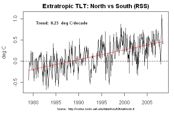
Figure 1. TLT 20-80N minus TLT 20-70S. (Version 3)
I don’t recall this having been mentioned in advance a particular fingerprint of GHG forcing. It’s so prominent that you’d think that it would deserve a little comment in AR4 – has anyone noticed such a discussion – maybe they can point us to a page.
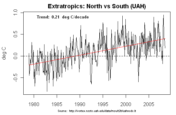
Update: Here’s the corresponding graphic from UAH which is pretty similar. One thing caught my eye in the difference between the two, which may or may not be relevant to the ongoing disputes between the two parties. The UAH differential seems less like a trend and more like a changepoint in the late 1980s, with a new level established in the 1990s and 2000s. RSS nets out about the same, but the transition is more gradual. I have no views on whether one makes more sense than the other, but maybe the explanation of the difference would be interesting. It will be interesting to do similar graphics on the surface records, which I’ll do at some point.
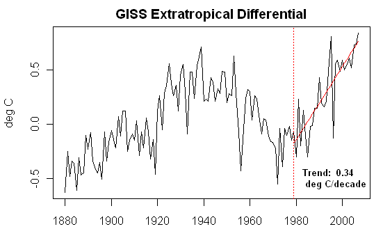
Also here’s the same plot from GISS annual data (24-90N minus 24-90S). Seems to me like I’ve seen a plot like this somewhere before and it caused apoplexy in Team-world.
Update: Atmoz has observed at his blog that wondering about the strength of this trend shows that I must be about the stupidest person in the world and that everyone knows from Meteorology 101 that land warms faster than ocean; that there’s more land in the NH than the SH, so duh!!!
In order to illustrate his point, I have plotted the land-ocean differential in NH and SH extratropics (MSU), which shows that NH extratropical land has warmed by 0.02 deg C/decade relative to NoExt oceans, while SoExt land has cooled by 0.04 deg C/decade relative to SoExt oceans. I’m not sure exactly how this proves Atmoz’ point; I think that Atmoz must be leaving out a step in his proof.


Script:
url=”http://vortex.nsstc.uah.edu/data/msu/t2lt/uahncdc.lt”
fred=readLines(url);N=length(fred)
msu<-read.table(url,header=TRUE,nrow= N-4)
msu<-ts(msu,start=c(1978,12),freq=12)
msu.glb=msu[,”Globe”]
layout(1);par(mar=c(3.5,4,2,1))
ts.plot(msu[,”NoExt”]-msu[,”SoExt”],ylab=”deg C”,xlab=””)
title(“Extratropics: North vs South (UAH)”)
mtext(side=1,paste(“Source: “,url),line=2,cex=.6)
fm=lm(I(msu[,”NoExt”]-msu[,”SoExt”])~time(msu));summary(fm)
# 0.2308 per decade
lines(c(time(msu)),fm$fitted.values,col=2)
abline(h=0,lty=2)
text(1980,0.9,paste(“Trend: “,round(10*coef(fm)[2],2), ” deg C/decade”),pos=4,font=2,cex=.8)
url=”http://www.remss.com/pub/msu/monthly_time_series/RSS_Monthly_MSU_AMSU_Channel_TLT_Anomalies_Land_and_Ocean_v03_1.txt”
tlt3<-read.table(url, skip=3)
dimnames(tlt3)[[2]]<-c(“year”,”month”,”70.80″,”20.20″,”20.80N”,”20.70S”,”60.80N”,”60.70S”,”US”,”NH”,”SH”)
tlt3=ts(tlt3,start=c(1979,1),freq=12)
tlt3.glb=ts(tlt3[,3],start=c(1979,1),freq=12)
# year month 70.80 20.20 20.80N 20.70S 60.80N 60.70S US NH SH
#1979.000 1.000 -0.268 -0.249 -0.498 -0.045 -0.246 -0.392 -3.339 -0.376 -0.156
layout(1);par(mar=c(3.5,4,2,1))
ts.plot(tlt3[,”20.80N”]-tlt3[,”20.70S”],ylab=”deg C”,xlab=””)
title(“Extratropic TLT: North vs South (RSS)”)
mtext(side=1,paste(“Source: “,url),line=2,cex=.6)
fm=lm(I(tlt3[,”20.80N”]-tlt3[,”20.70S”])~time(tlt3));summary(fm)
# 0.2308 per decade
lines(c(time(tlt3)),fm$fitted.values,col=2)
abline(h=0,lty=2)
text(1980,0.9,paste(“Trend: “,round(10*coef(fm)[2],2), ” deg C/decade”),pos=4,font=2,cex=.8)


175 Comments
Steve – Sorry if I am being thick, but what exactly is represented on the y -axis? Is it the NH extratropic anomaly minus the SH extratropic anomaly or something completely different? Maybe a plot showing the NH anomaly and a plot showing the SH anomaly would help.
I haven’t seen any discussion of this. Of course, if Anthropogenic CO2 really does have more than minimal effect, and much more of it is produced in the Northern Hemisphere…
This would tend to destroy the idea of “Well Mixed Green House Gases” though. Since they found clouds of methane occasionally over tropical forests, it is time to give it up anyway. With the AIRS data soon to be available it would seem to be on the way out.
The coldest 10 degrees of the SH is missing which might be important.
My interest in paeleoclimate goes back several decades. It’s well known that the northern and southern hemispheric climates are not closely coupled. What you have noticed is not very surprising, though of course in the context of current climatological “thinking” it is very interesting. Sad too that like the importance of land-use change, it’s ignored in AR4.
The N-S delta is very interesting in terms of historical fluctuations. The earth has small but interesting asymmetries in its poleward heat transfer, with a slight bias towards the north. In entropy terms, if the energy can find a pathway to be slightly biased north, then that’s a more efficient solution. With the same T^4 average and somewhat more efficient poleward distribution, you can increase the T^1 average, which is what we measure. A line of reasoning suggests that the ITCZ was further north in the MWP and south in the LIA.
If there was some mechanism whereby stochastic variations in poleward heat transfer could occur in an order of 5%- which might be larger than makes sense- you could impact N vs S temperatures. Just a thought.
Doesn’t the orbital wobble from the M cycles provide some N-S asymmetry at some periods?
I believe it is mainly the warming in the Arctic (versus the lack of warming in the SH.)
While the RSS sat temps only reach to 82.5N (RSS goes to 82.5N rather than 80N), they are catching a sufficient area of the warming in northern Siberia and the Arctic basin. The 60N to 82.5N has a -2.5C anomaly in the early part of the record and several +2.0C anomalies in the latter part of the record.
The Arctic warming is not enough to account for all the divergence between the two hemispheres but a substantial portion of it.
The lack of any warming at all in the tropics is another topic of interest.
I suspect the delta is largely related to changes in Atlantic circulation and to the difference in land mass fraction between the NH and SH. I have some plots somewhere of AMO behavior for which I’ll search.
This is likely due to the fact that the northern regions are majority land surfaces and the southern regions are mostly ocean. If warming was an extra one Watt, warming of the air would account for less than 10% of that energy. Over land, heating of the air would be roughly 30% to 80% of that one Watt (depending on the availability of near surface water). The land surface should also warm faster than water. The sun’s energy is deposited in the top cm or so of a land surface and in the top 30 m or so of the ocean surface.
Given all that, given that there is a real net long and short wave forcing, the northern hemisphere should warm faster.
Apples and oranges dude. 20 to 80 North versus 20 to 70 South does not compute. The satellites are biased North because we live North. Poor topic.
Steve: These are in anomalies so the slight difference in lat coverage is pretty much immaterial.
steve response to 10
How immaterial? Quantify please.
Faster being the key word. There is no significant SH (extropics) warming over the satellite record (UAH). Which would appear to preclude a global effect operating with different magnitude in the 2 hemispheres. One is left with cause(s) that are hemisphere specific. Given there are many more people in the NH (ex tropics) compared to the SH. I’d look for a cause based on population density.
http://www.junkscience.com/MSU_Temps/UAHMSUSExt.html
#11 the missing area is approx %6 of the total
As any sailor knows, air over land is heated more than air over water. This causes on shore breezes in the morning and off shore breezes in the evening. I think this is a macro version of the same thing, which points to solar heating as the cause. If I’m right, then the trend should reverse over the next 10 years.
>> Of course, if Anthropogenic CO2 really does have more than minimal effect, and much more of it is produced in the Northern Hemisphere…
Speculation without support, because they could not even measure a C02 island over cities. I think it’s generally lower over land, since that’s where the plants are that are sucking it in.
>> 20 to 80 North versus 20 to 70 South does not compute. The satellites are biased North because we live North. Poor topic.
Hardly a poor topic, since he’s measuring the relative change. The difference in areas is irrelevant.
Sorry for the short response in 11. (not really) a few degrees of longitude are a couple of grand of fuel today. (one mile per minute lat at $5.00 per mile). Sixty minutes per degree for you land lubbers. So to truly compare things they should be readily comparable. Ten degrees is not what I would consider negligible.
Steve: NO one’s saying that 10 degrees are negligible; but that’s got nothing to do with what’s going on in this graphic. Enough,
Steve
What is even more interesting is the deviation of the NH and the tropics. According to the AR4 we should see the “Hot Spot” In the Tropical Troposphere. Maybe just me but there are at least 5 things that are currently in disagreement with AR4 and the AWG theory.
1) No Water Vapor Feedback
2) No “Hot Spot” in the tropical troposphere
3) Oceans are not warming eg ARGOS
4) Stratosphere is warming
5) 10 years of Cooling
6) Antarctica is not warming
OOOPPPSS that six dang! My 2 Cents
#15
It may just be that the RSS does not measure that area. Simple maybe Steve is right its immaterial besides it just may make it a larger value and that really doesn’t add anything to the discussion. Maybe -.1 or -.2 less but the point is that there is a large difference.
Bill #9 wrote
I agree.
I think it would happen with either AGW forcing or solar forcing, for example. So, it is not necessarily a “signature” that can easily distinguish between AGW and some natural causes — though, I wouldn’t know that for sure.
One of the dogmas of climate science seems to be that CO2 is “well mixed” in the atmosphere. There was a post over at Anthony Watt;s blog about it which showed an AIRS CO2 map from 2003 which Anthony commented on the disparity in the distribution of CO2.
http://wattsupwiththat.wordpress.com/2008/07/29/co2-well-mixed-or-mixed-signals/#more-1909
The CO2 doesn’t look well mixed at all in terms of N-S hemispheres. It looks (to me) like there could be a 20 ppm difference between the hemispheres. If CO2 is the reason for the temperature difference, would this be enough to account for the differential?
18 (Allen):
It seems that most just takes solar forcing as a given, but there is no or little evidence for any significant solar forcing.
BarryW,
There is indeed a gradient in CO2 concentration between the NH and the SH. Presumably, however, this gradient has existed for some time as it is thought to be related to the difference in land area between the NH and SH. So there may be a difference in absolute temperature between the NH and SH caused by the difference in CO2 concentration. But we are looking at a temperature anomaly so that doesn’t matter. Also, AGW forcing is caused by the ratio of starting to final CO2 which would also not be affected much if at all by the gradient between the NH and SH.
It could be “solar forcing” in the sense of a greater loss of albedo in the NH – ice loss or cloud cover or just lots of black parking lots.
Hey, why not parking lots? Has anyone calculated the growth in m^2 of parking lots? Could be on to something here…
Here’s a comparison of the RSS North-minus-South value and the Atlantic Multidecadal Oscillation (AMO) index. I used 12-month lagging averages for the plot:
An AMO index description and data can be found here . The AMO index is basically detrended North Atlantic SST. R-squared using the smoothed values is 0.69
My conjecture is that much of the AMO (detrended North Atlantic SST) effect is at high northern latitudes, where the heat and moisture released by the ocean have a large impact on both Arctic and Northern Asia temperatures.
David Smith,
Would you please do the same type plot for 60 to 82.5 latitude vs AMO index? The big question I have now is whether the trend in the AMO index has gone negative long term or whether this downturn is just another wiggle on a long term upward trend.
As the NH has much more land coverage, if we were getting more sun over those years, I would expect the NH to be warmer. I would also expect to see the NH cool faster if solar heating diminished globally for the same reason. In other words, I would expect the vast expanse of water in the SH to moderate the changes due to outside influences.
One possible interpretation:
– Barely discernible trend 1979-1997
– El Nino 1998 ushers in upward step change in temperatures, possible link with AMO (#23) and Arctic Oscillation
– Since warmer seas and more intense jet stream/weather patterns in north Atlantic, especially far north, major effect on land temperatures, especially in winter. Land most affected is:
— Land immediately surrounding far north Atlantic
— Large areas of land to east of far north Atlantic i.e. northern Eurasia (prevailing wind from ocean)
— Land in the arctic
— N.b. some limited positive feedback re: reductions in Arctic ice and NH winter snow cover.
(N.b. just noticed this is all very similar to David’s conclusion)
[But is this so unprecedented compared with earlier in the 20th century? Following links may confirm large temperature increases over land concerned in past decades, but also suggest recent levels might not have been so unprecedented:
http://www.arctic.noaa.gov/detect/land-permafrost.shtml (re: Siberia in particular)
http://data.giss.nasa.gov/cgi-bin/gistemp/gistemp_station.py?id=620040300000&data_set=1&num_neighbors=1 (capital of Iceland)
http://data.giss.nasa.gov/cgi-bin/gistemp/gistemp_station.py?id=431042500000&data_set=1&num_neighbors=1 (capital of Greenland)
Of course these limited/cherry-picking data come with all the usual health warnings attached…]
Much more recently, La Nina 2007/8 ushers in a downward step change in temperatures, likely link with PDO.
But my speculation here is that the cooling in the tropics has meant less transport of moist air to higher latitudes, and hence drier/clearer skies at these higher latitudes on average (of course, you might not have sensed this if you live where the jet stream has shifted south recently in the NH e.g. Eastern Canada, UK)
Drier/clearer skies during the recent SH winter would have had a net cooling effect. However, in the NH drier/clearer skies could have explained some of the high positive temperature anomalies over (far) northern landmasses in recent months. Thus, the combined effects could explain the recent peak in Steve’s graph.
My speculation is that this recent divergence is a temporary phenomenon, and drier/clearer skies mean a steep plunge into winter for the NH as heat is radiated back to space at record rates (c.f. http://discover.itsc.uah.edu/amsutemps/execute.csh?amsutemps+002), meanwhile the PDO shift could increase the winter cold for the US with knock-on effects elsewhere. Whether the AMO is due a shift, I’m not sure – history suggests it could be a few more years yet. As for the Arctic Oscillation, I don’t know enough about this – can anyone help?
Of course a new La Nina or El Nino this winter could make things even more interesting……
Note: perhaps the temperature increases of up to 2C or so on the Antarctic Peninsula (associated apparently with warmer local ocean currents and stronger winds) in recent decades support the idea that the SH as a whole would have warmed more as well if it had had more land at higher latitudes. [N.b. the temperature records from the Antarctic Peninsula do not go back far enough for anyone to be able to claim from them that the increases have been unprecedented, and records from further afield suggest a mixed picture….]
We should also expect NH to be cooler when it cools (land effect as well) It should interesting to see August temps (taking a dive now)
Isn’t it one of the standard Hockey Team responses to questions about the medieval wram period to claim thatit was a Northern Hemisphere phenomenon?
Weren’t we told that the satellites were calibrated against the surface measurement somehow – or am I mis-remembering?
From NCDC here, and others, so what can we really read into this
As a comparison with the graph I did a quick and dirty comparison of the North and South hemisphere temperature anomalies from UAH which appears to show that the southern hemisphere has less variation than the northern. Would this be because of the greater heat sink in the southern ocean is less affected by short term effects.
By D.R. Kniveton1 and B.A. Tinsley2 http://www.utdallas.edu/physics/pdf/tin_dcgcc.pdf
‘After the initial citing of the Wilcox effect subsequent studies showed that the amplitude varied, decreasing in the late 1960s and early 1970s before falling below the noise level after 1974 [Williams and Gerety, 1978; Shapiro, 1979]. In common with many other nonstationary statistical climate/solar relationships this prompted claims that the phenomenon was merely a chance coincidence. However the original observations of the effect were in the period of enhanced stratospheric aerosol loading following the explosive volcanic eruption of Agung in 1963 and some smaller eruptions several years later. A reappearance of this effect following the eruption of El Chichon in 1982, and again following Pinatubo in 1991 re-ignited interest in the Wilcox effect. Tinsley et al.[1994] and Kirkland et al. [1996] made the suggestion that an increased stratospheric aerosol loading was a pre-requisite for changes in the global circuit that modify cloud microphysics and cause this effect to occur’
star.arm.ac.uk/slides/epb/seminar1.ppt slide 7 puts all the CO2 forcing figures into perspective. I would not expect the small differences caused by poor CO2 mixing to have a major effect and certainly not as much of an effect as would be caused by the SH maintaining its cloud cover.
Clouds, low level clouds, set the thermostat: clouds form more or less readily depending on the number and type of aerosols in the atmosphere. So changes in the aerosol population act like changing the signal on the triode of a thermionic valve — they are the amplifier of change.
I can’t find aerosol population studies for the North and South Hemispheres, but there must be, somewhere, figures for cloud cover. My google-fu has failed me.
JF
I’ve not yet had time to study all the posts above in detail, but there is a point for some contributors like David Smith at # 8.
We have 30 years of satellite measurements graphed. The area of land to the area of sea has not changed much in centuries, so surely this trend from this mechanism would be ongoing and there would be a huge difference by now. There has to be a feedback or other effect not evident in the data as plotted.
I like post # 31 oldjim more.
The fluctuations in the monthly data are rather fast and do not suggest a steady, unrelenting trapping of heat by GHGs.
It would be interesting to look at absolute temps rather than anomalies as the crossover about 1988 might be artificial.
Post 16:
1) No Water Vapor Feedback
I’m not sure what you mean exactly with this, but I’m pretty sure there were satellite measurements by the end of the 80s showing the role of water vapour on the greenhouse effect.
3) Oceans are not warming eg ARGOS
There were several publications in 2008 showing an increase in the global heat content of the oceans during the last 30 years or so.
4) Stratosphere is warming
The last time I took a look it had been cooling for a while. What are your sources?
5) 10 years of Cooling
This result is not robust and due only to the strong 98 el nino. If you start in 1999, you get heating.
6) Antarctica is not warming
Really? I remember well some results about the antarctica warming rapidly (look at this for example)
Josh Willis mentioned over at dotearth that during positive PDO periods, the rate of temp change goes up, during negative phases it goes down. During most of the period of Steve’s chart the PDO was in a positive phase. Thus the 0.75 in 30 years is on the high side and not indicative of what’s to come.
17 Jim,
It is immaterial to this discussion but with an equal area comparison it could lead to other discussions. Disproportionate warming should be an indication of natural variation of climate. There is a jump in 1989-91 that could easily be related to the 3.0 C jump in northern Europe at that time. A jump definitely not due to GHG’s. That jump would be more pronounced with the added ten degrees Lat of the SH’s coldest region.
Equal area comparison of N v S temperature trends is interesting to me at least.
And an interesting one. Consider the natural (unforced) behavior of the northern circumpolar vortex.
Couple with #29 Paul’s observation (that NH-localized MWP is a Team belief). Is CWP is a MWP analog?
MSU July 2008 results are out!
http://vortex.nsstc.uah.edu/data/msu/t2lt/uahncdc.lt
Since the majority of the earth’s land mass is in the NH, I believe that there is enough evidence (Pielke Sr et al) to suggest that land use method affects albedo and thereby affects measured temperature. Secondly, being in the warm phase of the AMO, it is intuitive that the land mass downstream from the north Atlantic is affected by the warmer than normal waters.
#40 Note continuing convergence of NH and SH, now only 0.09C apart
(Also might have to re-think strength of arguments about heatwaves over northern landmasses being such a significant factor in past month, since MSU results show NH land +0.23, SH land +0.26…)
Same goes for Northern and Southern Extra Tropics: now only 0.18C apart
Here’s the link again to get MSU July 2008 data
http://vortex.nsstc.uah.edu/data/msu/t2lt/uahncdc.lt
Re21
Without seeing the changes over time I can’t disprove your statement, but if you look at the map I referenced the areas of high CO2 are a band right across the industrialized areas of the NH. The SH high spot is right where Argentina sits. If it were just land I don’t think there would be such obvious concentrations.
UAH MSU temp: where is the error?
According to http://vortex.nsstc.uah.edu/data/msu/t2lt/uahncdc.lt , the July anomaly is 0.06
According to http://vortex.nsstc.uah.edu/public/msu/t2lt/tltglhmam_5.2 , the anomaly is 0.048
Post 34
1. Antarctica is cooling over the last 40 years FYI http://www.worldclimatereport.com/index.php/2007/09/05/antarctica-warming-cooling-or-both/ or http://www.nature.com/nature/journal/v415/n6871/full/nature710.html.
“Rapid warming” is observable only in Antarctic Peninsula, very small portion of the continent, while over 95% of the continent exhibit cooling.
2. According to RSS data stratospheric trend is flat since 1993.
3. Cooling in the last 10 years. If you start in 2001 you again get cooling, and since 2002 you have very strong cooling.
Solar. Cleaner air over last 30 years. More sunlight reaches land. Air was dirtier over NH.
http://www.dailytech.com/Europes+Warming+Attributed+to+Cleaner+Air+Not+Climate+Change/article12371.htm
re: #46
Paolo, just taking a quick look, but looks like one dataset is lower trop, and the other is surface temperatre.
#49 Don’t think it can be that because the previous months all match to 2 decimal places. Though having said that, looking back to 2007 I’ve spotted at a couple of months where there is a discrepancy of approx. 0.01 out (May and June) Can’t think of an obvious good reason?
(In any event I don’t think there’s any doubt that both sets of figures are for LT)
maybe I’m naive but it seems to me that the Antarctic cooling while the rest of Earth has warmed, has got to be responsible for the N-S relative temp changes? Svensmark suggests that when high solar magnetic flux bats away cosmic rays, cloud cover decreases, thereby lowering albedo for the rest of the world but increasing albedo over huge, ice-capped Antarctica. And we’ve had times of high magnetic flux recent enough for its effects to be still playing out, allowing for thermal inertia factors.
#34
Go to Dr Roger Pielke Sr. blog and that should answer your questions.
http://climatesci.org/
National Geographic page for Temperature data please.
Pielke has papers on all these areas so no need to go into any detail.
Some of you have mentioned solar. That’s on the table. No DEBATING solar on this thread. Stay in your own threads.
I’ve added a graphic showing the GISS differential. Again remarkable looking results. This is a pretty elementary calculation. Surely it’s discussed in the literature and I’d appreciate any references.
uahncdc.lt tltglhmam_5.2
2008 1 -0.05 2008 1 -0.046
2008 2 0.03 2008 2 0.020
2008 3 0.09 2008 3 0.089
2008 4 0.02 2008 4 0.015
2008 5 -0.18 2008 5 -0.183
2008 6 -0.11 2008 6 -0.114
2008 7 0.06 2008 7 0.048
And looking back farther, there is enough differences to know that it isn’t a rounding up/down issue. So what is it?
Did my post showing the difference between USA48 and Southern Extra Tropics disappear, or did it never make it to begin with? I posted it from home before leaving for school, and it appeared to me to have posted. But now that I’m at school, I don’t see it.
I don’t think I said anything about solar.
Below is a note in UAH’s Global Temperature Reports (not released for July yet) eg. http://climate.uah.edu/june2008.htm
“The processed temperature data is available on-line at:
vortex.nsstc.uah.edu/data/msu/t2lt/uahncdc.lt”
Fred #53,
as far as 2008 is concerned, besides July, the other difference is in February, 0.03 vs 0.02.
In the February report, the preliminary anomaly is 0.03; in the March report, the revised anomaly is 0.02. Maybe, this is the reason for the February difference.
I don’t know the reason for the July difference.
So which dataset to use, that is the question.
Fred
Your link to the data is broken because it has an extra slash at the end.
DAvid, can you refresh us with the operational definition of the AMO, which as I recall is a temperature difference between the North Atlantic and the tropical Atlantic or something like that. So to that extent, the similarity is something that is almost by definition. The most intriguing difference is in the 19th century? Why do they track so well until 1900 and then diverge? I wonder if it’s bucket adjustments.
Steve,
I’m glad you started a post on this. About 3 months ago, I reported trend data (C/dec) for NH, SH, and the tropics based on RSS data on RC and WUWT. What is really interesting is that the warming trend in the tropics is the average of the NH trend and the SH trend (of course, the SH trend is essentially zero), AND the warming trend in the tropics is the same as the global trend. Really weird. It was like the tropic temperature was a 50:50 mixture of NH and SH air (which it is in a way). By the way, I too reported the step change in the NH anomaly starting in the early 1990’s.
Anyway, I speculated 3 reasons for the NH/SH disperancy: less production of sulfates in the NH, which is the source of 85% of all sulfate emissions (particularly after the enactment of the 1990 Clear Air Act and the fall of the Soviet Union), hotter sun over land (i.e., solar effects affecting the NH), and last, the SH oceans providing a negative feedback loop that counteracts CO2-driven warming.
Thus, I claim that I raised this issue first on the blogs! (In reality, like you say, people have pointed out these anomalies before, I just took it one step further). Again, thanks for following my lead. People respect your work. On RC, all I got was derision (of course, I made a comment along the lines that if climate modelers can’t explain this phenomena, how can we trust their models?).
If the NH-SH anomaly difference was basically due to land warming faster than the oceans (as discussed in AR4), I think we should also see more warming in the southern hemisphere over land than over the ocean. UHA rather shows the opposite.
SH land trend: 0.05
SH ocean trend: 0.07
SH Extr. land trend: 0.03
SH Extr. ocean trend: 0.07
In the SH more warming seems to have taken place over the oceans than over land.
Re #60 Steve, you’re correct about there being a relationship almost by definition, since the AMO index is the detrended Atlantic SST and the North Atlantic constitutes 20-25% of the Northern Hemisphere.
But, I believe that the AMO index is a proxy for thermohaline variation (there is no direct instrumental measurement of thermohaline activity). Here are a few NOAA comments :
and
When I use the AMO index I see it as a measure of thermohaline activity, activity which has naturally oscillated for a long time.
So, my suggestion is that natural thermohaline variation drives Atlantic SST variation which drives Northern Hemisphere temperature variation which drives the contrast between north and south. Thermohaline variation may also drive Southern Hemisphere temperatures by changing the amount of cold water which upwells. Increased thermohaline activity would increase cold upwelling in the South while increasing heat transport towards the Arctic, amplifying the contrast between north and south.
The evidence offered is indeed weak because North Atlantic temperature is part of both the AMO index and the RSS data. However, I do find it to be suggestive of a thermohaline role. If I get time later this weekend I’ll see if I can construct a Pacific detrended index and compare that with the NH/SH differential.
On the nineteeth century data, the AMO index looks reasonable to me as it tends to match the hurricane records (poor as they are). I suspect the GISS values are a bit wacky, which would not be a surprise because they involve SH temperature reconstructions where data was quite sparse.
From Kerr (2000):
Iceland vs Lisbon is the leading EOF for SLPs in the North Atlantic.
#64
Again, note deep ocean circulation – Wunsch’s baby – being cited as a key driver of AMO LTP.
And this, from Kerr (2000) supports David Smith’s #63 speculation on THC connection:
Whereas long-term climate records are limited to Earth’s surface, sophisticated climate models use basic physics to build an ocean interior that can be probed for signs of what makes an oscillation tick. In the case of the GFDL model, the AMO seen at the surface reflects a “clock” within the ocean that’s “wound” by the atmosphere’s NAO. The NAO’s seesawing atmospheric pressure alternately cranks up and weakens the cold winds that blow out of the west across the Labrador Sea. The harder they blow, the more heat they extract from surface waters, the denser those waters become, and the easier it becomes for them to sink into the deep sea, drawing more warm water from the south through the Gulf Stream. Thus, in the model, the NAO has a hand on the control valve of the North Atlantic’s so-called thermohaline circulation (THC), in which warm water flows north, cools, sinks, and heads back south through the deep sea.
It seems quite inappropriate to speak of “trends” over a few decades, as if they can be projected into the future. Clearly, there are strong multidecadal oscillations, of which many erudites speak, but few provide any convincing explanation. Wouldn’t it be be better to refer to such enigmatic variations as “swings?”
Atmoz in #67 says the NH is warming faster because it has more Land than the SH and Land warms faster than the Ocean.
The UAH data shows the NH Ocean is warming by 0.1C per decade faster than the SH Ocean and the NH Land is warming by 0.18C per decade faster than SH Land. In total, the NH is warming by 0.13C per decade faster than the SH.
So, I guess there is something to Atmoz’s statement.
John S#68
You said “swings”. This is a recurrent theme. IMO, it is best translated as “What is the signal?”. From the IPCC, “most” of the warming in the latter part of the 20th century warming was anthropogenic. Not to start an argument about “most”, or “latter”, or what constitutes “warming”. These swings are usually termed as noise (weather), with what we are trying to determine is the signal (climate). To further compound the problem, have been those who have chosen “unique” recent events that show “unprecedented” warming (actually noise), as proof of this signal while ignoring and/or refusing to publish equally valid “noise”, or recorded data, that shows the event is not unprecedented, which contradicts the claim of “unprecedented” wrt signal.
However, I would like you to consider one of the inseparable, at present, quantifiable problems about considering “trends” that are longer than a few decades.1)Few, if any, credible scientists claim that it has not been warming since the little ice age (LIA). 2) most everybody agrees that there are long term trends, usually referred to as “in the pipe(line).” When you consider that these two statements have few, if any supported contrarians, and even more important, less quantified data showing that trends have to be short term, just where did all “in the pipeline” warming stop, when did the antropogenic warming start; and not only how do you measure this, but how did you separate the warming signal of the LIA, from the anthropogenic warming signal? Especially since few disagree that some of, if not most of , especially if you believe in “tipping points”, the signal is still “in the pipe(line).”
The question is still, how do you separate the noise from the signal, and more importantly, how do you prove that you are correct?
Looking at these trends from about 1980 shows an increase. This is very similar to looking at hurricanes from 1979. However if you look at the last 10 years (which may not be significant statistically) you may notice a topping off.
In my post , I noted:
This seemed like a large divergence to me and I presumed that there would be some discussion of this in IPCC AR4 and asked if anyone had a relevant page reference. The closest that I was able to locate was the following in the section entitled “Consistency between Land and Ocean Surface Temperature Changes”
Elsewhere they say:
Atmoz has observed that this is meteorology 101:
OK, that’s a reasonable enough observation as far as it goes. A differential between land and ocean trends is certainly relevant. However, the point about NH-SH differentials is one that crops up in MWP discussion (e.g. Newton et al 2006), so that’s a perspective that I tend to bring.
It also raises the question why land and sea records so much more coherent in the first part of the century? By Atmoz’ reasoning, shouldn’t the land records have led the ocean records according to the Meteorology 101 theory? I’m not arguing the point, just asking. If the land records didn’t lead the ocean records, why not? Is it possible that the bucket adjustments aren’t right Just asking.
Another question – MSU breaks out their NoExt and SoExt data by land and ocean. The N-S trend differential for land is 0.25 deg C/decade while the N-S trend differential for oceans is 0.19 deg C/decade. So there’s a slight difference, but not all that much. I presume that the retort is that SH land takes on the characteristics of the adjacent ocean, which is fair enough. But then if you did have divergence between the hemispheres (and I’m thinking mathematically here), wouldn’t that cause a land-ocean differential? I’m not asserting this – just wondering.
I finally solved a problem in A First Course in Atmospheric Radiation involving energy flow from the tropics to the poles. The problem is based on this graph (Fig. 1.1, p4), modified to include annual average insolation at the top of the atmosphere.
The lines represent total insolation at the TOA, absorbed incoming SW solar radiation, emitted LW radiation, and difference between absorbed and emitted. Note that there is less emitted radiation in the tropics than is absorbed and more emitted radiation at high latitudes than is absorbed. The heat transfer that allows this can be calculated from the area of the deficit in each hemisphere. The maximum rate of power transfer to the north and south in Watts is almost identical, ~5.24 PW (compared to 124 PW total absorbed), but the surface area where there is excess outgoing radiation is smaller in the north than the south which contributes to emitted radiation and hence brightness temperature being higher in the north than the south.
The dip in the tropics in OLR appears to correspond with the dip in forcing in the GISS graph I posted somewhere else. This dip seems also to be associated with a small increase in albedo at the same latitude. The variation in albedo with latitude is also quite large with the high southern latitudes exhibiting a much higher albedo, ~0.7 compared to 0.55 for the high northern latitudes.
The relative flatness of the OLR curve means that, at the TOA anyway, the planet is to all intents isothermal. The surface temperature is another story. Using MODTRAN, for tropical conditions the clear sky surface temperature must be 300.7 K to get the equivalent (MODTRAN flux corrected for the missing part of the spectrum at short wavelengths, less than about 6.7 micrometers) of 310 W/m2 OLR as in the graph compared to a TOA brightness temperature of 259 K. For sub-arctic conditions averaging summer and winter, the surface temperature is about 262 K and the TOA brightness temperature is about 247 K for about 210 W/m2 OLR, assuming I did the calculations correctly which has often not been the case so corrections are appreciated.
FYI,
RSS has land plus ocean, land only and ocean only on separate pages.
#73. How do you determine how much energy distributes poleward in this setup?
#74. I recall seeing an article recently by some guys in Boulder (I think) saying that changes in ocean temperatures were the source of all changes, but I’ve blanked on who it was. I’ve got the words Camp.. Sarru… in my head but I’m not sure. I meant to read it but got distracted.
DAvid Smith discussed a similar point here
http://wattsupwiththat.wordpress.com/2008/04/14/curiosities-mixed-signals-in-land-and-ocean-temps/
#76 Steve,
Look here at Anthony’s for the paper you are thinking of.
Now, I think this is on-topic. The magnitude of the difference between NXT and SXT temperature changes is not nearly as great when looking specifically at the continental US. UAH has a time series specifically for the continental USA (”USA48″). I did this last night, before the July data was available, so it is only through June:

There is clearly greater warming going on in the Northern extra tropics, but not necessarily in the continental US. So where is it concentrated? Europe? Asia?
Steve: Yes, thanks for the ref. I don’t get the point of the US comparison.
It’s done by finding the total area of the negative flux difference in each hemisphere. I do this somewhat crudely by starting at 90 N or -90 S and taking the average of the absorbed – emitted flux in 5 degree bands ((F(90)+F(85))/2, e.g.) then multiplying it by the total surface area in each band to get total power. Continue this process until you get to the latitude where the difference between emitted and absorbed is zero and sum the results. This gives you the rate of transfer at the latitude where the difference between absorbed and emitted is zero, which is also the maximum rate of transfer. Explaining why this is so is part b of the problem for students in the book. The two latitudes are about -35 and 38.5. I’m picking points off the graph, which isn’t all that large and doing a fairly crude integration so there are discrepancies in total power and average flux for each line. But it’s surprisingly close. The global average flux density in each case is close to 240 W/m2.
Atmoz has observed at his blog that wondering about the strength of this trend shows that I must be about the stupidest person in the world and that everyone knows from Meteorology 101 that land warms faster than ocean; that there’s more land in the NH than the SH, so duh!!!
In order to illustrate his point, I have plotted the land-ocean differential in NH and SH extratropics (MSU), which shows that NH extratropical land has warmed by 0.02 deg C/decade relative to NoExt oceans, while SoExt land has cooled by 0.04 deg C/decade relative to SoExt oceans. I’m not sure exactly how this proves Atmoz’ point.
On the face of it, land and ocean in the respective hemisphere are pretty much in step. I’m not saying that you can’t reconcile these results on the basis of land-ocean, but, once again, in math terms, the land and ocean are moving together in their respective hemispheres. I’m not asserting the opposite – just wondering.
Bruce,
Given the Asian brown cloud, who says the air is, in fact, cleaner in the NH as a whole. Europe and USA, yes. ROW, not so much.
Steve # 72 and 80,
First, I hope that you remember that ATMOZ (Nate) is the same person who turned out to be a student masquerading about the net as a scientist. You are dealing with an environmental campaigner who is not intrested in the truth, but gaining power for his belief system and he will say or do anything to further his cause. Here he seems to be begging for attention using the same tactic recently started by Tamino; insult the host and the posters. Hopefully you will learn to ignore him.
Now to the fun stuff; you might consider that the NH (and land) warmed faster in the last 30 years because a warming ocean puts more water vapor into the atmosphere. That was the point made by the guy at Boulder who you were asking about; Campos.
You might also consider how the oceans work, specifically how the weather patterns affect the ocean (equatorward winds cause upwelling, especially on the west coasts of continents etc etc etc) then you get to figure what the winds do with THAT cooler or warmer air. You will also find another feedback in this area of climate science (warming creates stronger equatorward winds which creates more upwelling / cooling)
Bob Tisdale has some very preliminary work on the individual oceans on Jennifer Marohasy’s blog in the last few days. Have fun, it’s gonna open up a whole new world for you.
Massaging the data I used above a little further. I integrated emission and absorption for each hemisphere separately. It turns out that the NH absorbs slightly more than it emits and the SH emits slightly more than it absorbs. I doubt the difference is actually significant because I don’t know the accuracy of the data to start with, much less how much error I introduced in my crude digitization process. Not to mention that total emission and absorption didn’t balance so I normalized the emission to the same total as the absorption. If it is real, though, then likely someone who has access to better data already knows about it.
The only stupid thing here is to perpetuate the myth that land troposphere is decoupled from the surrounding ocean troposphere.
Short term swings can and are decoupled and land variance is greater, but long term and climate variability must behave in the same way. No wall is in between. And, of course, ocean sst is what drives the temperature of ocean troposphere itself, of land troposphere too and, finally, the whole Earth. Land vegetation cover and use changes do have some influence, but northern land masses can drive global climate only when they change their ice cap cover.
Another myth is the “heat in the pipeline”, with oceans storing some of the current extra forcing for a future dramatic warming. Since when an extensive and valid system to measure the ocean heat content has been estabilished, heat hasn’t been accumulating in the oceans. To think of some problem of measurement in the past (bucket) is the only rational thing to do.
After excluding the different properties of land in order to explain the differential warming of the NH with respect to its southern counterpart, it is well estabilished in the literature that the NH gains extra warming from the SH via ocean-atmosphere circulation and that the strength of that circulation determines the differential heat content of the two hemispheres. William Gray docet.
Steve,
The purpose of my chart was to show that the difference was not strictly latitudinal. Some portions of the NXT — the continental US is a fair piece of it — are not warming that much faster than the SXT. So any explanation for the N/S difference you are drawing attention to should take that into consideration.
I think Hurst exponents are informative here. The following are all for selected UAH series (through June)
Globe: 0.9057
Northern Extra Tropics: 0.967697Tropics: 0.732871Southern Extra Tropics: 0.862738
Northern Extra Tropics, Ocean: 0.986821Northern Extra Tropics, Land: 0.918612
Tropics, Ocean: 0.721679Tropics, Land: 0.752451
Southern Extra Tropics, Ocean: 0.911177Southern Extra Tropics, Land: 0.703744
USA48: 0.765931
In the extra tropics, both north and south, trends are more percent for ocean than for land. The exponent for USA48 isn’t that much different than for SXT land, or the tropics, either — all three in the 70’s. For for NXT land overall it is 0.92. I think Paolo’s emphasis upon the role of ocean currents in climatology can be seen in all this.
Paolo (#84),
Is more heat brought into the NH in such a way (Gulf Stream) that it would cause some land masses (Europe) to warm more rapidly than others (US)?
Well, the “br” tahs worked in preview. I hope you can make sense of the numbers.
Basil, since the air flows eastward and the Atlantic basin has the main role in sucking heat from the south, I think it’s easy with a climate model to show that Europe and northern Asia have a larger impact.
Re #80: Why do you think that the land and the sea in both hemisphere’s would not be in step? Do you think that they are not coupled (and yes MET 101 explains why the coupling across the Equator is weaker)? Given that you can figure on the back of an envelope that the total heat capacity of the hemisphere with the larger amount of ocean will be larger.
#88 E-Lie,
Your question assumes that the oceans behave the same. It has little to do with the damping effect that water has compared to land, more to do with upwelling, geography, weather patterns and etc.
#88. As a general policy, I try to avoid advancing personal theories; I’ve resisted requests to present my own reconstruction of climate history; and try to focus on statistical analysis of studies relied upon by IPCC. In my post, I presumed that the differential was well understood and requested a relevant page reference in IPCC.
If, as you say, the results are readily explained by a calculation of hemispheric heat capacities, and I have no reason to doubt your word on this, then all the more reason to presume that there would be a clear discussion of the matter in IPCC, together with a relevant figure illustrating the point. Subsequently, I’ve identified Figure 3.8, together with a couple of covering sentences, as touching on the issue, but this discussion does not contain the heat capacity calculation that you say is relevant. Perhaps you can direct me to the relevant section that contains the analysis in the form that you recommend.
While it may be possible for you to do the relevant calculation on the back of an envelope (and I have no reason to doubt you), you will understand that I am more interested in an official IPCC calculation – no offence intended. My understanding of IPCC reports is that they are written with policy makers in mind, and, if a scientist reporting to a policy maker told the policy maker to go take a Met 101 class if he wanted an explanation of a relevant matter, the policy maker would rightly find that a saucy and unresponsive answer and think poorly of the scientist in question. I don;t think that a policy maker would have any reason to have an independent opinion on whether the trend differential should be 0.1 deg C/decade or 0.3 deg C per decade due to differences in heat capacity nor an opinion on how long such a differential could be expected to persist.
As I noted above, the difference seemed large enough that I presumed that IPCC would provide an explanation without telling policy makers to do the calculation themselves.
Part of my surprise at the size of the differential also relates to the fact that the two data sets seemed to move in relatively close unison in the earlier part of the century, a period where I had considered bucket adjustments. If the experience of the past 30 years is due to land warming faster (and I have no reason to doubt that explanation), shouldn’t the same thing have occurred in the first part of the 20th century, in which case, shouldn’t the land temperatures lead the ocean temperatures, as opposed to the seeming synchronous increase? Again, I’m not advocating any particular alternative, just seeking to understand the matter and to obtain relevant references within IPCC literature.
Am I reading too much into the word “present”? To me it sounds like you have a reconstruction that you have not shared. But what you may mean is that you’ve resisted the temptation to create one.
Just curious (though if you have one, I see no reason not to post the code and the data and let people try to punch holes in it).
–t
Steve: Nothing that I’m holding back. I’ve done experiments on the impact of slight variations of proxy choices, some of which I’ve reported on and some of which I’m still experimenting with. Until specialists reconcile contrary results from say Polar Urals and Yamal, or Ababneh and Graybill, etc etc, I don’t really see how the field can advance.
Steve # 90,
“Part of my surprise at the size of the differential also relates to the fact that the two data sets seemed to move in relatively close unison in the earlier part of the century, a period where I had considered bucket adjustments.”
Try Smith @ Reynolds, they dampen the signal as it goes farther back in time. The practice seems to be more and more common.
Also, to further my point in 89, the Distinguished Professor Halpern might remember that the highs on land are not just higher, but the lows are lower. I am sure his fake climate scientist buddy can find discussion about the cause of on-shore and off-shore flow (and why it is different between day and night) in a met-101 textbook. If he can’t then try placing a call to Carl Muench, I hear he’s looking for friends on Eli’s side of the aisle lately.
Steve: Can you give me a precise Smith-Reynolds page reference for the point in question. Also, I’m not trying to argue my own interpretation of these issues; they are not ones that I’ve examined. I was simply looking for relevant references in IPCC AR4, reading the references being something that Eli always encourages and I’m sure that he’ll accommodate us with an exact page reference where IPCC provides the heat capacity calculation done the way Eli says the calculation should be done.
I’m gonna go diggin, yer gonna owe me a beer.
*92 Mike C
Why do they dampen the signal? And why do it more and more often (common)?
It appears that the “back of the envelope” might have to be the size of a football field.
Eli has posted over at the Atmoz site a treatise that starts:
#90 Steve,
I think a case can be made that the same thing did happen in the earlier part of the century. There was a sharp rise in the 1920’s (and a drop in the 1960’s):
I haven’t looked to see if there are leads or lags, though.
Steve,… here’s the link, it starts in the abstract and continues to the conclusion.
Click to access Smith-Reynolds-dataset-2005.pdf
That’ll be a Heinekin with a slice of lime please.
John F Pittman,
They dampen the signal as part of filling in missing data… which is substantial early in the record.
I would bet that it is popular because; It’s probably the best way to infil missing data… and the more conspiratorial minded among us would say that it is how they can artificially eliminate natural variation so they don’t have to explain anomalies to AGW theory such as the mid-20th century cooling period or the regime shifts noted in Karl et al 2000.
John M 95,
I read his post and just about fell out of my chair laughing. He still has NO clue.
John Pittman (Re: #70),
Most geophysical signals are richly laden with oscillatory components over a wide range of frequencies. Climatic time series are no exception, with widely-recognized quasi-biennial oscillations (QBO), ENSO, PDO, NAO, and onward into the little understood very low frequencies(VLF). My point is that linear regression (LR)is grossly inadequate in analyzing such series, which are not at all a simple superposition of a trending “signal” and some white noise. Take a pure sinusoid, for example, and apply LR on a moving basis, with a time-frame less than the period. One gets oscillatory, sign-changing determinations of “trend,” whose amplitude and phase delay are purely the product of the chosen time-frame. Now take a time-frames
longer than the period. The amplitude progressively decreases and the phase delay increases, but the oscillation remains fixed by the sinusoid. Such results, of course are nonsense, from a comprehensive analytical perspective.
This why the analysis of variance in time series is done in spectral terms. The discrimination between signal and noise becomes a matter of perspective. If one is interested in discerning, say, edge waves on a continental shelf, than tides and sea-swell constitute “noise,” although they are unquestionably physical components of the surface-elevation record. Thus frequency discrimination enters into the picture. Pure linear trends
leave a distinctive signature in the power spectrum of first-differences of the record, because they are reduced to constant biases of mean. When comparing two time series, cross-spectral coherence–the analog of the familiar correlation coefficient R–is then unity at zero frwquency. One does not find anything close to such a result in cross-pectrum analyzing co2 and T.
Basil #85 et al
I have spent the morning trying to dumb down the argument for myself so that I have a reasonable chance of advancing my knowledge as this debate goes on.
If our world was perfectly symmetric and had a mirror of land masses in NH and SH, revolving about the sun where radiative forcing from our sun were exactly equal in summer/winter what could you say about all the observations that are being debated? If observations in the NH showed a warming trend relative to the SH over a long time period using a variety of independent tests, one could go searching for the cause. For example if there were more people, industry etc in the NH we might look at the NH as a place where humans were leaving a footprint, and I would find purpose in changing my career to look for ways to mitigate the imbalance.
Alas, as with any real life experiment our planet exhibits none of the regularity that I would need to quit my day job. The world is constantly in a state of disequilibrium; ying and yang constantly competing with one another and I have to remind myself daily of that fact.
Great thread. Lurk on.
100, Lurker hengav,
Maybe a good idea is to understand how the oceans work.
First you might try to understand how high and low pressure systems work
Next, do some research on ocean gyres, Ekman transport, coriolis effect and etc.
Then get an idea of the basic ocean currents and how they are affected by winds, which are a product of different pressure systems.
Then research ocean upwelling and how wind changes the 3 different basic types of upwelling.
Then think different oceans…
The speed of the North Atlantic Drift Current varies depending on the winds that drive it. The winds vary depending on the polar low (often called the Iceland low) and the subtropical high. The NADC brings heat north from the tropics, the faster it moves, the more heat transported. BUT THE MOST IMPORTANT THING IS that the equator-ward transport of cold water occurs at the bottom of the ocean.
In the North Pacific, associated with the PDO is a southerly current along the North American west coast, which brings cold water from higher latitudes and Deep Ocean towards the equator at the surface.
Similarly, the Southern oceans have mechanisms for surface transport of equator ward cold water.
These are not inclusive of all of the currents and upwellings but should give you a general idea.
So the answer to the question, why the N and S hemispheres heat differently, is an imbalance in the surface transport of cold (and warm) water between the N and S hemispheres, primarily caused by the different transport mechanism in the North Atlantic and the winds and pressure systems that affect the speed of its oscillation.
Mike C No. 98.
I didn’t conclude he doesn’t have a clue. It’s just the difference in approach.
Here: You guys are just a bunch of idiots. If the problem wasn’t so elemantary and if I wasn’t so smart, I might take the time to teach you.
There: Let me show you how smart I am. Blah, blah, blah, OTOH, yadda, yadda yadda…zz-z-z-z-z.
Whoops!
Elementary, and it could have been worse!
John M,
Well, you may not have concluded that but I did. I laid it all out in 101. Eli is arguing that the N heats faster than the S because there is more land there, it’s not an approach, it’s incorrect. It has nothing to do with the difference in land mass between the hemispheres, it has to do with how the oceans transport heat… duh, that’s just e-l-u-m-e-n-t-e-r-y… well, maybe 1st year college Earth Sci.
Steve– please don’t do foolish little word games even with Eli,
Mike C,
Aren’t all those things you mention different between the two hemispheres because of the relative amounts and position of land and ocean?
John M,
You need to make a very important distinction here… it is not amount and position, it is position.
Steve Mc, that was a joke with John M who mispelled the word then came back and corrected himself in a humorous (and classy) way.
Comment 82
Mike C: Thanks for the kind words, but let me clarify my use of the word preliminary in those guest posts at JenniferMarohasy and in my follow-up comments. In my blogspot series on Smith and Reynolds SST data, I have two preliminary posts. They’re on North and South Pacific SST anomalies, where I’ve segmented them by 10 degree longitude bands. They’re listed as preliminary because I haven’t had the time to finish the accompanying description and I haven’t double checked the text on the graphs. I used one of the graphs from those preliminary posts in my posts at JenniferMarohasy. I did, however, check that graph before I posted it there.
I also used the word preliminary in a follow-up comment to Steve Short. It pertained to a new data set I posted as an attachment. I consider it preliminary since I haven’t yet created a post on the “weighted average of NINO1+2+3+4” data. It’s an interesting data set.
Other than that, the rest of my series on Smith and Reynolds are as done as I’m going to take them.
Link to the overview of my 20+ posts (and growing) blogspot series on ERSST:
http://bobtisdale.blogspot.com/2008/06/smith-and-reynolds-sst-posts.html
Also, I enjoy your discussions with the others about confidence levels, dampening, etc, but let me say this: The ERSST.v2 data available through NOMADS is the only easily retrievable SST data set, and my posts contain information that has not been presented before. Take the time and look. If you have a concern, leave a comment. As far as I know, it’s the only series on SST data subsets.
I have been doing a little analysis and don’t know if its worth mentioning or not.
The North Ext area has large areas of desert, Sahara, Saudi Peninsula, Gobi, Afghanistan, and a large desert south of Urumuqi. The South Ext has only one large desert area located in Australia. What would be an interesting exercise is to divide the MSU data into more subsections e.g. Europe, Sahara, West Asia and East Asia. The Lower 48 already has its own data map. Maybe it will pinpoint more accurately where the NorExt hot spots are.
Steve
Steve Mc: Such plots already exist. The high trends have been discussed in many places – Siberia, Arctic.
Steve: I could run something in parallel if you want using the GHCN data on NOMADS. The data starts in Jan 1880 and ends in March 2004 (the drawback). It would take only a few minutes for me to download it since I’m familiar with the system, and I could email the raw data in a spreadsheet tomorrow morning. (I believe I still have your email.) All I need are coordinates for the areas you’re studying.
There should also be precip data for your deserts, though I’m not sure of the start and end dates.
Regards.
Bob Tisdale,
When I used the word “preliminary” it was my view, not related to your use of the word. The observations you are researching are a good starting point to understanding how upwelling affects global temperatures over the short and long term. Most of the modelers I have spoken to (most are staunch AGW advocates) have a basic handle on how this works but their computers are programmed with the GHG and anthropogenic aerosol effects set to the wrong levels resulting in weird regional problems ie (Sahara Desert being a jungle). Sceptics have been saying for years that the GHG’s are set too high and the aerosols are the only thing that prevent a runaway greenhouse efect. What the sceptics never offered was the correct formula which I believe involves that cold upwelling water. Hopefully the Campos paper will have enough of an impact on the modeling world to get them all to plug in the correct assumptions for GHGs and aerosols.
By the way, have you seen the Pacific / equitorial cross section at Nino 1 + 2 lately? Did ya see what’s peekin?
Here’s an unusual plot. I compared the North Atlantic Oscillation (“NAO”) index with the North-South GISS extratropical differential (“N-S”) for 1880-2007, allowing the NAO to lead N-S. The plot shows the r-squared value for NAO lead times of zero to 30 years. (Notes: the NAO and N-S values are five-year smoothed values. The NAO is based on air-pressure differences in the three winter months of each year.)
The NAO is thought to affect thermohaline activity, as the NAO affects wind strength in the Labrador Sea. This wind strength affects evaporation, salinity, deep water formation, thermohaline strength and ultimately Atlantic SST (Latif et al) .
Here’s the plot:
This seems to indicate that changes in the NAO are related to changes in the N-S differential ten to twenty years later. Correlation, of course, is not causation but it’s an intriguing plot nevertheless.
Bob
I was thinking of the Satellite Data rather then ground based data.
Steve M
I haven’t seen any MSU data sets for these areas – not that they don’t exist of course. I know where he data is but I don’t have the programming skills to separate the grid cells.
David Smith,
That graph reminded me of this figure from some time back:
I’ve sort of been blogging about the likely fundamental cause of this for some 6 months or so – principally at Jennifer Marohasy’s blog. I sent something on this directly to Steve about 3 months ago but heard nothing and presumed I must just another lone Aussie eccentric.
FACT SHEET:
Marine cyanobacteria absorb CO2 and bicarbonate from seawater (subject to the constraints of SST) and emit O2. In so doing they:
(1) In some cases secrete biogenic calcite i.e. coccolithophores. Blooms of this give the sea surface a much enhanced albedo.
(2) All cyanobacterial blooms cause the sea to be covered with monoloayers or thicker of lipids, sterols etc due to predation by zooplakton and cell lysis by cyanobacteriophages (viruses if you will). This reduces the rate of evaporation relative to a sea surface without monolayers etc. For example, for years long chain alcohols have been used to lower evaporation of water surface in reservoirs etc. There are textbooks on this.
(2) Cyanobacteria emit a compound which decomposes into dimethylsulfide (DMS) which passes into the air. This nucleates low level cloud, not only releasing latent heat but further increasing low level albedo and lowering SST (thereby increasing CO2 solubility and so on and so forth).
In my view, marine cyanobacterial blooms have profound effects on SST, surface and low altitude albedo and cloud mass, relative humidity and lapse rate as explained above. They can be thousands of km2 in size. They are easily photographed and studied from satellites.
This realisation in fact is what led me (6 months ago) to start looking at great Southern Ocean (SO) ‘CO2 residuals’ defined in the way I have done it (refer Jennifer’s blog) to try to find out what is going on.
This is when I discovered that the mean annual CO2 level over the SO i.e. mean of all stations below 30 S started about =
#114 Steve,
I have read some of your posts at Jennifer’s and sounds interesting but I suspect Steve will snip it because he does not want pet theories promoted on his blog. Can you post it on the ClimateAudit forum instead?
Steve M: I’ll add deserts to my list of future blog posts. Now you’ve stirred my curiosity.
Re # 99 John S.
I have to lean to your explanation.
If there were systematic differences between NH and SH , or ocean versus land, they would learn to live together with a constant difference unless perturbed. The relative closeness of them at times over a 30 year observation seems to suggest that there are small perturbations with differences in relaxation times. I don’t think these make much difference and I do not think they have much capacity to explain new mechanisms.
After all, the errors of measurement are rather large. Maybe that is the total answer.
#117, Geoff
Did you see the chart I posted in #96:
There would appear to me to be evidence of systematic deviations in the differential along the lines of perturbations. The differential seems to move with global temperature trends — it increases when temperatures are rising (recent decades, 1920’s), and contracts when temperatures are declining (1960’s).
Re #113 DeWitt, here’s an updated NAO time series (10-yr smoothing):
The recent peak was in the early 1990s. If NAO leads thermohaline activity by 10 to 20 years then we’re into peak thermohaline activity (and possibly peak N-S contrast) now.
Of interest to the AGW debate, of course, is how much of the warming since 1976 is due to AGW vs. natural factors like increased thermohaline activity.
Here’s my latest plot of smoothed NoPol data from UAH. Note the apparent peak in 2007, about 15 years after the NAO peaked. Coincidence?
Geoff (Re: #117),
Not only are the measurement errors large, but so is the sigma of year-to-year land-station variability (typically ~0.6K).
Re #120 Interesting-looking plot, DeWitt. What is the y-axis? ( I can’t get the thumbnail to expand). Thanks.
David Smith,
Sorry, I shrunk the image too much. The y axis is anomaly in degrees. The raw data is smoothed using exponentially weighted moving average with an alpha of 0.08. Higher resolution image.
Re #120
DeWitt what do UAH classify as NoPol, RSS doesn’t report any data above 82.5º?
Phil,
I’m reasonably certain that UAH NoPol is the same as RSS 60 to 82.5. It’s a misnomer, of course, but it fits in the column header. I haven’t actually done a correlation, but they look very much the same. SoPol, which they use for -60 to -70, is even worse. RSS’ labeling is clearly superior. For example, NoExt in UAH vs. 20 to 82.5 in RSS. Are they the same? Probably, but it’s not exactly crystal clear. I’d like to see 20 to 60 and -20 to -60. The data are probably there to construct it, but I’m not that energetic.
John Christy said he extrapolates the poles.
I suspect that if enough data were available, the power density of the N-S differential would show a low-frequency peak at f~1/44yrs, and an f^-2 decline thereafter. Such is the spectral characteristic of the difference between wholly disjoint, geographically balanced samples of US small towns from 1896-2005. This suggests white-noise variation of the annual differences, probably due to clouds.
#14 Gunnar,
Speculation???
http://airs.jpl.nasa.gov/index.cfm?fuseaction=ShowNews_DynamicContent&NewsID=10
This measurement is about 5 miles up. wanna SPECULATE as to whether the concentrations are higher at ground level around UHI’s??
The only speculation is whether or not CO2 is a significant contributor to AGW.
Not sure if this NH-SH differential is that aignificantly different from the overall global temperature trend as meassured by UAH in the LT – cyclical variation around -0.1C until ~2001, then a step change to +0.3, which has reversed itself in the past ~18 months. Expect the remaining NH-SH differential to follow, after a short lag.
Note that the Tropic LT temperature record indicates that three of the coldest monthly readings occurred in March, April and May 2008. The other ten coldest readings occurred in 1985 and 1989. All were approx. -0.5C or colder, with the coldest occurring in 1989.
Isn’t this, from the RSS_MSU website, just another way of looking at the N/S differential:
That’s a pretty steady gradient from cooling in the southern polar region to very strong warming in the northern polar region. Can the pattern we see here be attributed to the role of THC in carrying heat into the NH and northern polar region, and ocean-atmospheric coupling to cause more rapid warming in Europe and Asia?
#130. It’s another way, but it doesn’t make the same point as in my original post – one which people seem to have misunderstood – not that I expressed it as sharply as I can after some comments.
If we consider the N-S extratropical differential as a type of index (and things like the North Atlanic Oscillation are defined merely as temperature differences), the N-S differential is at an “unprecedented” level within the instrumental period. As used here, this was defined in the same way as many other indexes e,g, the NAO. According to GISS data, this differential has varied within the instrumental period.
That this differential is presently at an elevated level seems like an obvious point and I asked for references to discussion of the matter, which neither Atmoz nor Eli Rabett, so quick to pontificate, seem either willing or able to provide. Eli Rabett states that the two hemispheres are coupled. As so often, he argues a point that was not contested by anyone. However based on the fact that the differential has changed by over 1 deg C in the instrumental period according to GISS data, the coupling does not appear to occur in a matter of days or even weeks, but seems able to persist for up to decades. Atmoz says that the present differential is due to land warming faster than ocean, but this does not explain the level at which one can expect the differential to max out nor why it reversed in mid-century.
Again, I encourage readers not to present speculative theories unless they can provide a citation. Basil, perhaps this has something to do with THC circulation; perhaps not. But there’s little point speculating on it without referring to underlying literature.
Contrary to Atmoz’ allegation that processes of interhemispheric coupling are a topic in Met 101, based on my cursory look at the literature, it appears to be an active area of research where there are many puzzles.
Also although Atmoz implied that my mentioning the ITCZ in a comment was, to use his Mannian phrase, “very very wrong”, I’ve seen references in relevant literature to ITCZ location as being very much involved in interhemispheric coupling – indeed, that was why I had mentioned the point in the first place (referring to Newton et al 2006, a palaeoclimate article, but there are others.)
Steve,
Thanks for the elaboration. I’m not trying to speculate. I’m asking questions to see if there are not already established answers to this. Like you, I think this is something which is so easily established as a significant aspect of recent climate change that with all the interest in climate change that it would be the subject of interest, inquiry, and scrutiny. If this is Climatology 101 (and it is more likely that, than Meteorology 101), then where is it discussed in the textbooks? Can it be explained in terms of basic textbook concepts (ocean currents, ITCZ, Hadley/Ferrell/Polar cells, easterlies, westerlies, et al)? And if not, then shouldn’t it be a subject of interest in the relevant literature to where a list of peer reviewed citations would be readily at hand?
No need to specualte, it’s the NH vs SH UHI effect. 🙂
#133, Sam
Seriously…when Steve wrote:
I wondered what he meant by “nothing” to do with UHI. Why couldn’t UHI be at least a part of it? Not only is there more land in the NH, but in the NH, the warming is increasing more rapidly over land than over oceans. I think any explanation for the trend difference needs to take that into account.
Steve: Because we’re talking satellite data, not Jones or Hansen data.
I wonder if a thousand years from now they will be arguing: “it was just a local, Northern Hemisphere effect?”
Steve,
Correct me if I’m completely off base here, but the heat generated by UHI’s has to go somewhere. If not into the atmosphere, then what happens to it? I realize, of course, that in the atmosphere it will be “well-mixed,” and may no longer be spatially identifiable with UHI’s, but it would still have contributed to “global” (or regional) warming. I should add, here, that what I’m asking about would not be limited to UHI, but to any warming attributed to human activity, such as land use cover changes. And I don’t mean to be speculating or advancing a pet theory. I’m thinking here of Pielke Sr.’s view that there are a variety of human impacts on climate at regional scales. Given that most of the world’s population lives in the northern hemisphere, I would expect whatever these are, that cumulatively they would result in a N/S differential. It might only account for a fraction of the differential, but why rule it out?
Steve: The issue with UHI has, for the most part, been a concern over biased measurement and that measurement at biased stations has biased the measurement record. You’re talking here about what people usually call the “land use” issue – something that Pielke Sr has written a lot about, but which hasn’t been covered here at all really.
Sooty snow in Siberia (low albedo) vs clean snow in Antarctica (high albedo). This is not a GHG effect, but exemplifies the knock-on positive feedback effects that are expected as a result of polar warming. Note that (1) the positive temperature anomalies in Russia are strongest in winter; (2) N.Amer has much cleaner air and lower arctic land surface temperatures than Russia.
Mental note to check IPCC 4AR for discussion of this topic.
IPCC AR4 p. 339, Ch 4 Exec Summary:
Snow cover has decreased in most regions, especially in spring and summer. Northern Hemisphere (NH) snow cover observed by satellite over the 1966 to 2005
period decreased in every month except November and December, with a stepwise drop of 5% in the annual mean in the late 1980s. In the Southern Hemisphere, the few long records or proxies mostly show either decreases or no changes in the past 40 years or more.
So the NH-SH divergence is noted and is thought to be a driver of hemispheric differences in snow/ice cover.
4AR p. 343:
Basil, I will answer in Unthreaded
Hansen on “Soot climate forcing via snow and ice albedos”:
No explicit mention of SH in abtract. However:
soot~=BC=Black Carbon
But how to objectively estimate cause and effect when you have a positive feedback loop:
sooty snow cover->temp->snow cover->temp …
More Hansen on BC in Russia:
See their Table 1 for more stats on BC ppbw around the world.
More Hansen on BC, E vs W:
i.e. NH has more BC than SH, and furthermore Asia is a stronger source of BC than N.Amer. That actually fits the profile of global temp anomalies remarkably well.
More Hansen on Arctic vs Antarctic BC:
The two papers he cites are:
23. Warren, S. G. & Clarke, A. D. (1990) J. Geophys. Res. 95, 1811–1816.
24. Grenfell, T. C., Warren, S. G. & Mullen, P. C. (1994) J. Geophys. Res. 99, 18669–18684.
Hansen on BC attribution:
No uncertainty on that estimate? How exactly was it obtained?
Hansen on attribution of ice melt:
This echoes my closing line in #142.
Perhaps their BC sensitivity is too low? Which would imply their CO2 sensitivity being too high.
What the community needs is greater clarity as to the range of parameterizations that are tested in tuning the GCMs. The sort of sensitivity analysis attempted by Kiehl, for example.
IPCC 4AR p. 345:
i.e. Not much opportunity in SH for BC (+) feedback loop to kick in.
May I further speculate that industrial haze in the sky and BC on the ground will have opposing effects, and that where you are in the “clear air” policy curve determines whether you are experience a (+) or (-) feedback effect? e.g.: Greenland (clean air, clean snow) vs. Russia (clean air, dirty snow) vs. China (dirty air, little snow).
One has to wonder if the BC feedback contribution has been correctly estimated in the GCMs. Perhaps it is so strong that regional BC effects are over-riding global CO2 effects?
Does 4AR address this hypothesis anywhere?
Steve: Ramanathan, who, to my knowledge, originated the 4 wm-2 number and is very eminent, made a very convincing presentation on the importance of haze/soot at AGU last year.
I would like to make a major comment on two elephants in Gavin Schmidt’s ever-shrinking room:
(1) regional climate variability (aka internal noise)
(2) regional differentiation of forcing effects (aka external signal)
These two issues seriously constrain one’s ability to use time-series approaches to estimating forcing coefficients. In that context they invariably lead to high-biased global forcing estimates (e.g. for well-mixed GHGs) and low-biased regional forcing estimates (e.g. for regional BC).
I will leave it at that for now. Except to say: I doubt very much this has ever been studied in a way that IPCC could have made use of it.
Any links to haze/soot research would be appreciated.
Two Ramanathan papers cited by Hansen, one with Kiehl as co-author:
20. Novakov, T., Ramanathan, V., Hansen, J. E., Kirchstetter, T. W., Sato, M., Sinton, J. E. &. Sathaye, J. A. (2003) Geophys. Res. Lett. 30
22. Ramanathan, V.,Crutzen, P. J., Kiehl, J. T.& Rosenfeld, D. (2001) Science 294, 2119–2124.
#22 was used to support the following in Hansen & Nazarenko (2004):
Divergent NH vs SH trends in sea-ice anomaly are found in AR4 Fig 4.8 p. 351
OP:
4AR Ch. 3. emphasizes coherence in hemispheric trends. (e.g. Fig. 3.4.)
Even where regional differences are recognized textually, the emphasis is on similarity in root causes (p. 246):
To the extent that flows through these circulatory pathways could be mediated by AGW effects, one could argue that latitudinal differentiation might be part of the AGW fingerprint. AFAICT IPCC 4AR does not exlicitly make that argument. That doesn’t mean it isn’t implicit.
Later on p. 246:
So they are explicitly pointing at THC, not AGW, as a signature source of the “fingerprint”.
But again, AGW could affect flows such as THC, thus muddying the proverbial waters.
Second quote in #155 is in reference to temp map in Fig 3.5
p. 248:
i.e. Oceans, more abundant in SH are less prone to temperature rise due to higher specific heat of water & hydrospheric circulation.
*They don’t actually say how much is “much”?
So again, they are not attributing this NH vs SH trend difference to a GHG signal. They seem to argue it is the background pattern one would expect from ANY increase in global heat.
See IPCC 4AR Fig 3.8. It does not use UAH.
http://en.wikipedia.org/wiki/Deforestation_during_the_Roman_period
Click to access 005-015.pdf
Where there is lead there is black carbon?
#159 – The Roman Warm Period – Not global but neither was Rome. Fast forward to today where the Roman model has been applied to the entire NH.
I should be more specific with my terms, and stop saying “UHI”. Only UHI by itself is one thing; I mean Land Use and Land Change, and everything that goes along with it. It’s not just urban heat; it’s also buildings affecting wind and weather patterns, pollution and waste heat from cars, factory output, the non-urban changes to the properties of the surface (such as farmland versus forest or grassland; wind and albedo and humidity and what else, and how?). A lot to consider.
What percent of worldwide shipping is in the NH vs SH? And I know bender’s on to something here with the BC; it’s one of the things associated with population, snow levels, urbanization and industrialization, number of vehicles and all the other number of NH/SH variations.
Does all this affect even the satellite record? I’m sure it does. The difference is striking because it hasn’t been adjusted, I’m thinking. So it has most everything to do with LULC and all associated between NH/SH to get us the difference. It would seem.
Hansen, not bender. (What bender’s on to is how the BC vs GHG sensitivities could be badly mis-estimated by a global time-series approach.)
Bender wrote:
How much global warming is left after all that natural variability (warming) is subtracted?
And then, as estimated by Roger Pielke, only 27% of the forcing is due to CO2, so that the global warming attributed to CO2 only is…?
I meant looking into it and realizing this is probably not being considered properly and/or reported mainstream in enough depth etc.
IPCC 4AR p. 318
I conclude by noting that although 4AR ch.3 mentions the NH vs SH trend difference pointed out in the OP, the document tends to focus on homogeneity of global response as opposed to heterogeneity among regional responses. The title of this section 3.9 is symbolic of the editorial emphasis on consistency across global observations.
Now why couldn’t Tamino et al. just answer the question?
166 Bender,
🙂
With NASA publishing things like this answers may become even more difficult.
#167
You know what Gavin Schmidt would say: this is yet another example of internal climate noise; we are aware of it; our GCMs generate lots of it; it is discussed extensively in IPCC reports; although fascinating, it does not threaten the GHG-AGW consensus.
168
🙂
I’ve spent a significant portion of my evening wading through Steve McIntyre’s excellent blog and its comments, and I’ve found it to be one of the best critiques of GW that reveals many of the complex and confusing issues that contribute to it. I was particularly impressed with the closing thread by bender.
Although I am pro AGW, I find Anthony Watts blog with its frequent and usually well-deserved critique of NASA/GISS highly informative and an excellent source for up-to-date GW information and analyses. It is a must-visit in my daily schedule, and like many wattsupwiththat bloggers, I am extremely disappointed that Hansen and Gore resort to Bush/Cheney/Rove scare tactics to support their view points. Anthony and his colleagues are true, dedicated professionals making positive contributions to GW literature that must be acknowledged, even if I do not always fully concur with them.
This thread is important because one of the Team’s favorite arguments these days is that the MWP was localized to the NH. (What, no grapes growing on Antarctica?) One has to wonder to what degree the CWP is an analog of the MWP. Sure, there is some 20th c. global-scale warming. But there is quite a bit of NH warming. Which is, according to Team research, not unlike the MWP.
In this thread we note that IPCC 4AR cites ocean currents and land-use surface features (e.g. BC) as largely accounting for the NH vs SH difference in CWP. Do these same effects account for the “localized” MWP? If so, then the “localized” MWP was hardly “local”, was it? Given the constraints on warming imposed by the distribution of continental land vs. ocean, perhaps it could not have been more global!
Mental note to check 4AR for discussion of regional-scale comparison of MWP vs CWP. (Data limitation will be a huge problem for paleo-based MWP global temp recons. So probably no discussion at all of the topic.) Also check Team papers to see if this interesting hypothesis is swept under the rug.
THE CONSEQUENCES OF NOT KNOWING LOW- AND HIGH-LATITUDE CLIMATE SENSITIVITY ny D. RIND
p. 856:
Did IPCC 4AR downplay inter-hemispheric divergence, and play up inter-hemispheric homogeneity?
p. 859:
Bony, S. and Coauthors, 2006: How well do we understand and evaluate climate change feedback processes? J. Climate, 19, 3445–3482.
The right July anomaly is in the second file
http://vortex.nsstc.uah.edu/public/msu/t2lt/tltglhmam_5.2
RSS August anomalies have been posted (TLT land plus sea here). The global anomaly for August is 0.146, down very slightly from July’s 0.147.
Interesting note on recent NH volcanism ( link )
For comparison (approximate):
Cerro Hudson 3,000 kt
El Chicon 8,000 kt
Pinatubo 25,000 kt
Link
Final note on Kasatochi – it looks like its SO2 release was about 1,500 to 2,000 kt. Also, the number for Pinatubo is about 20,000, not 25,000 as noted above (incorrect eyeballing of the log chart)
5 Trackbacks
[…] See the complete article on Climate Audit here […]
[…] McIntyre notes something explained by MET101. In this case, why the northern hemisphere is warming faster than the southern hemisphere. […]
Dónde queda la relación entre CO2 atmosférico y las anomalías de temperatura global?…
Si toman los datos oficiales de la UAH (actualizados a Julio 2008) por un lado y los de concentración de CO2 atmosférico por otro y hacen un plot, obtienen una respuesta bastante interesante (click sobre imagen para ampliar):
Fuente: Climate Audit. …
[…] I checked Climate Audit and Watts Up… I read Anthony’s post on HadAT2 Steve M blogged about the difference in Northern and Southern Hemisphere trends. […]
[…] planeta. Fuentes gráficas: World Meteorological Organization; MET Office Británico; Klimanews; ClimateAudit; Desdeelexilio; CO2; National Oceanic and Atmospheric Administration; Mediciones RSS; Mediciones […]